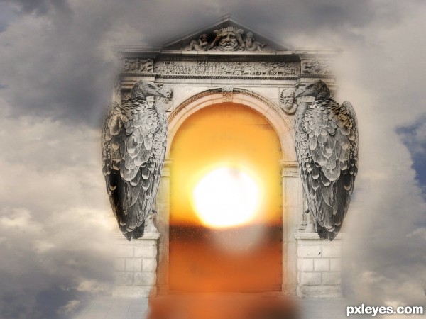
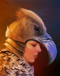
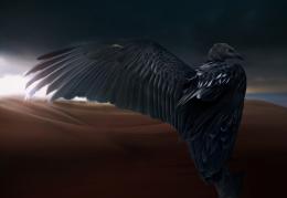
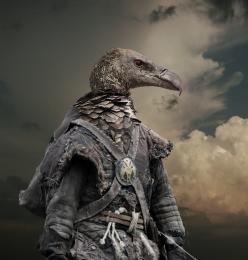
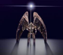
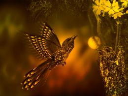
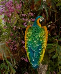
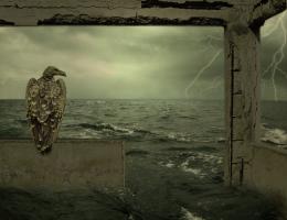
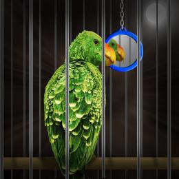
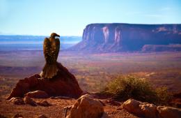
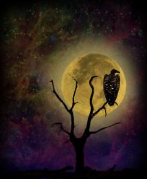
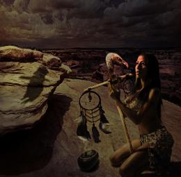
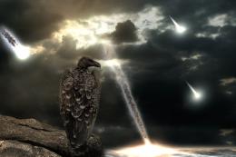
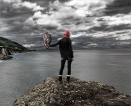
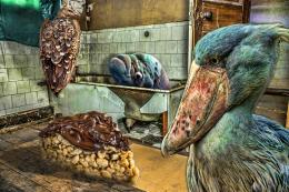
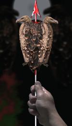
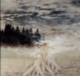
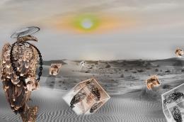
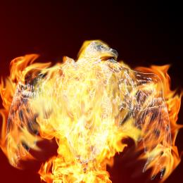
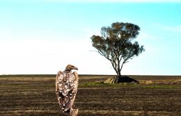
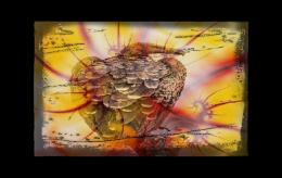
For the vultures to look like statues I used, hue/saturation, cooling filter and color balance , clipping masks. All 3 pictures were cut using layer masks, and the edges where made using low opacity soft brush. The light on the vultures is made by using a new layer (on top of all), fill it with 50% gray and set to overlay. Then use the dodge and Burn tool with 50-60% exposure, set it to shadows and adjust the light by your choice. You can also add a light effect choosing a light color from the clouds and with a softbrush painting where you want to be lighter, then set the layer to soft light and adjust opacity/fill to fit right in the picture. (5 years and 2586 days ago)

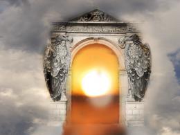


I think the picture doesn't necessarily need the text above the gate because everyone can see the name also above the whole picture. In my opinion it would be better without the text.
Thanks for the advice , I was thinking the same thing
If you're lighting one source with the light source of another, try to use only the light colour. In this case the only part of the sunset light affecting the archway would be the brightest yellow; and considering the archway is generally lighter in colour than the sunset to begin with it wouldn't be affected by it very much.
Nice idea btw.
Howdie stranger!
If you want to rate this picture or participate in this contest, just:
LOGIN HERE or REGISTER FOR FREE