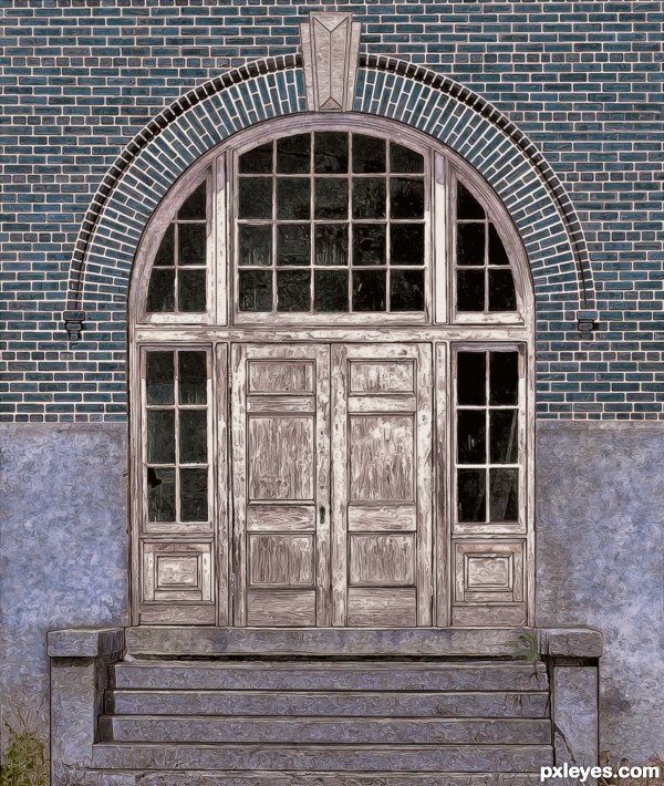
The Hi-Res version of this entry shows the anisotropic details much better. (5 years and 2546 days ago)
地çƒçŽ‹å†  by robvdn 8072 views - final score: 70.4% | Hidden Path  by DanielaOwergoor 14932 views - final score: 69.7% | Yahoooo , Coming Out !!  by Glockman 14103 views - final score: 69.4% |
Timeless 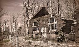 by buzzy 8086 views - final score: 67.8% | His Own Playground 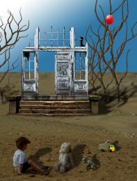 by George55 11073 views - final score: 66.3% | Ol' Blue 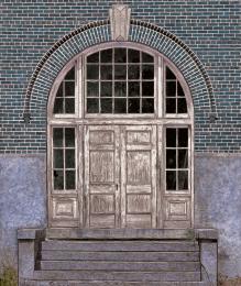 by MossyB 7599 views - final score: 65.8% |
The world within 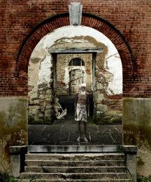 by divair 9696 views - final score: 65.1% |
Howdie Guest!
You need to be logged in to rate this entry and participate in the contests!
LOGIN HERE or REGISTER FOR FREE
Cool—which also describes the color palette referenced in your title. I think having the top brickwork being exactly in line with the top of the image and the bottom step perfectly parallel with the bottom edge of the image could be more compelling (i.e., in your face/"here I am" . Given the clear falseness of the image, I might exaggerate the contrast and saturation a bit more.
Thank you, I vacillated with "how much fake is too much fake?" so it is nice to know that it is clear enough. I decided against going too stylized with a harsher contrast, although I did like the high contrast step in the SBS...
I really like what you did, just wish there was a main subject on steps....anything.
a calligraphic precision, very special. bravo
Howdie stranger!
If you want to rate this picture or participate in this contest, just:
LOGIN HERE or REGISTER FOR FREE