(5 years and 2542 days ago)
Blow up doll on ship  by IRONCOW 10160 views - final score: 71.9% | I Dream of a Blue Bear  by rturnbow 20371 views - final score: 68% | Balloon Room  by jpeteralphonse 10988 views - final score: 64.9% |
Down the hallway.  by karaflazz 6830 views - final score: 63.3% | Going to Ibiza  by demi 6419 views - final score: 61.6% |
Howdie Guest!
You need to be logged in to rate this entry and participate in the contests!
LOGIN HERE or REGISTER FOR FREE
Awesome
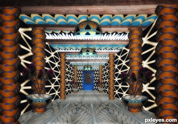
An intriguing space where I can still recognize the source despite all the chopping—kudos!.
I do feel the flatness of the image could be remedied by focusing on adjusting the uniform lighting. I would make the chandeliers the primary light sources, shadowing the outer edges.
There need to be tiny, dark shadows where the columns and planters touch the floor in order to ground them.
The planters need broader, slightly weaker shadows to recognize how much wider the upper portions of the planters are. Most disturbing are the planters' high horizon lines that don't match the lower horizon of all the other elements.
Howdie stranger!
If you want to rate this picture or participate in this contest, just:
LOGIN HERE or REGISTER FOR FREE