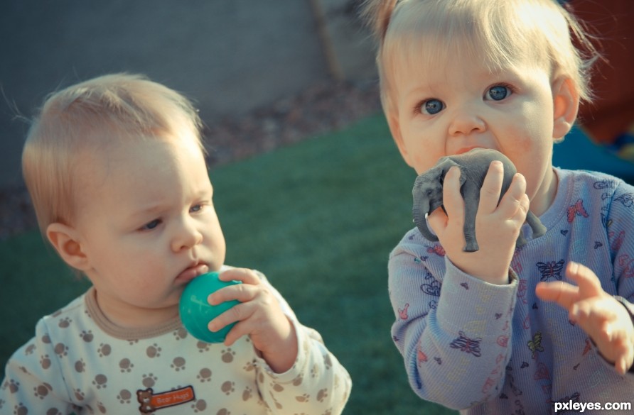
Would you rather lick a plastic ball or a tiny Elephant? (5 years and 2534 days ago)
1 Source:
In Your Hands  by samanway 15532 views - final score: 70.6% | Fikittynger  by jaskier 11799 views - final score: 70.3% | Tiny monkeys  by Nonnykka 15748 views - final score: 68.6% |
Got Orca? 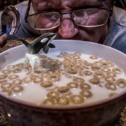 by rturnbow 18164 views - final score: 68.4% | Nesting Area 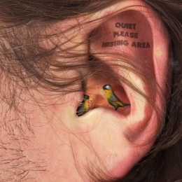 by robvdn 4706 views - final score: 67% | Comfy Cozy 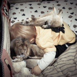 by rturnbow 17828 views - final score: 66.5% |
Friends 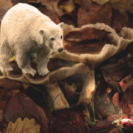 by vertigo 2343 views - final score: 66.4% | jungle food 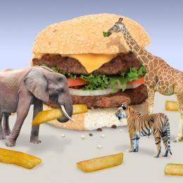 by krigios 2667 views - final score: 66% | The little proboscidean  by filantrop 3296 views - final score: 65.6% |
er...honey? I think we need to defrost! 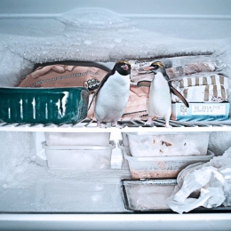 by kcinsti 7111 views - final score: 65.6% | The Unexpected Guests 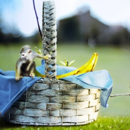 by bcabilan 2569 views - final score: 65.2% | Oh....Little Deer  by Arlo 9542 views - final score: 62.8% |
Frog in Your Throat 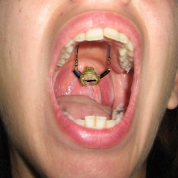 by magicalfruittuts 17413 views - final score: 62.6% | Wanna Trade? 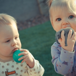 by rturnbow 17834 views - final score: 62.6% | Duck Soup  by kcinsti 4730 views - final score: 62.3% |
Goodnight  by M.Sh 2714 views - final score: 62.3% | Catching a Couple of Z's  by Majkman 3912 views - final score: 62.2% | Une, Deux, Trois Cats  by Majkman 2244 views - final score: 61.1% |
E.L.O .  by IRONCOW 2917 views - final score: 60.6% |
Howdie Guest!
You need to be logged in to rate this entry and participate in the contests!
LOGIN HERE or REGISTER FOR FREE
The shadow of the elephant on the hand is of a color which doesn't fit (give the shadow a darker color of the hand and not gray! A shadow is lack of light on the reflecting object and not a black light projected on that object ).
).
Another thing which can be improved is that the elephant is way sharper then the hand which makes it stand out.
I do like the photo you used of your children though the expression on the face of the little one fits perfect. Besides that the elephant in the hand is a good find.
Thanks for the comments. Agree with the shadow, adjusted it. The Elephant is actually not drastically different in noise and blur as the hand, it just stands out more. Note the butterflies on the shirt, they look less blurred as well. Blurring that size element at 1 pixel can make a big difference.
I think the issue isn't sharpness it's the levels of darkness/shadow
No.....!!! Don't eat him! I wonder if elephants taste like peanuts? LOL. This is cute. Great idea.
Lol, they taste like chicken, but she's only sucking on him, no worries!
Howdie stranger!
If you want to rate this picture or participate in this contest, just:
LOGIN HERE or REGISTER FOR FREE