(5 years and 2472 days ago)
New Dawn.  by TorDoni 16337 views - final score: 73.9% | Runway Robot  by TorDoni 4303 views - final score: 71.8% | In The Library  by oziipop 12048 views - final score: 71.3% |
Steam engine(designer thirsty)  by Ambil 4637 views - final score: 66.4% | Finding Pitch in the Blood Bugles  by Drivenslush 3941 views - final score: 64.5% | 2 pots  by shabeebsabu 2301 views - final score: 64.2% |
Entry number 85771 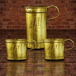 by Chuck 4444 views - final score: 61.3% |
Howdie Guest!
You need to be logged in to rate this entry and participate in the contests!
LOGIN HERE or REGISTER FOR FREE
Not bad, try some shadows.
Thanks CMYK46 :0 I have some on bottom ...Do I need more?
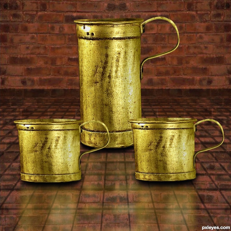
I don't see them, and you've created conflicting light sources by flipping the cup at right. The light on the others is from the left.
Thanks I'll get on it.
The perspective is off. The cups in the foreground would be much rounder top and bottom and you would see into the cups at the tops since they are below eye level.
Thanks spaceranger I will take care of.
You always have to think..."where is my light source?" even when collecting stock photos to use. I have turned down fantastic stock photos simple because the light source did not match with the piece I was working on. If you don't think where your shadows are CMYK46 will be the first to let you know! lol isn't that right Bob? :P
He does know what he is talking about.
you know what would be nice...is if you, look sharp!
duplicated the cups
flipped vertically
Gaussian blur about 40%
drop opacity to 30%.
then you would have a nice reflective surface coming from your tiled counter.
cool! now take the farthest cup reflection, and erase gradually. getting heavier with the eraser as you get closer to it. This one in the back would be less prominent then the others. Also gently erase the reflection where the bottoms meet the existing cup. I would say about same distance as your shadow.
Thanks I took care of and Thanks for the help.
and it looks great!
Thanks!
Your corners are still too sharp on the 'cups' using the ellipse will create the correct shape, also the dark line at the top of the cup would also have a slight curve - following spacerangers advice regarding eye levels. Lastly take some time to clone out the repeating patterns you have on all the cups. (make the two front different to the one at the back)
Thanks
Took care of.
You've done a great job improving your entry! Listening to helpful advice from these good members will make you a better artist. No matter what the outcome of the contest you should be proud of what you've done and your willingness to accept advice has earned you my respect.
Thanks! I have always appreciated the advise I've got from those in here who have helped me through the years on here. There has been good times and bad. I can say I have learn from members on here and they all know who they are.Yea I haven't done anything in here for a while but trying to fit time in for it. And Keep Learning!
Howdie stranger!
If you want to rate this picture or participate in this contest, just:
LOGIN HERE or REGISTER FOR FREE