(5 years and 2461 days ago)
3 Sources:
Wanna Play?  by IDt8r 9926 views - final score: 73.4% | A New Exhibit  by Jewbee2000 13060 views - final score: 66.5% | Rocky's Dragon  by PSA2009 6972 views - final score: 64.4% |
The golden hatchling  by CMYK46 4903 views - final score: 61% | The Worm in the Rising Damp  by Drivenslush 4246 views - final score: 59.9% | Fire breather  by CMYK46 1849 views - final score: 59.7% |
Howdie Guest!
You need to be logged in to rate this entry and participate in the contests!
LOGIN HERE or REGISTER FOR FREE
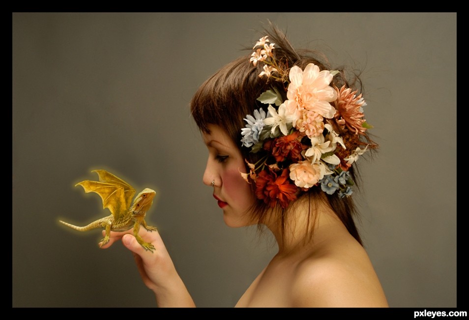
Great image. There is a light "halo" around your dragon. Removing this along with adding some shadow under the dragon would help. Good luck.
See the SBS. The glow is intentional, and as i mentioned in the SBS there are shadows under the feet. Since the hatchling is glowing, there would be no other obvious shadows. I especially made my comments in the SBS to avoid comments like yours. Pay attention.
Thanks for your comments. I gave you my opinion based on the image I can see. The "glow" you say is intentional, however, the image isn't dark enough to make it appear as a glow, only look like a white halo around the image. Again, I say good luck author
I have no idea what you're talking about. I suspect you don't either.
TorDoni says:
I believe what finalcut is trying to say is that the background is so light, and the glow is so faint that it does not come across as intentional, it would be much better IMHO, if you darkened said Bkgd, and brighten up the glow and perhaps have it show on the hand and the face of the girl. Give it a try, I'm sure you'll agree with us.
(< 1 min ago)
Didn't want to darken the background, so now the glow is more intense & more yellow. I think it looks better. The glow does show on the hand, but IMO it's not strong enough to show on her face. Anyway thanks for helping it improve.
Howdie stranger!
If you want to rate this picture or participate in this contest, just:
LOGIN HERE or REGISTER FOR FREE