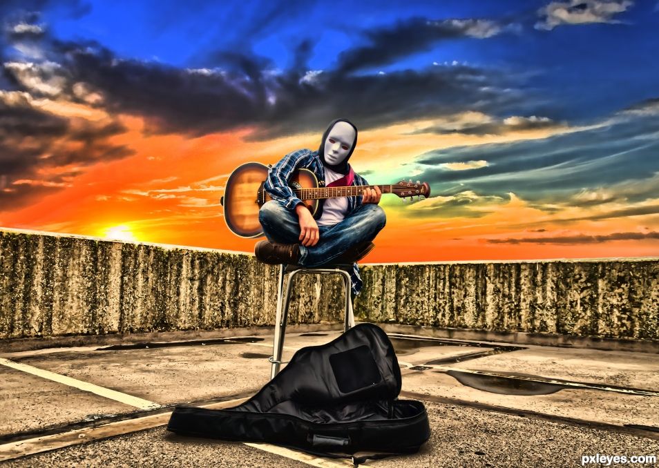
This is a shot for my brothers new EP, great shoot very random. (5 years and 2367 days ago)
1 Source:
Magic Halloween Night  by DanielaOwergoor 18105 views - final score: 75.3% | The Clairvoyant  by velkanx 8777 views - final score: 69.9% | Décès  by StuartJohnH 29373 views - final score: 69.7% |
No More Halloween Pumpkin Fun....Right? 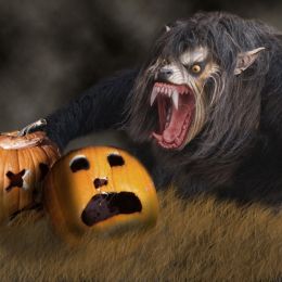 by George55 10981 views - final score: 69.5% | 13 Steps Back 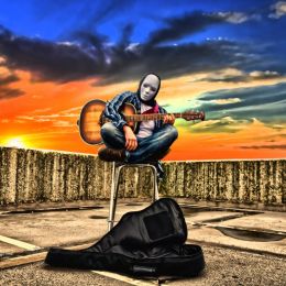 by StuartJohnH 22403 views - final score: 66.7% | Dia De Los Muertos (Day Of The Death) 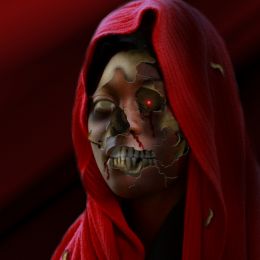 by George55 10164 views - final score: 66.7% |
Bloody Bath 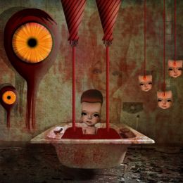 by M.Sh 3287 views - final score: 66.5% | Pumpkins Queen 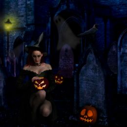 by anoosh 3020 views - final score: 65.9% | Trick or treat 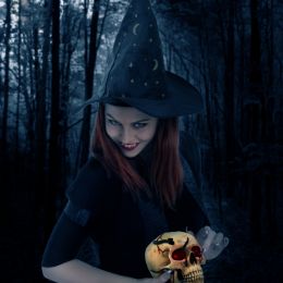 by anoosh 2680 views - final score: 65.4% |
Tragedy and the Pumpkin 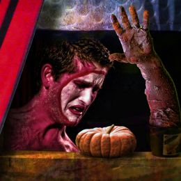 by Drivenslush 2576 views - final score: 61.2% | Entry number 89983  by maiaschka 2273 views - final score: 60.4% | Halloween Party  by red 2127 views - final score: 58.4% |
Howdie Guest!
You need to be logged in to rate this entry and participate in the contests!
LOGIN HERE or REGISTER FOR FREE
SBS now added as best I can, used a different image for the sky, source has now been recorded. Everything else is from my photos.
I think it doesn't represent halloween....
will you please stop commenting for the sake of commenting, it's a creepy image of a guy in a mask............it is the second time that you have voiced your opinion and both times what you have said is not relevant......they are both masked guys showing a scary or creepy image. If it wasn't in fitting with the theme the website would have taken them down.
If you don't stop commenting on my images based on your own personal views on what Halloween represents the I will be forced to report you.
Remember the movie Halloween????? Killer in a mask????.............
Just because your idea of violence or reelvance is different, doesn't make my entry wrong on not in fitting with the subject.
The reason those masks give people the creeps is because they are terrifyingly stoic/ Zero emotion. Good luck author, I like the overall texture
Thanks very much for your great (and knowledgeable) comments. Glad you like them.
Not sure you should be saying you have multiple entries in this contest, even though the final image quality is the same, that's different to actually broadcasting it in the comments.... I've got to agree though, this image isn't very Halloween like; performers where those masks all the time and as a result, it's not very creepy - maybe if his hands were also white? - or the guitar case was a coffin it might present the idea better!? - that's not to say that the image isn't good, just could fit the theme more I guess.
WEAR even!
Many thanks for your commend and ideas. I've just followed the guidelines and entered something either creepy, scary or horror. To be honest I didn't want to distract or change the image too much as it's almost original. It's supposed to be a contrast between light and dark, dark is the guitarist, light is the skyline. And as mentioned previously of course it's a horror theme as lots of horror movies include masks. Everyone perceives Halloween differently so the is no right or wrong answer. What I don't want though is comments like this putting voters off as it is just one opinion, it's more about the work that has gone into it and the quality of said work. But thank you for your comments all the same.
Howdie stranger!
If you want to rate this picture or participate in this contest, just:
LOGIN HERE or REGISTER FOR FREE