
Something is missing ,but I don't know what. (5 years and 1657 days ago)
5 Sources:
- 1: Boat
- 2: Red snake
- 3: Placard no exit
- 4: Placard wishes
- 5: Exit

Something is missing ,but I don't know what. (5 years and 1657 days ago)
Sitting tower of Pizza 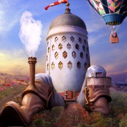 by Skogan 12916 views - final score: 69% | V3 - Relaxing on Some Mushrooms 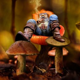 by BWR 13527 views - final score: 67.8% | Little Bird 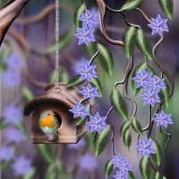 by George55 18079 views - final score: 63.6% |
The Village Gnome 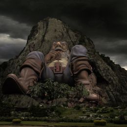 by rufkut 13412 views - final score: 62.4% | Inspiration the Grimm 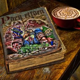 by Drivenslush 11922 views - final score: 57.5% | Cooling Off After A Hard Days Work 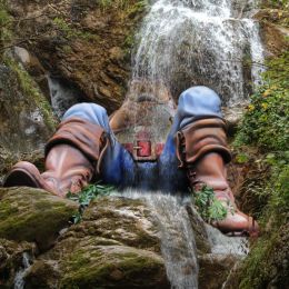 by George55 9790 views - final score: 57% |
No exit? 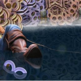 by gedup 7530 views - final score: 55.8% | Young Santa 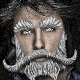 by Drivenslush 3295 views - final score: 54.3% | Marching into Halloween  by Drivenslush 3053 views - final score: 52.1% |
Howdie Guest!
You need to be logged in to rate this entry and participate in the contests!
LOGIN HERE or REGISTER FOR FREE
Nice job If I may offer some advice? You should be a little bit more consitent with your water reflections I think. The boat reflection is distorted and that is a nice touch but then all of your reflections should be the same. You have very sharp reflections under the shoe and under the boat but basically the whole image should be reflected equally in the water.
I really like how you did the water over the shoe!
You have a bit of a conflicting lightsource in the picture with light coming from the right on the gnome and from the left on the boat.
Anyway, nice image and good luck!
Thanks for your advices.
 )
)
I 'll do a new picture with a little more water reflection.
I do more clear Shoes and boat reflection (less sharper? ).
Light is supposed to be at the top and in the center of the picture so I think it is normal to have shadow on the right on the gnome and from the left on the boat? May be it is not a good choice?
The boat is just coming, so,the distorted reflection is not coming all other the water (..and so I don't thave to do the modification
Lots of fun
Thanks to take time to see details...and for your comment...see you later.
The shadow shoudn't be there on 'right leg/knee and face. I think the image without that shadows/dark shades will fit with whole lighting. Good luck
I understand your device and do the shadows clearer but, I don't want to totally erase it, The Gnome appeared for me too "flat"
Thanks.
good feedback so far author. I look forward to seeing the changes you make. I think Skogan has covered most of what would improve your image. Love the concept and how you have used the image to make it your own.. all the best.
It is the new picture. you can see the picture before modifications at the step8 of the SBS.
Thanks for your comments.
Howdie stranger!
If you want to rate this picture or participate in this contest, just:
LOGIN HERE or REGISTER FOR FREE