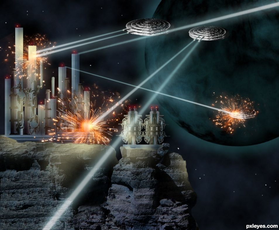
Just a space fight, thinking of Star Wars. Not really, but something like these fights for power can happen in space in a near future. (5 years and 1653 days ago)
2 Sources:
Fly again  by Verikakis 33973 views - final score: 69% | Dragonfly Trinket  by DigitalDreamer 18198 views - final score: 68.8% | In Orbit  by CMYK46 15469 views - final score: 67.6% |
Horizon X-2020 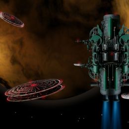 by George55 18981 views - final score: 62.8% | Under Attack 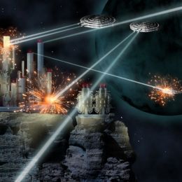 by George55 20383 views - final score: 60.8% | Sky Captain  by BWR 2685 views - final score: 60.4% |
Turban Mech Chic  by Drivenslush 4552 views - final score: 52.4% | Steamer Cookies 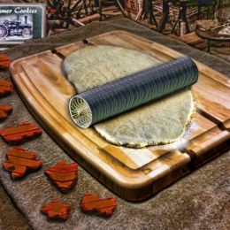 by Drivenslush 2864 views - final score: 51.9% | Whleyes.  by fille 2956 views - final score: 49.2% |
Redneck and his Purple Monkey with the Blood Moon 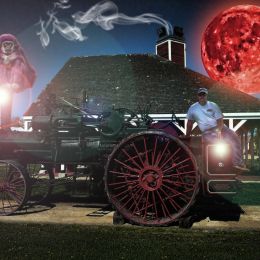 by Drivenslush 2270 views - final score: 47.7% |
Howdie Guest!
You need to be logged in to rate this entry and participate in the contests!
LOGIN HERE or REGISTER FOR FREE
Good construction with the power houses.. I would suggest a little more details for the Ufo's, atleast for the weapon portions (where the The UFO fires) some hole or a gun like thing (up to you), Now it looks like the firing comes from nowhere. It's ok to imagine the weapons are located at the bottom, But it will be more dynamic if the image shows some. Great work on the sparks/ explossion. Construction of rocks (the base station) is superb. Also I would like to see some more yellow glows on the powerstaton and some glow on the rocks too, where the explossions happening ( Now it's cool and dont blow up if I am wrong). Good luck author
See what I can do, I agree with the weapon guns and the details on the yellow glows.
I'm afraid that the yellow glow/color is bit over done, former one was better auhtor
Super concept. Maybe giving the returning beams from the Buildings a different color, or making them into some sort of plasma lightening to create the idea that there are two different weapons to add to the realism. Just a suggestion. Love the concept.
I noticed that something was not right in the beams, a different color will make it.... Thanks my friend.
Love your idea. I would agree with hereisanoop and Drivenslush. I would like to add a small suggestion about your beams. I would make them solid not transparent and narrower. Other than that it's a great idea. Good luck author.
Thanks for your comment....
Congrats on 5th and 4th
I thank you again....
Howdie stranger!
If you want to rate this picture or participate in this contest, just:
LOGIN HERE or REGISTER FOR FREE