(5 years and 1651 days ago)
i'll be back  by Verikakis 13051 views - final score: 70.4% | Stone can melt too  by Skogan 12039 views - final score: 68.4% | Bertie, our clock on the square  by robvdn 13919 views - final score: 62.8% |
Santagoyale  by buzzy 10790 views - final score: 60% | gargoyle  by vertigo 10415 views - final score: 59.4% | Souvenirs  by George55 4318 views - final score: 58.4% |
Fido 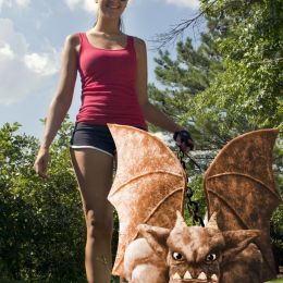 by pingenvy 4258 views - final score: 58.3% | The day of the Gargoyle 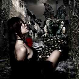 by Tijeras 2379 views - final score: 57.8% | SURPRISE!!  by CMYK46 2487 views - final score: 57.2% |
Guardianes de la Laguna 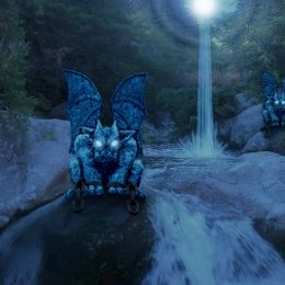 by srlr 2672 views - final score: 56.8% | Bodybuilder 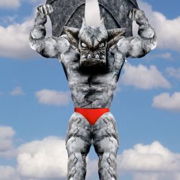 by omercb 2800 views - final score: 56.3% | Gar's Exile  by thefinalcut 8344 views - final score: 56.3% |
Rising Above the Chains  by Drivenslush 2575 views - final score: 55.8% | Nerd Gothic  by Drivenslush 2324 views - final score: 55.8% | Attack Of The Gargoyle  by George55 7626 views - final score: 55.6% |
NEXT TOP "gargoyle" MODEL  by MenelaosP 10108 views - final score: 54.3% | Butterflies  by Mienkie 2345 views - final score: 54.1% | Death Peels My Teeth  by Drivenslush 2313 views - final score: 53.6% |
To Live Again  by musicj19 2278 views - final score: 53.4% | Entry number 92409  by Chuck 2784 views - final score: 53.2% | Entry number 92364  by Chuck 2434 views - final score: 51.2% |
Entry number 92358  by Chuck 2117 views - final score: 49.5% |
Howdie Guest!
You need to be logged in to rate this entry and participate in the contests!
LOGIN HERE or REGISTER FOR FREE
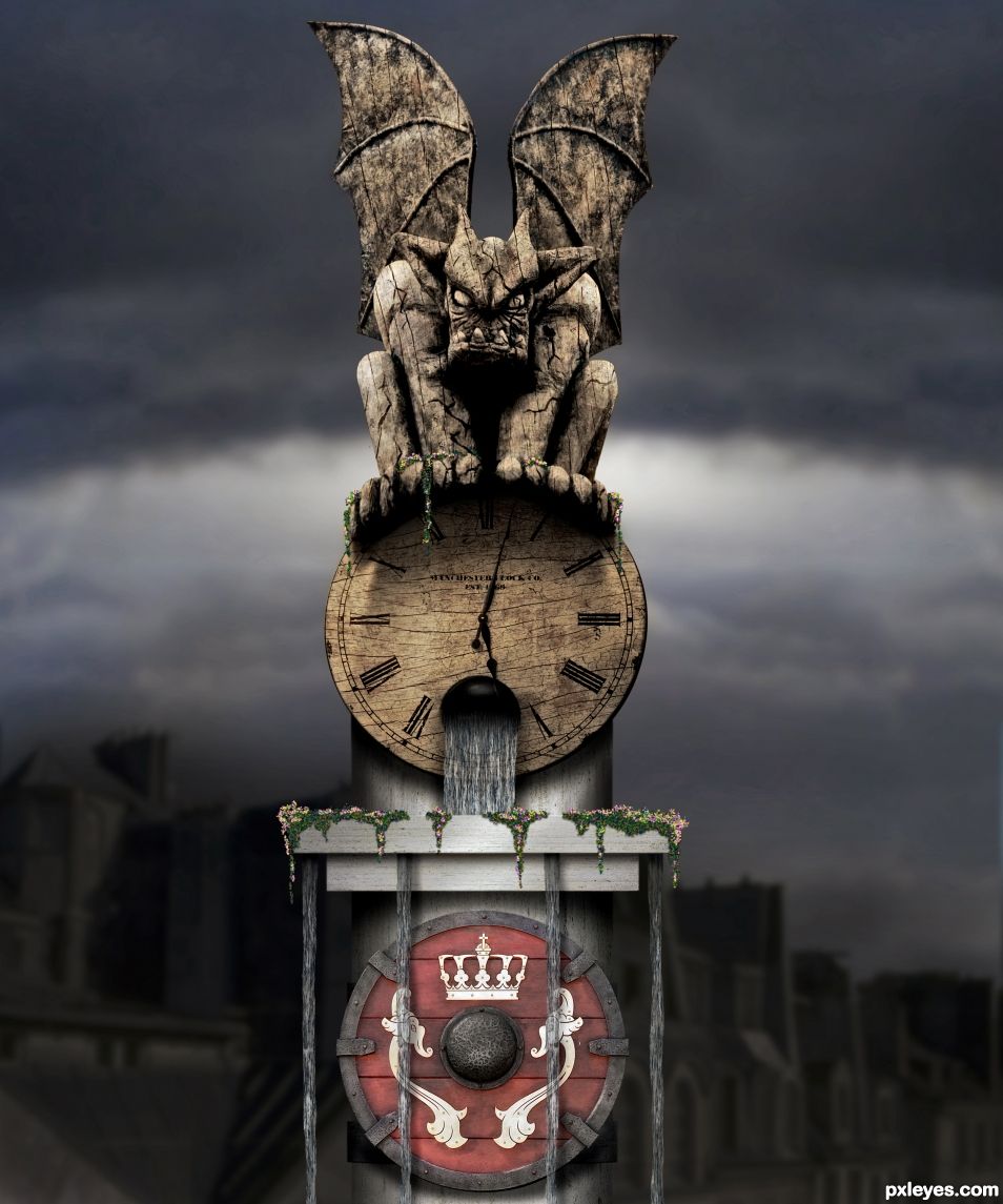
Nice job here. I have some things you might consider.

The hole in the clock is a bit flat, if you add some highlights to the inside I think the effect will be better, and make the edges just a little less sharp. Look at this picture as an example how to add some highlights:
http://www.conteches.com/portals/0/Images/applications/product-application-summary/73_Solid_Wall_Plastic_Pipe_Sanitary_Sewers.jpg
I would also warp the metal om the column to make it less flat, just warp it downwards slightly and add a little 3D effect.
On the flowers you can add some highlights on top and some shadows underneath to give them a bit more body.
It is a bit unclear where the light is coming from but I will grant you the artistic freedom
Good luck!
Thanks for your points, that's what you get when you work the whole night and want to finish rush rush.
You are right about the flowers & shadow, had them in a previous version so added them back. Some details where terrible, which I worked over. I notice I didn't do any PS work in the last 1.5 years, hard to get started again and get the inspiration back.
Reminder to myself: do not enter to quickly!
Well done! It looks really nice now with the shield and your changes.
I would like to give you two more things to consider if you don't mind. I am not saying you should change it but it might be something to think about.
The edges of the flower shelf are very sharp now, just a tad softer would make it blend better with the surroundings I think.
The second thing is when you add a texture onto an object that is "3D", you want to make sure that a line is not going straight over two separate parts, like the line on the left should onto the wing, if you know what I mean?
Anyway, great chop, I really like it.
Like I said before I haven't made a chop in 1.5 years and this one I really forced myself up on. Just must force myself to get in the flow again
I am sure you are back in no time, it is obvious you have talent.
Good job on the wood texture, but if that's supposed to be water, it needs a lot of work to look believable.
PS: I think you need a link to the wood texture.
Nice Job!
And good idea!
Author, here is a really good tutorial for making water from scratch. http://www.tutorialwiz.com/water_on_tap
Great tutorial! Thanks for sharing.
I like this.. great work . gets points from me because it has a Viking shield. (I am a medieval swordfighter ) not sure if the white images are to look as if they are part of the shield or top dressing.
Over all great use of source image author.
Nice! Good luck!
Clean, Clear and Composed. Nice. The wood grain is great but the texture should respond to the surface contours to pull off depth. Sometimes a simple "displacement" filter will give it "that, edge."
Awesome work
I have no idea why, but the PINK Viking shield gave me a huge case of the giggles. Kind of neat that you retained that color. Now reset the Clock to 4:20 (J/K). Super clean work and what Cornelia said
Nicely done my friend! clean and tasty! Good luck.
A neat concept! Best of lucks, author!
Congratulations...
Congrats Rob
Congrats!
Howdie stranger!
If you want to rate this picture or participate in this contest, just:
LOGIN HERE or REGISTER FOR FREE