Source photos credit goes to; Anwer Reyaz, Davide simonetti (5 years and 1630 days ago)
life at sea  by buzzy 9849 views - final score: 62.8% | When the bottle breaks  by buzzy 10553 views - final score: 61.7% | Sexy Pirate  by Mienkie 11267 views - final score: 61.3% |
Rough seas! 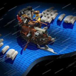 by buzzy 8406 views - final score: 60.8% | For old times glory!!! 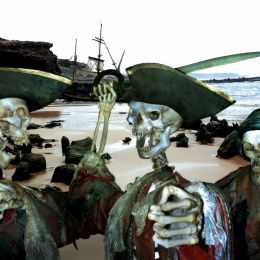 by JimLemon 18279 views - final score: 60.3% | Ghost of the Jolly Roger 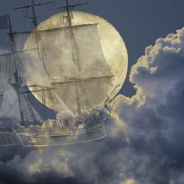 by CMYK46 2297 views - final score: 58.9% |
Message in a Bottle 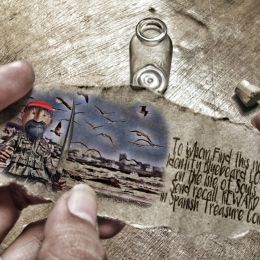 by Drivenslush 2157 views - final score: 57.5% | Pirates Brew 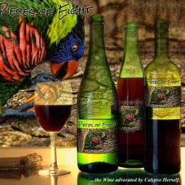 by Drivenslush 2555 views - final score: 53% | The Dread Pirate Walker 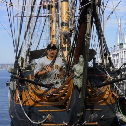 by CMYK46 2032 views - final score: 52.9% |
Treasure Island Map 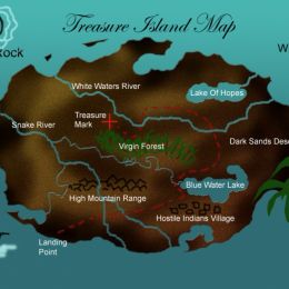 by George55 7642 views - final score: 51.5% | Captain Sinatra Ole' One Blue Eye 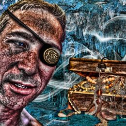 by Drivenslush 2683 views - final score: 48.6% |
Howdie Guest!
You need to be logged in to rate this entry and participate in the contests!
LOGIN HERE or REGISTER FOR FREE
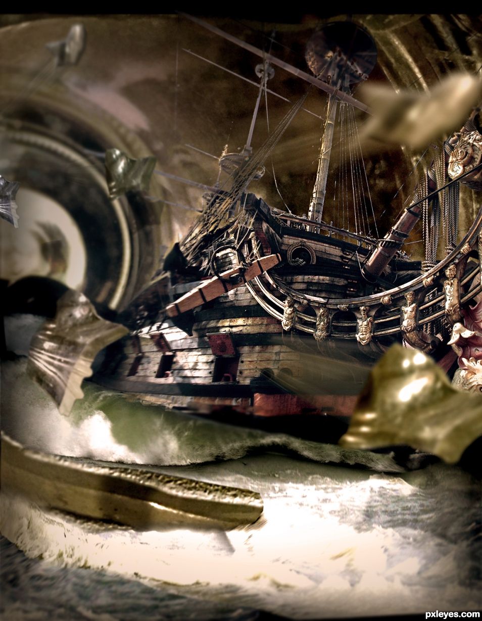
My first half second reaction was 'WOW!'
Then on closer looking I realized you have potential gold here but there's more work to be done before it is actual gold. Your source of the ship is great and I would have left the front part of the ship in the chop.
IMHO you should give this chop a couple more hours, enhance the blending of the waves, play around with color settings and try to add more sources to tell a story.
You could for instance use a radial blur on the bottle, I suppose this is an eye of the storm, add a couple of things flying around, to create a more chaotic look (remove the birds, they do not fly in storms).
I see great potential here and hope you will spend some extra time in this chop to make it great!
Not voted yet because I want to wait and see what you can come up with in the end, hope others will also.
Fantastic. Great thoughts... Ill give some of this a shot, check back in a few days. Thank you
oh the DRAMA!
Very nice, indeed! Looking forward to seeing those improvements you'll be working on (Holding my vote for later too, I'm pretty sure it'll be worth the wait!)
IMO reverting to something like Step 3 would be an improvement, with less yellow in the water, and not so much of a confusing dark mass in front of the bow. This can be a great image with the right tweaks.
Adding the broken glass really makes this work now. My only problem is with the line where the wave meets the hull of the ship, and I still think the water looks better in step 3, but it's a well made and imaginative image.
Thanks CMYK
Message in a bottle..
First version is more to my taste. (the one stored in the SBS.) The chunks (and I know they are suppose to look like broken glass) just don't work for me. They kind of look like debris that wasn't deleted/erased from another photo. But who knows, I'm completely loop the loop. Still a great chop
hehehe, can see the improvement with the blur... don't knock yourself author, it's a really great chop, be proud of that (great vision)
Thanks again 'D'
I think you have been doing a lot of work to better this image. For me, the flying glass looks ok, but not so sure about the water... is it me...or.... well, nice work, your changes look good.
i wasn't to fond of the sharper water, i thought it didn't present enough "movement" so i went with the blur(s). Thanks for the comment George
There ya go!!! Congrats!
congrats!
Congrats again!!
Howdie stranger!
If you want to rate this picture or participate in this contest, just:
LOGIN HERE or REGISTER FOR FREE