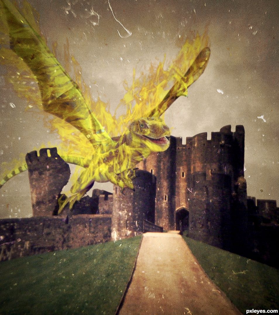
Just a fire dragon (5 years and 1539 days ago)
5 Sources:
GRRRRR.... 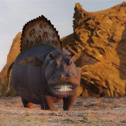 by CMYK46 13826 views - final score: 61.3% | Dragon Hunter 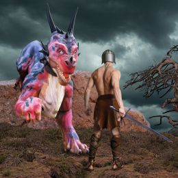 by spaceranger 12960 views - final score: 60.3% | Black Dragon 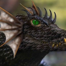 by Irse 13873 views - final score: 60.2% |
GREEN EYED ALLIGON 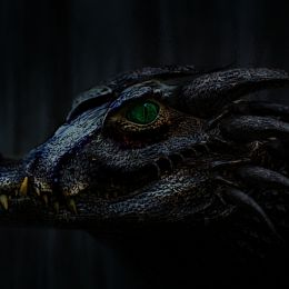 by nilknarfsoive 14311 views - final score: 59% | Angry Dragon 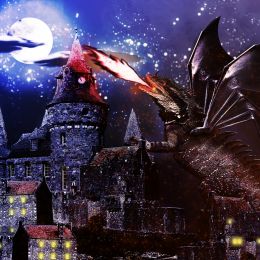 by Gobi 10916 views - final score: 57.9% | 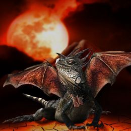 by fredlecigne 8330 views - final score: 57.3% |
Snake Fruit Dragon 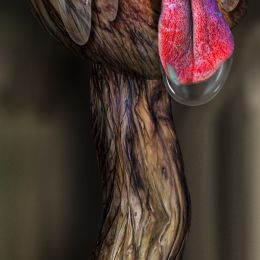 by Drivenslush 2547 views - final score: 56% | Dragon sleeps 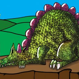 by LifetimeDamage 4298 views - final score: 56% | Frost Fire Dragon 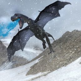 by NuclearGumbo 3408 views - final score: 55.1% |
Le crépuscule des dragons (Twilight of the dragons) 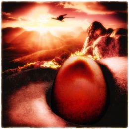 by gosseyn 9315 views - final score: 54.9% | Entry number 94499 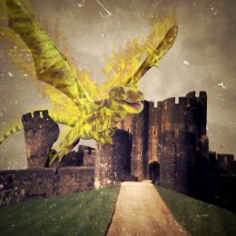 by igogolf 2285 views - final score: 53.2% | Interdimensional Pepper Dragon Space Travel 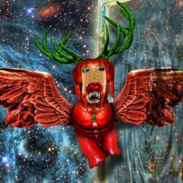 by Drivenslush 2750 views - final score: 52.9% |
St George 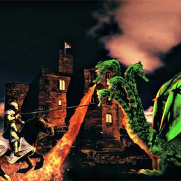 by filantrop 1986 views - final score: 52.6% | Damn Pumas 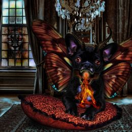 by Drivenslush 2117 views - final score: 49.9% |
Howdie Guest!
You need to be logged in to rate this entry and participate in the contests!
LOGIN HERE or REGISTER FOR FREE
Interesting image with good texture work. What's the source for the flames?
Used some old Photoshop brushes.
When overlaying an image with textures be careful not to destroy the resolution. (Unless that was your intent). In photoshop, you can see how the tail of the dragon is INSIDE the Castle, but the distance is funked up and gives the feeling the Dragon is flying INFRONT of the castle not landing on top of it. (In my eyes anyway). If that was your intent you may want to burn the edges of the castle where the dragon landed to give it more of grounded/holding the tower feel. Again, this could be caused by the texture overpowering the image and making the detail blur. Only a suggestion as always IMHO.
The Castle source is incredibly blurred in the original source and that adds to the difficulty of matching up the landing effect. Trying to match up the resolution of the castle with the incredible detail of the reptiles cause a lot of the blending issues.
Don't get me wrong, it's a great design, I'm just looking at it as how it could be improved for the overall effect and crank it up a notch.
The calm color scheme is well thought out, but be careful as that can make it a bit bland with no punch. Not a bad thing, but in photoshop there is always room for a little more WOW. GOOD LUCK.
Howdie stranger!
If you want to rate this picture or participate in this contest, just:
LOGIN HERE or REGISTER FOR FREE