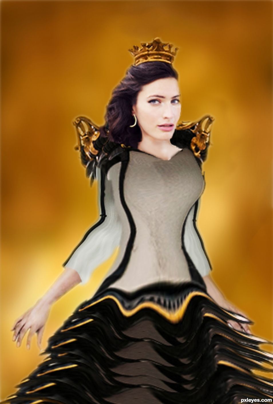
A princess from the far away land of lamp posts. So many lamp posts, even the royal family there uses lamp posts to tailor fine clothing ;) (5 years and 1366 days ago)
- 1: Head
- 2: Arm and hand

A princess from the far away land of lamp posts. So many lamp posts, even the royal family there uses lamp posts to tailor fine clothing ;) (5 years and 1366 days ago)
Glow Worm  by scratzilla1 19349 views - final score: 67.7% | Holy Light  by macarhign 16121 views - final score: 66.3% | Entry number 96977  by fdgreece 10844 views - final score: 65.5% |
waiting at the gate 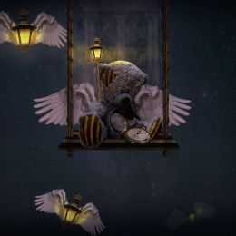 by scratzilla1 8624 views - final score: 65.4% | Parking Lights 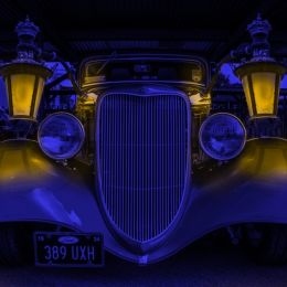 by rturnbow 9025 views - final score: 61.8% | Trying to escape 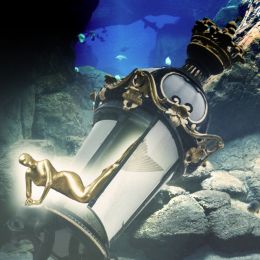 by oana 3381 views - final score: 59.8% |
The Puncture Doll on the Lavender 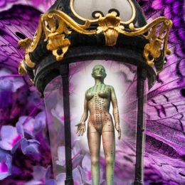 by Drivenslush 2300 views - final score: 56.7% | Royal Air Corps 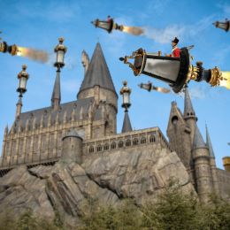 by rturnbow 2454 views - final score: 56.7% | Juggling to Amuse the Sun 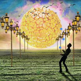 by Drivenslush 2284 views - final score: 56.4% |
a bright step 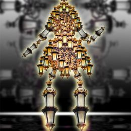 by Drivenslush 2224 views - final score: 53.9% | Bat Lamp Haunt 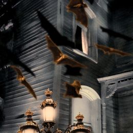 by Drivenslush 3050 views - final score: 53.9% | Three Oclock on the High Way to the Nether World  by Drivenslush 2263 views - final score: 53.7% |
Her Royal Highness, Princess StreetLamp 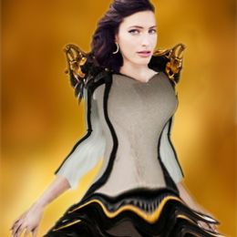 by Bushra 7442 views - final score: 46.3% |
Howdie Guest!
You need to be logged in to rate this entry and participate in the contests!
LOGIN HERE or REGISTER FOR FREE
congrats on your entry.. may I give you a couple of tips. if you look at your cut out, especially the arm on the left of screen ( and other parts) it has a very "zig-zag" finish. to help fix that :
get a small brush .. round - hardness 0. size small ( will vary on the size of your image but start small.. eg 10-25
go to the image layer , click on it.. add layer mask. ( use mask not eraser.. easy to fix image issues).. now using soft brush on mask.colour black to take away , white to bring it back, go around the edges of your image and "smooth" them out
hope this helps.
Goodluck
a little rough author, but wonderful to see the imagination... fun chop and the polish will come, you will find yourself correcting things you never noticed before.. you'll get the hang of it, and this is a great start.. GOOD LUCK
Good advice from scratzilla1 and Drivenslush. The sources used are at a good res and will be sharper if you create your entry at a larger size and at a higher resolution. I usually work at 200pxl per inch, see this entry for an example: http://www.pxleyes.com/photoshop-picture/56fecc534026b/Sunday-in-the-Park.html
The PSD (working size) is appx. 11.656" X 9.56" at 200 pxls per inch. The JPEG used for submission is appx. 11.656" X 9.56" at 125 pxls per inch giving me a final image at 4.98M which is just under the maximum size allowed for submission images. This makes the high res version of the entry 20.236" X 16.597" at 72 pxls per inch.
It's just a matter of reducing the resolution when making the final JPEG. I keep the res at 100 pxls per inch as the minimum size and if needed I reduce the image dimensions until the final size is at 5.00M or just under that size. It's simple trial and error and takes a little time but the result is a good sharp entry image and a good high res version.
Thanx to all of you for the comments and tips. I have been using (and teaching) Photoshop since version 3. I just got lazy and uploaded the princess too quick. I fixed a few things this morning like her arm, the pixelized edges, and her skinny waist. I kept it at 72dpi since on screen the resolution won't make much difference.
It was fun!
super.. love the changes. great job. all the best with your entry.
It's still better to work your entry at a higher res and larger size, this will make it easier to work details and will give you an optimum quality which when reduced to 72dpi will give you a larger and sharper high res and entry image.
Your high res is only 6.292"X 9.292" and can't be enlarged to see more detail. Compare that with this other entry in the contest: http://www.pxleyes.com/photoshop-picture/57941c6bd6fc6/Royal-Air-Corps.html which has a high res of 64.528"X45.167" allowing the viewer to see a much larger version that you can zoom in to see finite details of the work.
As a professional artist my original illustrations both in conventional media and CGI were always done at a size much larger than the reproduction size to produce a high quality sharp image.
So this should be the last version. Her head is more in proportion, and I added a golden background by copying a tiny piece of the golden metal in the source image.
Howdie stranger!
If you want to rate this picture or participate in this contest, just:
LOGIN HERE or REGISTER FOR FREE