
(5 years and 1340 days ago)
5 Sources:
- 1: People waiting
- 2: Rider 1
- 3: Rider 2
- 4: bugs
- 5: rope
Froggy Rich - Shroom Drummer 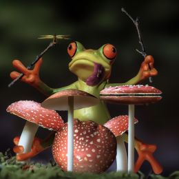 by rturnbow 14809 views - final score: 68.1% | Almost late 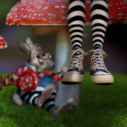 by scratzilla1 17788 views - final score: 64.7% | Mushy Models  by skyangel 8078 views - final score: 63.9% |
Little house 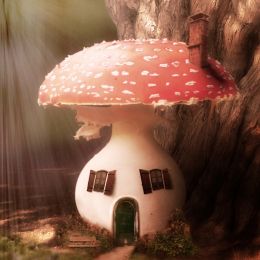 by oana 6808 views - final score: 63.3% | Lady Bug in Rainy season  by Ravindrav7 8178 views - final score: 62.4% | Shrooming the Light  by rturnbow 1960 views - final score: 61.1% |
Fall's Watcher  by scratzilla1 5703 views - final score: 59% | It's raining sunshine.  by filantrop 4465 views - final score: 57.8% | Worms 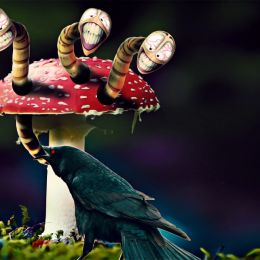 by filantrop 2075 views - final score: 56.4% |
The Bus Stop  by oana 2146 views - final score: 56% | Frog cocktail on the moss 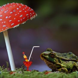 by Zizounai 2002 views - final score: 56% | Rain shelter  by skyangel 13439 views - final score: 55.8% |
Firebird Hatchling 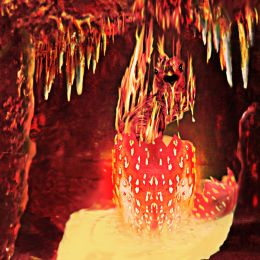 by Majkman 1776 views - final score: 55.6% | Pup Float  by Drivenslush 1840 views - final score: 54% | Sweat Bee Creating Stars  by Drivenslush 2068 views - final score: 53.1% |
Mushroom Lemon Ice Tea with Salad and Sea 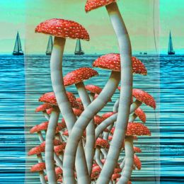 by Drivenslush 2145 views - final score: 52.5% | Unfortunate Carrot Infection 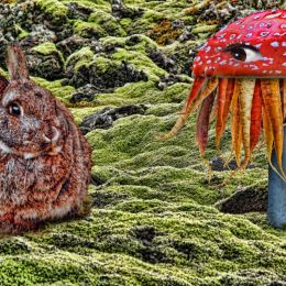 by Drivenslush 2787 views - final score: 52% | I've Fallen and I Can't Get Up 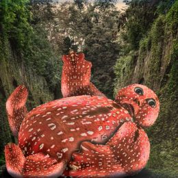 by Drivenslush 1882 views - final score: 51.5% |
Entry number 97398  by rajat200 5003 views - final score: 37.7% |
Howdie Guest!
You need to be logged in to rate this entry and participate in the contests!
LOGIN HERE or REGISTER FOR FREE
Fun image author. Do you think it could be improved by doing something that would pull it all together? It feels a bit choppy. Not a bad thing, but it just seems that the characters are floating off the image. You did an INCREDIBLE job with the lighting and blurring, but it still feels choppy. I'm thinking of an equalizing filter over the whole thing or maybe a overlay with a soft texture? IT'S ONLY A SUGGESTION, this is great as is, but I'm just thinking of the overall feel. Good Luck!!!
Yeah, you're right. I've made a few tiny changes and I think it looks a little better. What do you think?

Thanks a lot for the tips!
Head slap! It was just the saturation wasn't equalized. IT'S A ZILLION times better now. I always keep my saturation at full tilt because I can't see very good so of course I couldn't figure it out (I only figure it out playing with levels and when I see improvement I stop). It's much more stable now and you got rid of the "Floaty" feel.. Great job and good luck!
Thanks a lot!
Howdie stranger!
If you want to rate this picture or participate in this contest, just:
LOGIN HERE or REGISTER FOR FREE