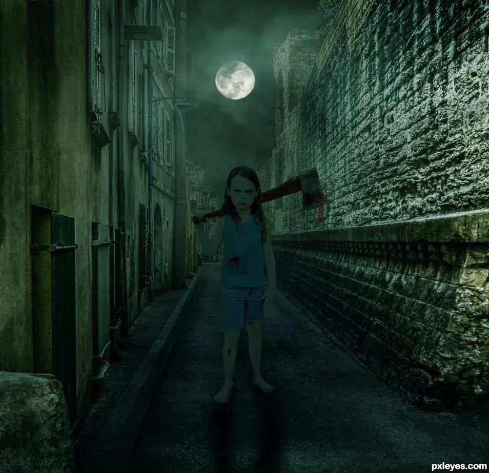
I took as a starting point this tutorial:
https://www.tutsps.com/post/2014/06/01/tuto-la-ruelle-de-la-mort-avec-photoshop-cc/
but with different sources, and I didn't do exactly the same for the girl as I whished her to be different. (5 years and 952 days ago)
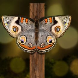
- 1: Alley
- 2: Girl
- 3: Moon
- 4: Blood brushes


Very creepy looking. It looks like it could be a horror movie poster. It makes me wonder who or what she is going to chop up for lunch. Well done. Maybe just add a bit of back light on the girl so it looks like the moonlight is shining on her back like in the tutorial? It will make her stand out a bit more.
Thanks for you advice Skyangel. I didn't want to show as much light as on the tutorial around the girl, but as you insisted I have added some and it looks better I think
I agree with this.
The brightness of the stone wall on the "axe girl's" left is some what bright compared to the other wall. perhaps toning that down would help the girl stand out a little more. Nice work I like the concept.
Tone is better now.
Good chop Zizounai.
Thank you BW
Howdie stranger!
If you want to rate this picture or participate in this contest, just:
LOGIN HERE or REGISTER FOR FREE