(5 years and 947 days ago)
Giant Wasp  by BWR 15578 views - final score: 61.6% | Snail crossing.  by skyangel 14572 views - final score: 60% | Big fish  by Zizounai 8134 views - final score: 59% |
Your mouse is too small, buddie... 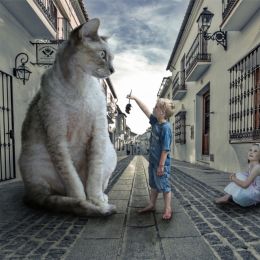 by Zizounai 7650 views - final score: 58.8% | Nail in the apple  by filantrop 7541 views - final score: 57.1% | Raspberry Delivery 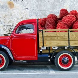 by Drivenslush 2013 views - final score: 56% |
Your claws are showing! 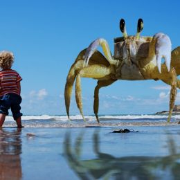 by Zizounai 2764 views - final score: 55.9% | Shell 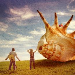 by WYSIWYG 2094 views - final score: 55% | IT IS PROBABLY THE GOOD SOIL....  by George55 1796 views - final score: 55% |
Camels can go thru eye of needle 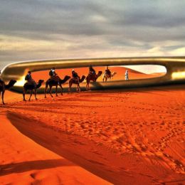 by filantrop 2533 views - final score: 54.9% | Fire Ant Stowaway  by Drivenslush 1656 views - final score: 54.8% | Learning to fly 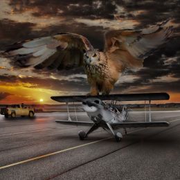 by Zizounai 3202 views - final score: 54.5% |
Big Hippity on route to the Toki 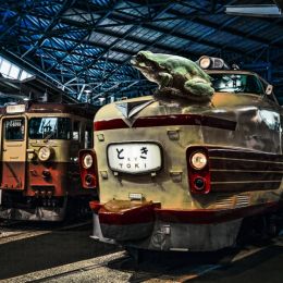 by Drivenslush 1776 views - final score: 53.9% | Meow Meow Grande' 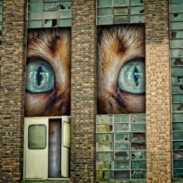 by Drivenslush 1811 views - final score: 53.7% | Jumbo's Jumbo Peanut 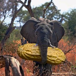 by lchappell 2739 views - final score: 53.2% |
IS IT A DRAGONFLY????? 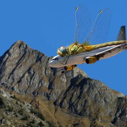 by George55 1466 views - final score: 52.6% | Kingfisher dropped the soap on top of Maria 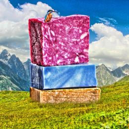 by Drivenslush 1920 views - final score: 47.2% |
Howdie Guest!
You need to be logged in to rate this entry and participate in the contests!
LOGIN HERE or REGISTER FOR FREE
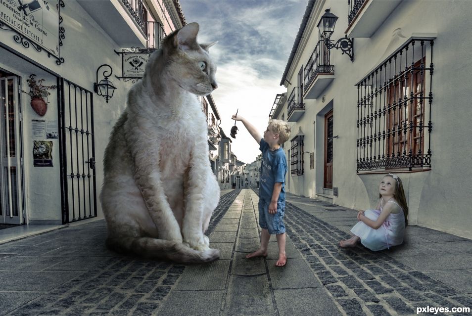
Neat idea. Maybe brush some very dark color either on a multiply, or hard light layer underneath them where they join the ground. Just a very small amount. This will connect them to the ground and make it look like the are not floating in the air. Look very closely at your source images and you will see what I am saying. You can use several layers if needed. Sometimes I do a very very fine real dark layer of shadows, and then a more spread out lighter one, and sometimes even a lighter one spread out more. Gaussian Blur can be helpful on the shadows but isn't always needed. Better yet, check out some video tutorials on this. Just making nice shadows will increase the believability of your Chops by a lot.
Thanks BW, I already have added shadows just the way you indicate
But to make you happy, I've put just a little bit more.
The street light seems rather dim, so the shadows would not be too contrasted.
Maybe I said that wrong. I meant some dark color where your subjects touch the ground. Here, I made a gif, using the boy's feet to show you what I mean. https://i.imgur.com/2tfukZe.gif
I used black in this gif, but it's probably best to sample a dark color by the boy's feet using the eye dropper. You can then use PS's Color Picker to make that sampled color lighter or darker. I used a 33% opacity brush, but went over it a couple times or so. IMO he looks more "attached" to the ground now.
Thanks for your gif, for your time, for your interest! I understand what you mean better now.
YW author. They do look better now. They don't look like they are floating in the air. I got some more suggestions if you would like to hear.
That's intriguing BW, more suggestions? Yes please!
Hi author. I did a few things that I thought would improve it. You did a really good job of color matching the boy, the girl and the cat into the background, but IMO the overall color cast of the image made it look flat. So I did some quick and dirty color/light work on it, and now I believe the chop "pops" a bit more. Let me know what you think.
Made two more images that are sort of a mini SBS. I used Nik filters and Color Balance. Am I allowed to tell you the settings? I have no problems giving you the settings, but is it against the rules?
https://imgur.com/a/fBQpN
Thanks BigWaveRider, he he now I now what your initials stand for! I don't think it is against the rules to tell settings, on the contrary we are asked to help and give tips to eachother.
The tone balance you did is much warmer. Usualy I do warmer pics but in this case I chose to keep it in colder tones. I like them both, now I'm confused
I added my settings for you in the Imgur album. Yea it's more warm for sure. At first I tried a warming color filter but it was inadequate. Up to you which one you like.
 . Gonna be changing my name soon. Mods said they can't give me a name change, so I have to make a whole new account.
https://imgur.com/a/fBQpN
Haha. Yup, BWR = BigWaveRider
very good, try to make the regard of the little girl in the right way !
Lolu!!! so good to hear from you! I've already changed the direction of the eyes of the little girl from the source image. It is something to get balanced between her position, the position of her head and what she is looking at...
i know....not easy
Howdie stranger!
If you want to rate this picture or participate in this contest, just:
LOGIN HERE or REGISTER FOR FREE