(5 years and 988 days ago)
9 Sources:
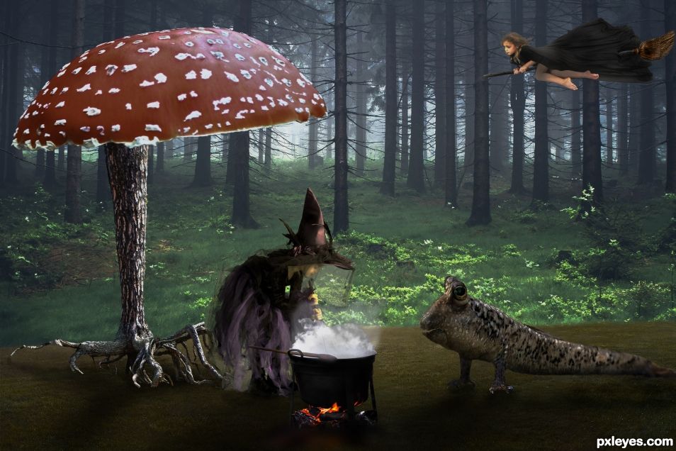
- 1: Foggy soil
- 2: Forest
- 3: Cooking witch
- 4: Flying witch
- 5: Roots
- 6: Pet
- 7: Branch
- 8: Fire & steam
- 9: Broom


Good chop. The front where the fish and the witch are, looks dark, while the background looks light. Maybe darken the background some to make them match or lighten the foreground?
Also I bent the wood part of the mushroom and did this to the flying witch's legs. Maybe you will like it?
https://i.imgur.com/KgTQRsU.jpg
Maybe use the grass brush, #134, to blend the roots into the ground.
Ah ah, very nice too, but then it is not my work anymore!
Not true. People help each other all the time. I change my Chops due to people's suggestions all the time. For example in this one George55 & CMYK46 suggested that I move some things around and change some colors here and there, which I did.
http://www.pxleyes.com/photoshop-picture/59ee63bf16f16/Staue-of-Liberty.html
That's so funny. I used that same with to make a Halloween Chop of my niece.
Howdie stranger!
If you want to rate this picture or participate in this contest, just:
LOGIN HERE or REGISTER FOR FREE