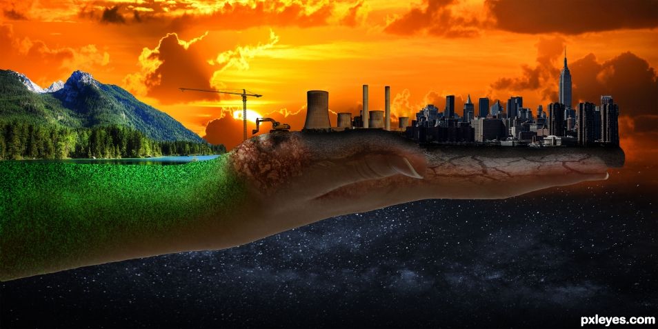
Spreading Virus - Thoughts on the impact of mankind on earth (5 years and 817 days ago)
Going home  by Zizounai 6822 views - final score: 61.6% | Puppet show  by Zizounai 9391 views - final score: 59.6% | Entry number 105528  by Wiking76 10064 views - final score: 58.2% |
A DREAM 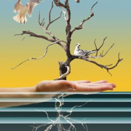 by George55 6088 views - final score: 53.8% | Trying to Escape 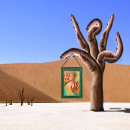 by Drivenslush 6036 views - final score: 53.5% | HI  by Drivenslush 2113 views - final score: 53.1% |
FLIGHT OF THE SEAGULLS 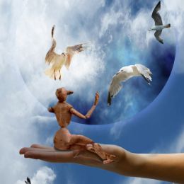 by George55 1879 views - final score: 52.9% | Make me a Warewolf 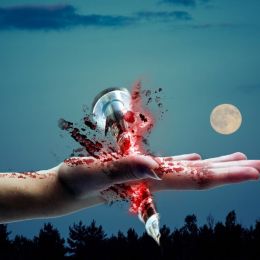 by Zahid5 2191 views - final score: 52.5% | The Creation 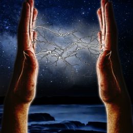 by Drivenslush 1847 views - final score: 50.5% |
The Destruction of Symmetry 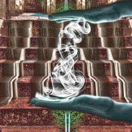 by Drivenslush 1565 views - final score: 49% |
Howdie Guest!
You need to be logged in to rate this entry and participate in the contests!
LOGIN HERE or REGISTER FOR FREE
Author, sources 1 & 3 are the same, please fix this.
...sorry, done.
Thank you
I wanna live there!
I really enjoyed this Photoshop. It's an awesome concept and made my eyes wander. The faults I see are the overall tone should have been much warmer due to the light source being a setting sun (things are much more orangy at sunset right?). The power plant for example fits in as far as temperature is concerned but right next to it the skyline is really "cool" (bluer) in temperature so they conflict. Also when you have a back lit scene like that, you would see some of the sun's light reflecting off the left side of some of the individual buildings that are getting hit by the sun's light, as well as the right side of the mountains, and perhaps some of top of the arm/hand. This can be achieved via a Brushing Layer, or multiple ones that are "clipped" to the buildings, hand/arm, and even the mountain. Generally you would use an Overlay, Soft or Hard Light, or Screen Layers, but there are a few more you can use. Then just brush some gold/yellow/orange color for your light, varying the brightness and opacity of the brush as needed. The green part on the arm has too much light on the top "half" which does not concur with the back-lit light source (the "back side" of the arm should be more shadowy and less lit up). As for the power plant, it's backwards. The shadowy side should be on the right due to the sun being on its left. If you need some help with this, feel free to PM me.
Good one !
Nice job. 3rd place on your 1st entry. Not bad.
Thanks for the kind words and the advice! I'm glad you like it!
Howdie stranger!
If you want to rate this picture or participate in this contest, just:
LOGIN HERE or REGISTER FOR FREE