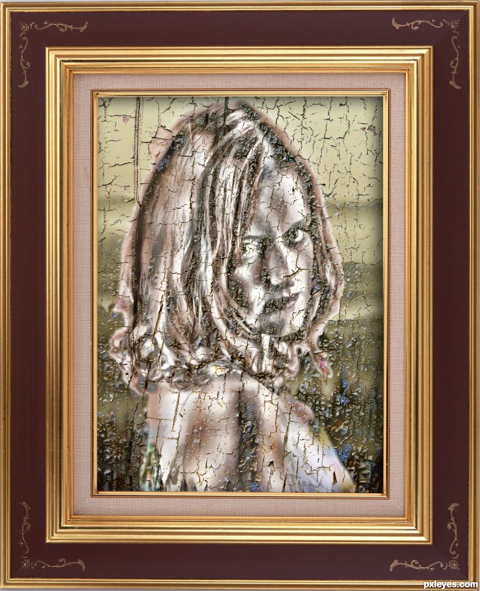
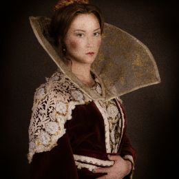
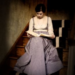
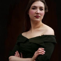
Okay, I remade this with textures and more filters, and I'm hoping it hits the level of 17th Century piece, I think the color scheme and the texture is there, but I KNOW the girl isn't in the right pose or era, but I had to try Perfectly okay if it gets pulled, this is a really hard contest :) but still fun (5 years and 693 days ago)
- 1: FRAME
- 2: VALLEY MIST
- 3: MODEL
- 4: TEXTURE




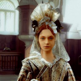
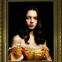

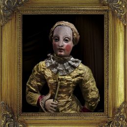
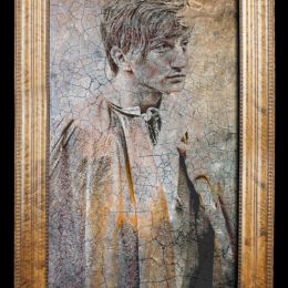


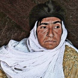

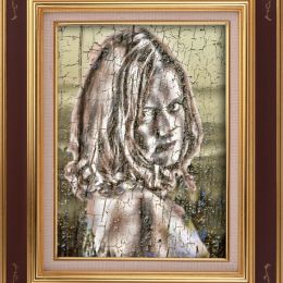



The portrait is very modern but not 17th century style at all. I also know you can do a lot better with cutting out the frame. It has a lot of stray pixels on the inside edge which need cleaning up. I suggest you use the pen tool to make a nice straight line selection, feather it by 1 pixel, and then cut it out.
I so appreciate reading your comments. Your notes become learning tools for me.
The portrait needs to be 17th century style, not modern.
Howdie stranger!
If you want to rate this picture or participate in this contest, just:
LOGIN HERE or REGISTER FOR FREE