(5 years and 568 days ago)
Catch of the Day  by WYSIWYG 6414 views - final score: 58.6% | home of apple  by LifetimeDamage 9322 views - final score: 58% | MEMOIRS  by George55 5377 views - final score: 57.9% |
Croa Croa  by lolu 5165 views - final score: 57% | An Artist's World  by George55 6054 views - final score: 56.2% | Domestic bliss  by Zizounai 1664 views - final score: 56% |
Death Pods  by Drivenslush 1472 views - final score: 55.9% | Inspiration  by George55 1497 views - final score: 55.1% | Toy story 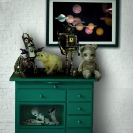 by Zizounai 1537 views - final score: 55% |
Chestnuts on a Chessboard 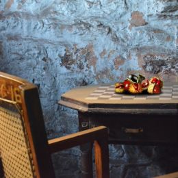 by Drivenslush 1452 views - final score: 53.3% | Necessary things in life 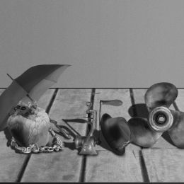 by wyndham 1756 views - final score: 52% | Super Fresh Still Life  by Drivenslush 1359 views - final score: 51.2% |
The Life Still  by Drivenslush 1410 views - final score: 50.1% |
Howdie Guest!
You need to be logged in to rate this entry and participate in the contests!
LOGIN HERE or REGISTER FOR FREE
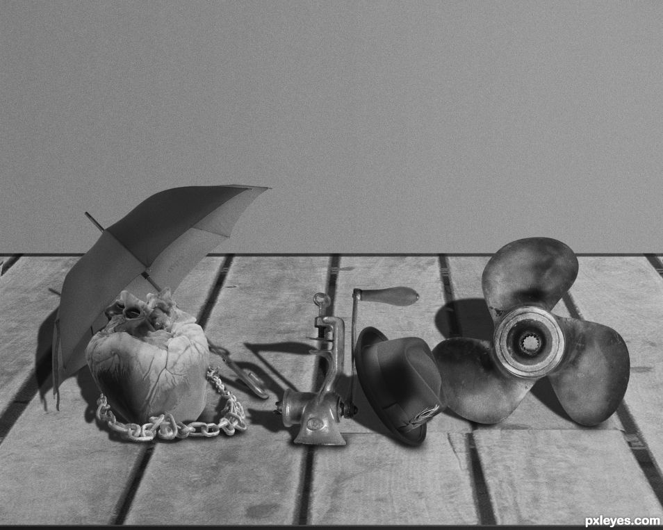
Your perspective is a bit wonky... but this is a surreal still life so I guess anything goes.. it's just that meat grinder is on a level plane while the floor boards are really tilting forward.. it's a great chop, but I think if you changed the perspective on the board, it would ground the objects tighter (Distortion works when only about 10 percent is alter, after that the image looks manipulated)
Thanks for your advice! I'm on it
I've changed the image, but I still don't think I've managed what you were telling me
I think what's causing you trouble is it's size, if you enlarged it and brought it more forward into the image, it would make it's perspective less obvious.. it's very small (you could enlarge it to complete a triangle (think of Jesus in the Last Supper by Leonardo)... now it's just a suggestion, but if you enlarged it triple it's size (yes I know that sounds big) but it would lock the whole image together by creation a giant triangle, pulling the whole image together... ack.. it's been years since design class.. so I could be a total nutter, but I think if you visualize it (the grinder) larger, you could see what I'm talking about
ACK! also.. by enlarging it, you could fiddle with the distort/perspective of it (again, in the 10 percent range) and it would give it more stability.. then again, live monkeys could fly out my butt.. don't spend too much time on it if it's not worth it to you.. Thank you very much for considering my advice, it means more than you know
Ok, I've tried the enlarging and modified the perspective. I don't think I can do much more. And thanks again. It's important to receive constructive criticism to get better.
Howdie stranger!
If you want to rate this picture or participate in this contest, just:
LOGIN HERE or REGISTER FOR FREE