(5 years and 557 days ago)
3 Sources:
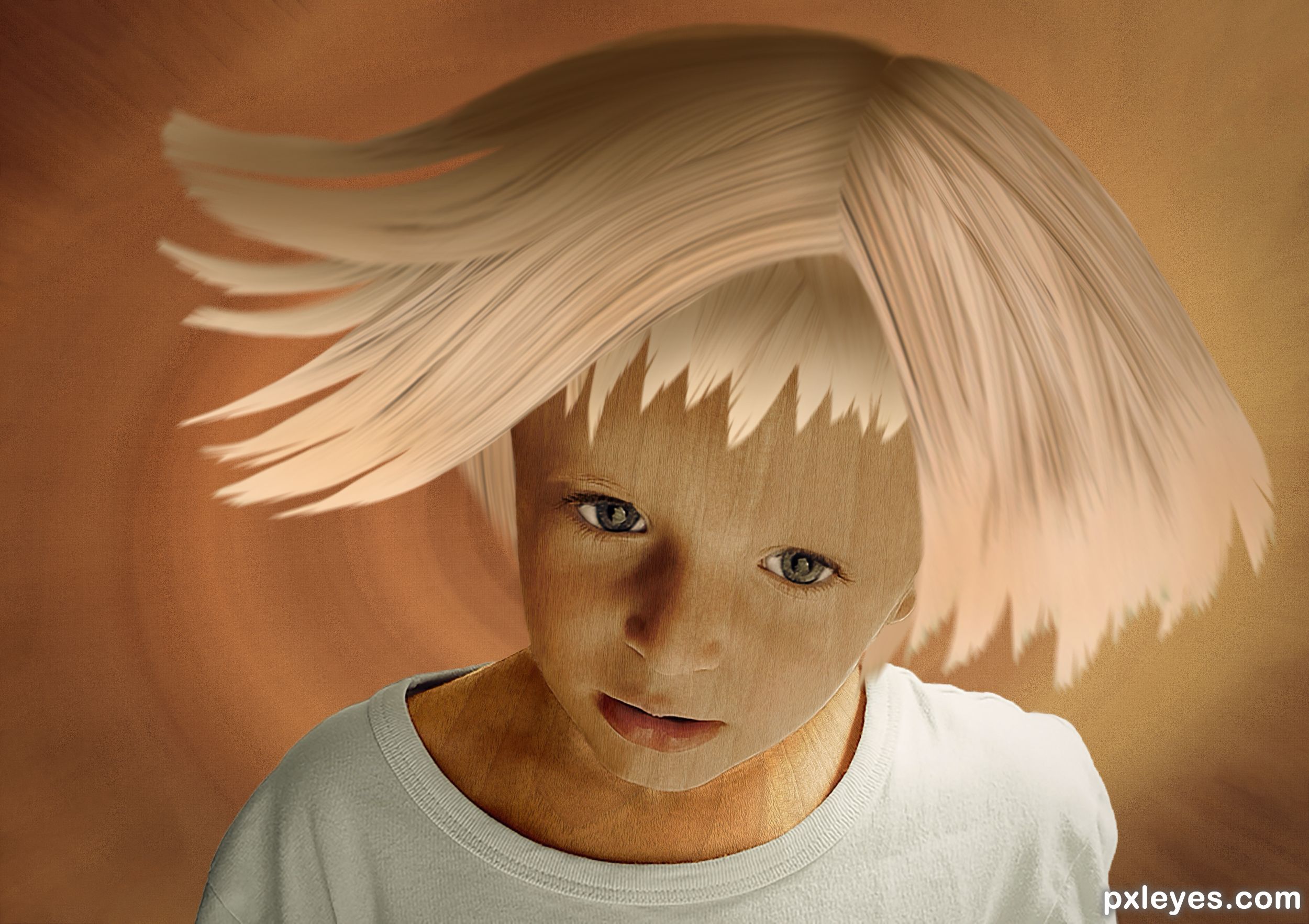
- 1: Portrait
- 2: Log
- 3: Wood texture
The Leader of the Pack  by BWR 21981 views - final score: 66.5% | Woody child  by Zizounai 9200 views - final score: 63.8% | Guardians  by wyndham 9958 views - final score: 59.9% |
Color my Life  by lolu 8846 views - final score: 58.3% | Robobrush 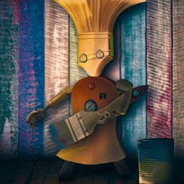 by Zizounai 8302 views - final score: 55.6% | Paint Brushes in Mason Jar 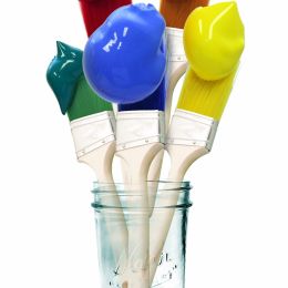 by Drivenslush 1886 views - final score: 54% |
Icky Bon Nu  by Drivenslush 1473 views - final score: 53.2% | Eye in the Sky  by Drivenslush 1628 views - final score: 51.7% | In the Wind of the Cloying  by Drivenslush 1752 views - final score: 50.9% |
Howdie Guest!
You need to be logged in to rate this entry and participate in the contests!
LOGIN HERE or REGISTER FOR FREE
Photography and photoshop contests
We are a community of people with
a passion for photography, graphics and art in general.
Every day new photoshop
and photography contests are posted to compete in. We also have one weekly drawing contest
and one weekly 3D contest!
Participation is 100% free!
Just
register and get
started!
Good luck!
© 2015 Pxleyes.com. All rights reserved.


The wood texture needs to conform to the contours of the face. Maybe try a displacement map.
Thanks for the tip CM, I didn't know this technique but I found a good tutorial:
https://www.youtube.com/watch?reload=9&v=PigTqI8pmjU
In this case it doesn't change a lot, but I've done it
I am not an expert in Displacement Maps but maybe there isn't enough contrast in the boys face. If you have the time you may want to try a copy of the boy's face with levels, curves, or contrast applied and try the Displacement Map on that copy. Or you could duplicate they boy once again and set the top layer on a Hard Light Layer, Multiply, (or otherwise) to bring out more contrast. Then flatten those two layers and try again. I don't know if any of this will work, but you may want to try.
Thank you. I find the contrast in the boy's face sufficient. It is a portrait. Too much contrast can ruin a portrait, it hardens the face. It can be interesting in some cases, but here I whish my boy to remain sweet as an angel
Good score. Congrats seestah Z!!
Thanks
Congratulations! It's a very good piece
Thanks Wyndham
Howdie stranger!
If you want to rate this picture or participate in this contest, just:
LOGIN HERE or REGISTER FOR FREE