Fonts used:
Century Gothic, Candara, Freestyle script (5 years and 509 days ago)
3 Sources:
- 1: Uniform
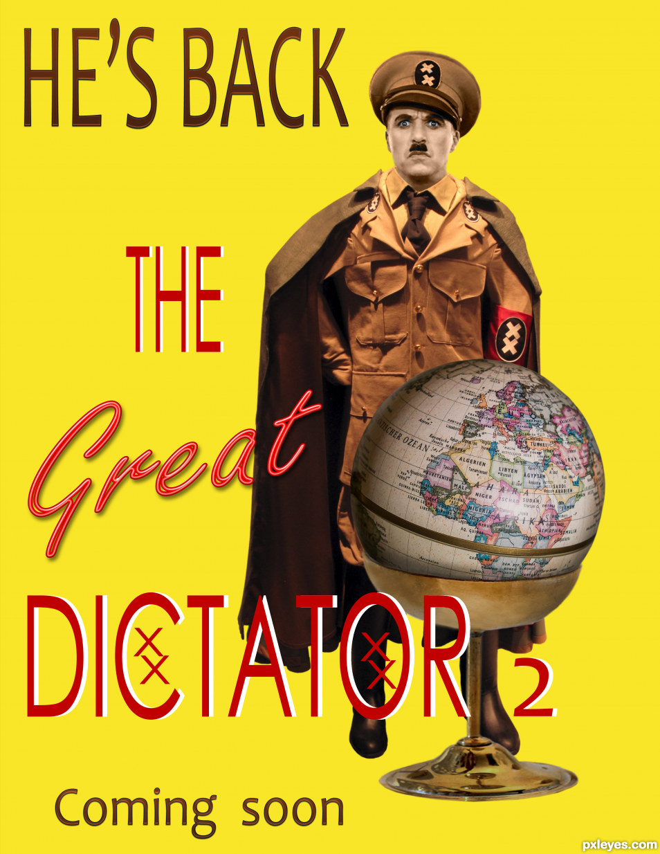
- 2: Chaplin Dictator
- 3: Egg cup
Fonts used:
Century Gothic, Candara, Freestyle script (5 years and 509 days ago)
He's back  by Zizounai 9716 views - final score: 61% | Microcosmos  by lolu 7279 views - final score: 57.6% | History Lesson  by Drivenslush 5823 views - final score: 55.4% |
MEMORIES 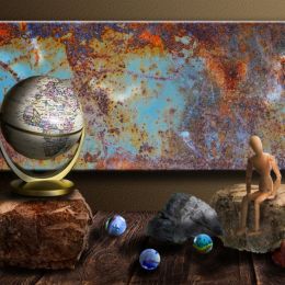 by George55 5470 views - final score: 54.7% | Earth Eggs  by Drivenslush 6671 views - final score: 54.5% | Global Warming  by magicalfruittuts 3462 views - final score: 53.5% |
The Crush  by Drivenslush 1438 views - final score: 52.8% | Sideways Globe Ad Sheet  by Drivenslush 1882 views - final score: 50.5% | Walnut Defense System  by Drivenslush 3066 views - final score: 49.2% |
Howdie Guest!
You need to be logged in to rate this entry and participate in the contests!
LOGIN HERE or REGISTER FOR FREE
Photography and photoshop contests
We are a community of people with
a passion for photography, graphics and art in general.
Every day new photoshop
and photography contests are posted to compete in. We also have one weekly drawing contest
and one weekly 3D contest!
Participation is 100% free!
Just
register and get
started!
Good luck!
© 2015 Pxleyes.com. All rights reserved.


Nice color work!
Only a suggestion (and because there is still time), you might want to consider not stretching the text and just enlarging it into the space. This would put it into the date line of the original film. (they didn't have photoshop back then hehehe). Also consider borrowing the XX from the uniform and placing it into the text where the xx are now text, this would lend to cohesion of the overall creation, along with creating a triangle within the image (old newspaper trick) which would make the eye bounce around the image without realizing it.
 and you don't have to change anything, I'm just giving you my insight
  GOOD LUCK! and great job.
I would also suggest an old film filter, or even masking/blending/opacity a film debris over the image to give it an "antique" feel to further the idea. I know blurring the edges would be a bit over the top, but there are some filters that do that automatically (especially film noir filters). Really is a fun chop
Oh thank you Ernest. I'm not sure I get everything you say. I just was inspired by this poster: https://en.wikipedia.org/wiki/The_Great_Dictator#/media/File:The_Great_Dictator.jpg
(because there are many)
I wish to keep it like it is I guess...
No problem, I was just pointing out some things that we used to do for full page Print Ads and street posters.
 GOOD LUCK!
If you notice in the original poster, Charlie Chaplin is stacked upon itself to form a rectangle. If you put He's (four characters) Back (four characters) you make a rectangle, (He's Back forms a LONG rectangle).. little stuff like that to improve the cohesion of the image. There's plenty of fun stuff going on in this, and there is no need to change, I was just spit balling
Congrats !
Merci Lolu
Howdie stranger!
If you want to rate this picture or participate in this contest, just:
LOGIN HERE or REGISTER FOR FREE