(5 years and 3736 days ago)
1 Source:
Thanks to Ameotoko!
*as I look at this from a different computer, it looks so dark. (5 years and 3736 days ago)
The man in the right is too clear. He should be blurry like the rest of the background. Also "cousin It" or whatever that is in front looks like they have no arms. I think they're a little dark and the edges are a little fuzzy.
Please fix source link...perspective on path is a bit off.
i can tell that you have flipped the source image. to make the trees look more realistic try to blend them together so it does not look reflected. gl
we are not sure why the source link is not working so here it is http://www.flickr.com/photos/ameotoko/3946537224/sizes/o
Howdie stranger!
If you want to rate this picture or participate in this contest, just:
LOGIN HERE or REGISTER FOR FREE
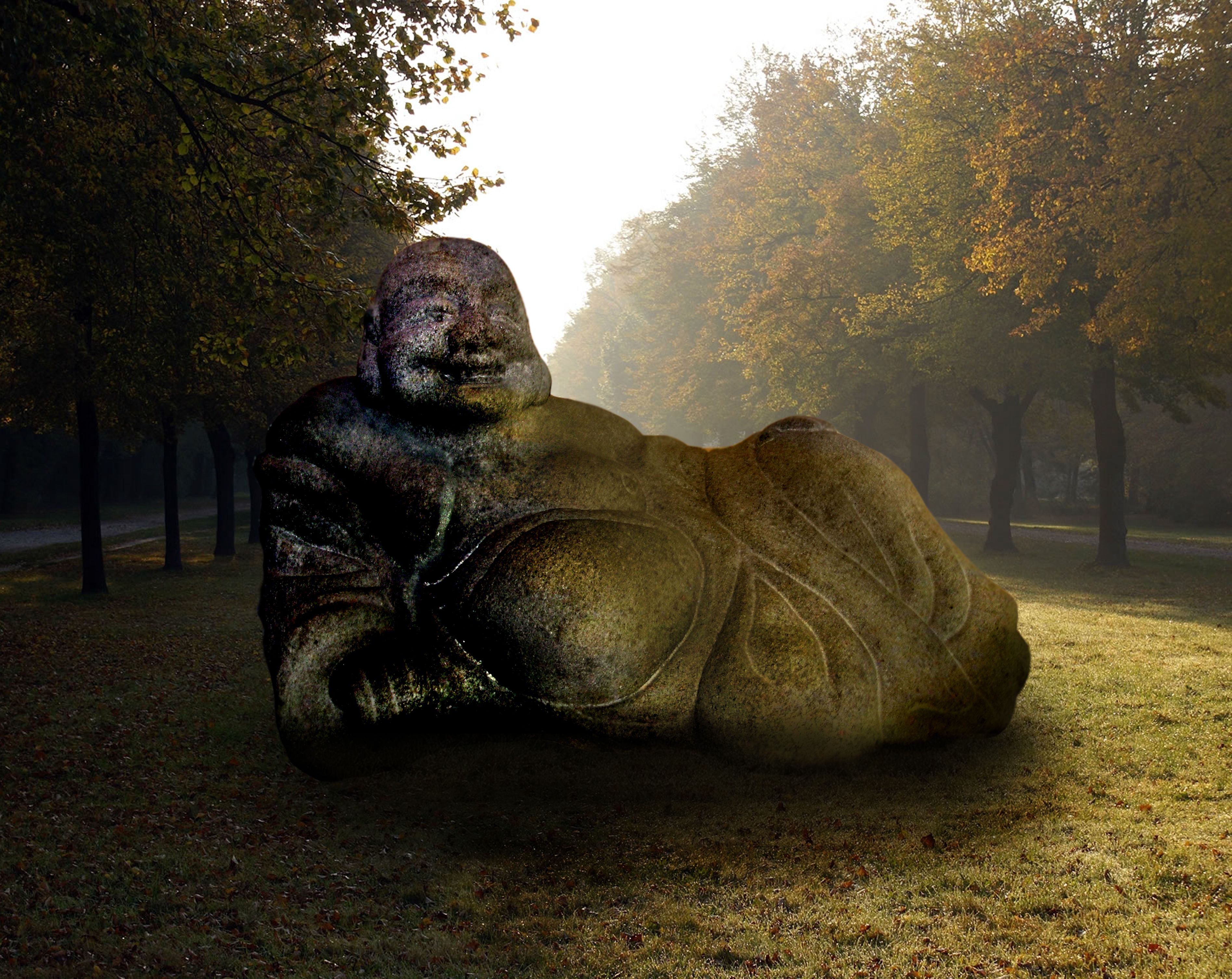
My Picture combined with source (5 years and 3740 days ago)
Light is from left to right...if you flipped the Buddha it would match the light source...
Nice image, the colours are well matched. The shadow may be a tad too dark around the Buddha, other than that it's a good simple image. Good luck!
The leftside of the buddha looks too dark compared too the rightside. Maybe lighten the left and darken the right a bit. Most of the buddha should be in shade because of where the lightsource is coming from.
agrees with everyone.
Howdie stranger!
If you want to rate this picture or participate in this contest, just:
LOGIN HERE or REGISTER FOR FREE
(5 years and 3761 days ago)
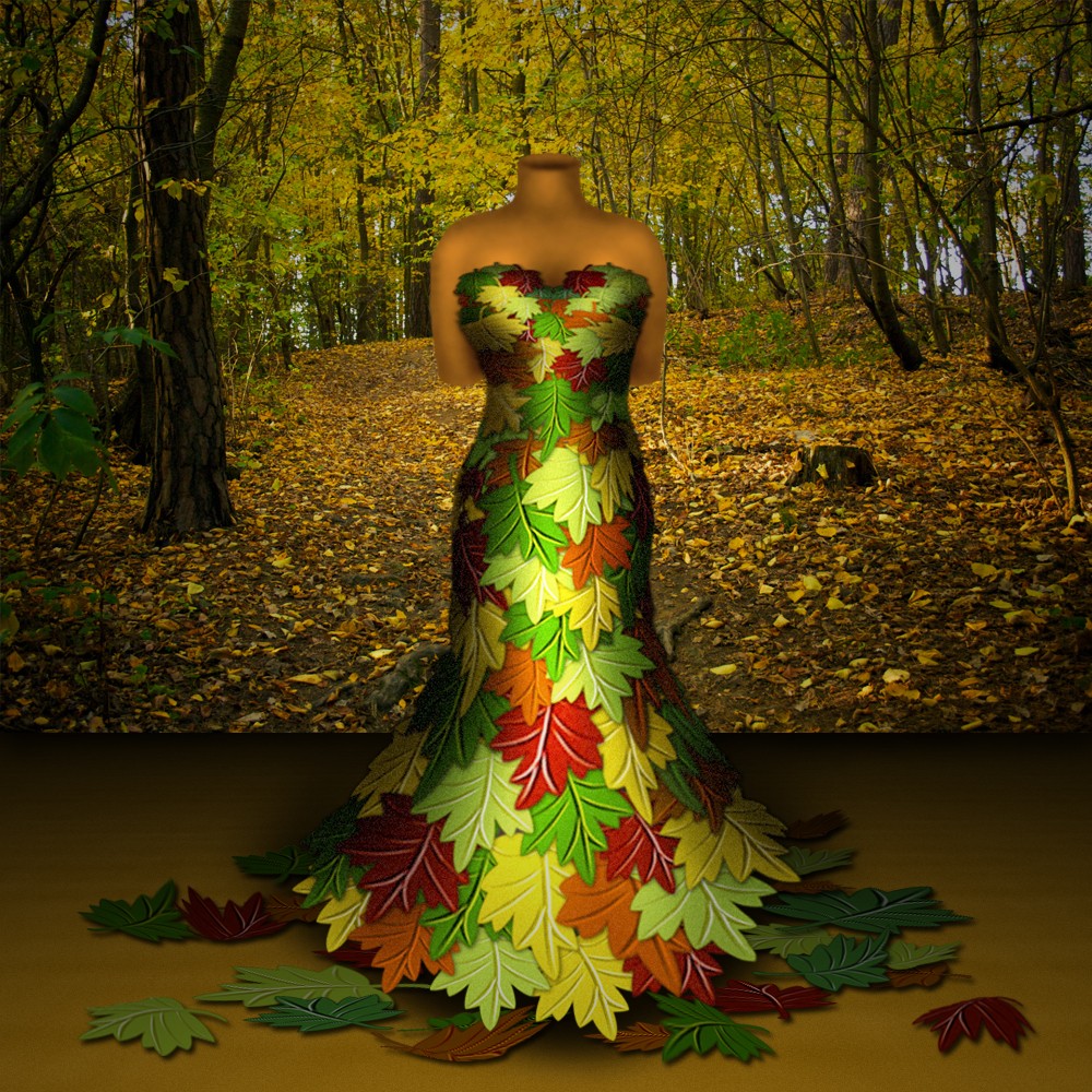
Very nice dress creation.. lovely shadows and highlights, the leaves on the floor look a bit flat, but the rest is very nice. Good luck!
Too much burn on the edges...work on light source.
i've made some changes, thx ponti and CMYK for the tips! 
Much, MUCH better! Great job
This is a VERY cute idea, The shading is way too dark still on the dress, but most importantly, the stand and form are the wrong color for this environment. In any environment all colors effect each other, the stand and top torso maniquin thing are way too purple. Try either changing their hue or using a photo filter in tones that match your image. I actually think you should get rid of the bottom stand as it's not shaded properly and the dress floating would be more interesting.
i got rid of the bottom stand and changed the color of that thingy (i don't know the english word). thx a lot anna, i think it does look better now!
Colors look better!
good work very nice
I love overall mood...good luck author
Howdie stranger!
If you want to rate this picture or participate in this contest, just:
LOGIN HERE or REGISTER FOR FREE
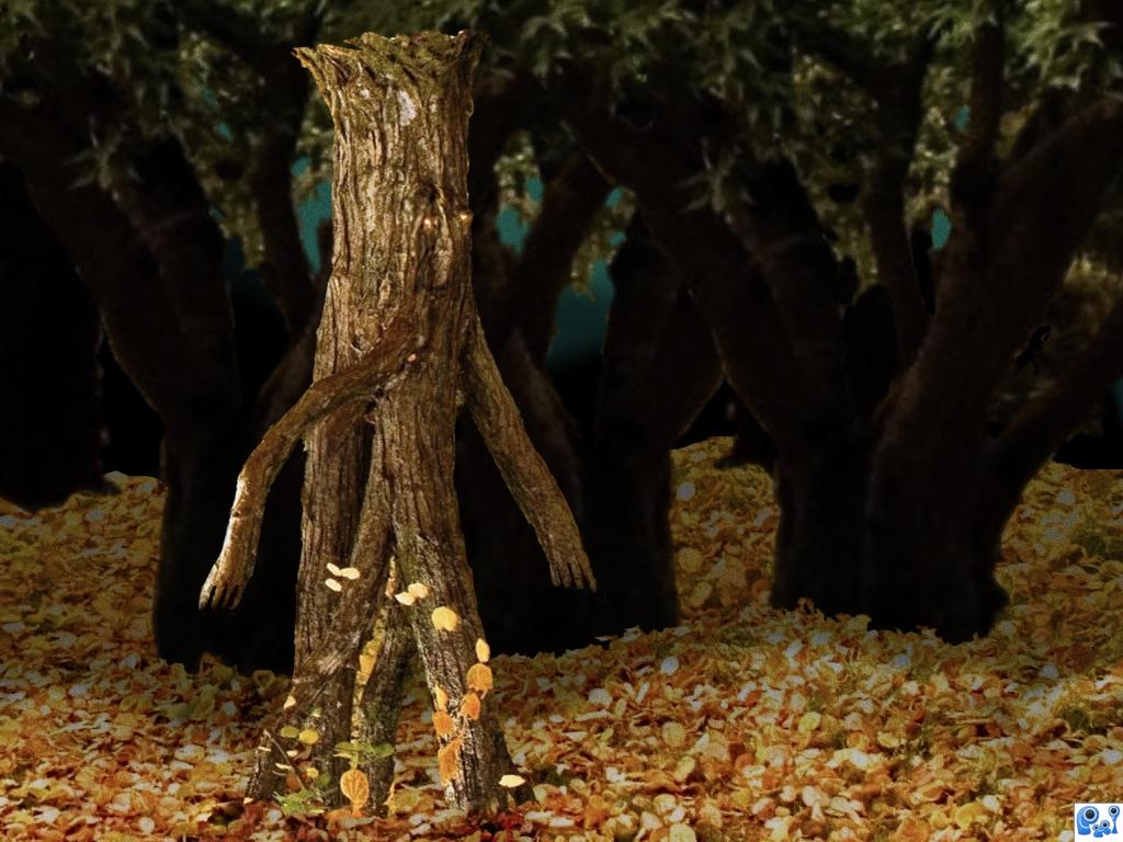
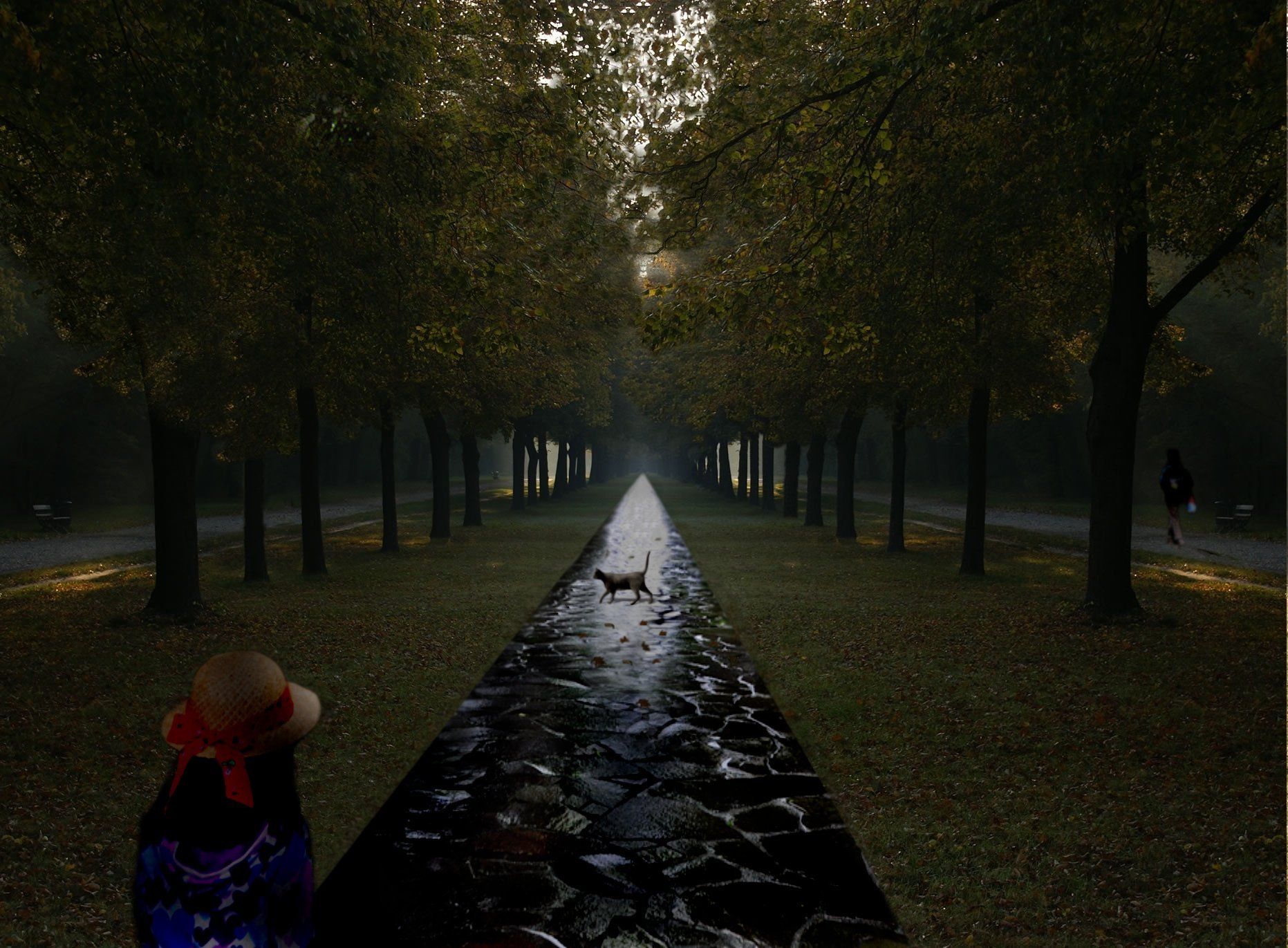
Back in the days when treebeard was still young, he liked to take a stroll every now and then....
Only source image. (5 years and 3790 days ago)
Very nice idea,its to bad why u dont have more time to make some improvements....gl
nice concept
very nice
Howdie stranger!
If you want to rate this picture or participate in this contest, just:
LOGIN HERE or REGISTER FOR FREE
Photography and photoshop contests
We are a community of people with
a passion for photography, graphics and art in general.
Every day new photoshop
and photography contests are posted to compete in. We also have one weekly drawing contest
and one weekly 3D contest!
Participation is 100% free!
Just
register and get
started!
Good luck!
© 2015 Pxleyes.com. All rights reserved.


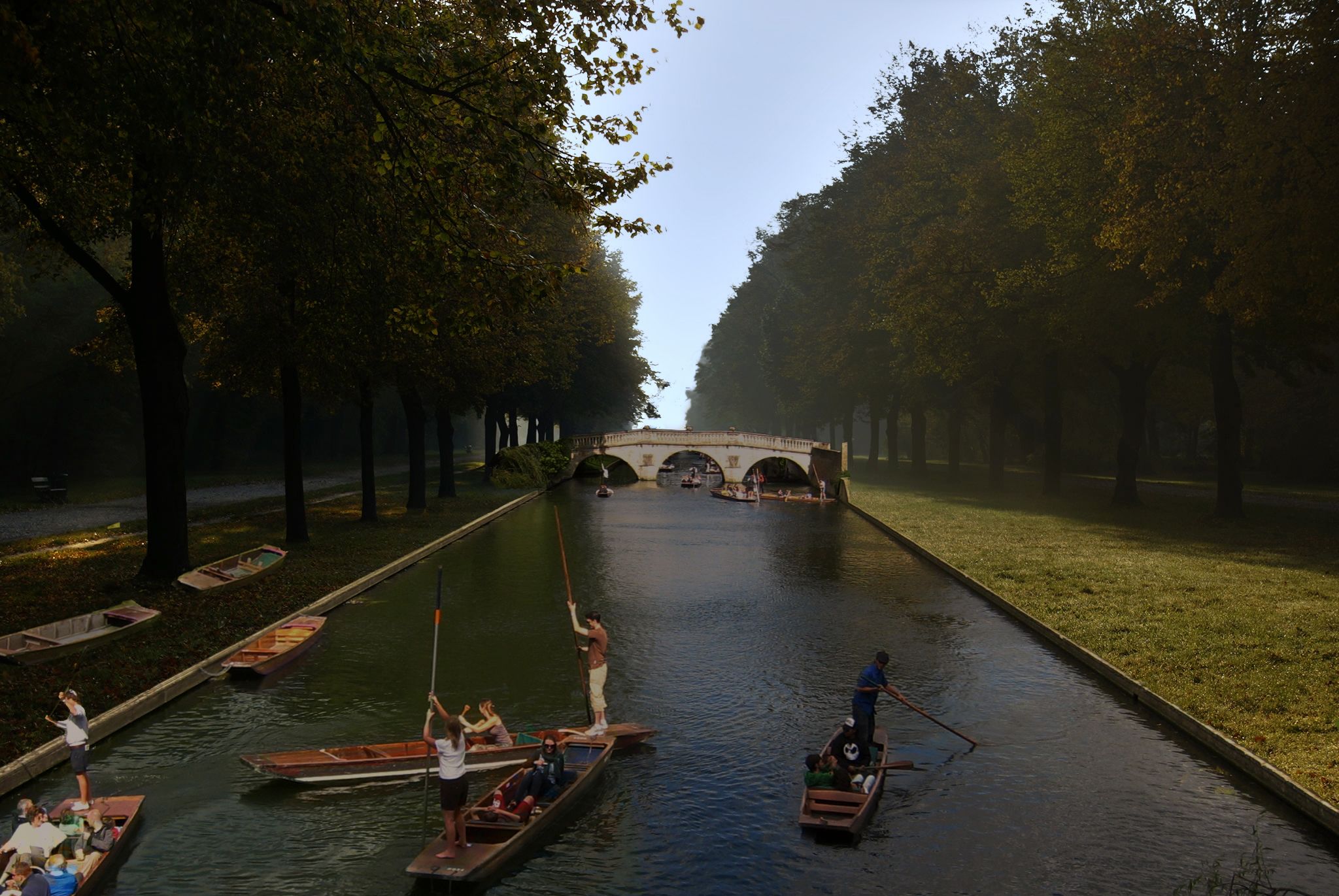
Boats & figures seem small to me, but good idea...
Thanks for the comments. CMYK is right, increase the size of boats and figures.
Are you telling yourself to increase the size of the boats and figures ?
Already done. Look at the SBS.
Like your idéa, but I think it should look better if you increased the wideness of the lake at the right side, stretch it to the trees on the right side so it keeps the same distance like the trees on the left side.
(Excuse my english, hope you understand what i mean)
Why you want to look for symmetry?.I know that the perspective of the right side does not match.This can have a high ground sense .
Author, thank you for accepting my suggestion. IMHO the image is improved. Also, good for you not accepting comments that make no sense. Good luck to you.
They still seem a little small (the boats and people) IMHO.
The idea is good
they seem too small
Howdie stranger!
If you want to rate this picture or participate in this contest, just:
LOGIN HERE or REGISTER FOR FREE