yes, a nice day on the beach and visiters came to mess everything up... lol.
"thanks to mterrazza on sxc.hu for the use of his image, the shade thingy" (5 years and 3616 days ago)
7 Sources:
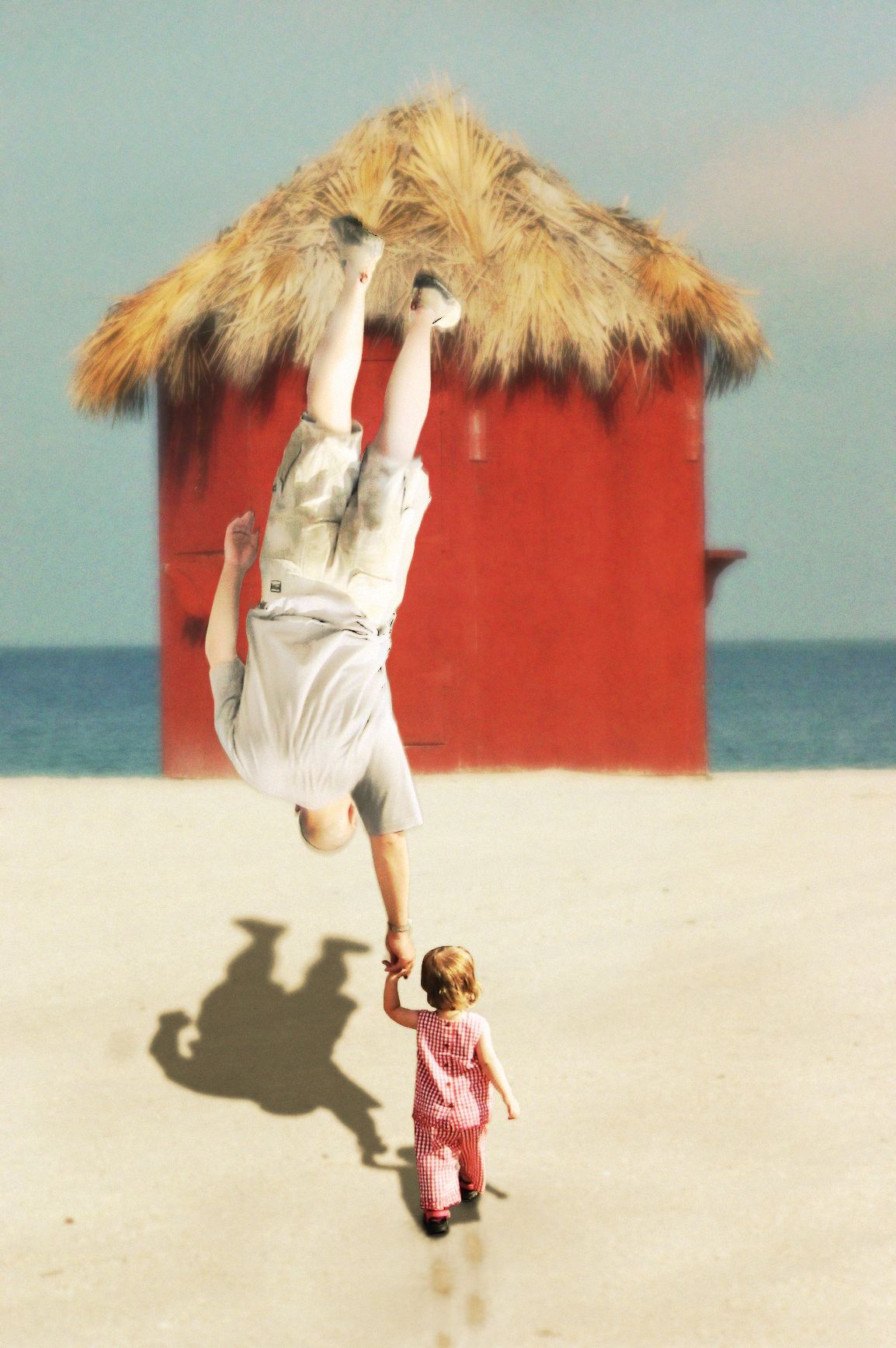
Even though daddy is big, baby Huey has the strength to raise him above his head.
Thanks to SCervino and Grunow at SXC for use of their wonderful stock! (5 years and 3620 days ago)
That is really cool, however, I wish the baby were in the same focus as the rest of the picture. Everything has a nice Gaussian blur to it and that baby is just crystal clear. Evening out the tones and sharpness of the three main items would really add to the painterly quality of it. Nice job overall though for sure!
thanks elinoree! for the bg part i was attempting to create a bit of depth by having distant objects less in focus... and the baby is in focus becase it is the main object, as is the dad, jsut the dad is swaying slightly in the air which is why he is less in focus... guess if i have to explain it i didn't do a good enough job showing it ;] Thanks for your thoughtful input!
lol... funny 
The idea is good, I really like it, but execution needs some improvements. Looks like you're hiding some mistakes on the layer of the father by blurring. You can say it because of the DOF, it's alright, but I can't imagine the father is not in the same plane with the child (because the his shadow is as sharp as the shadow of his kid). Moreover, the right hand of the father needs to be recovered, looks like he loses fingers. Just my opinion, don't take it offensive. Good luck, author
no i was not covering up any mistakes... all blur added was simply for effect... i think i can stand to blur the father's shadow a bit more... thanks for your comments!!! ;]
i like this...
Nice one...gl
what a great idea  funny
funny
I think a better source image would have eliminated a lot of your problems to begin with.
she's on steriods!!!!!!!
Howdie stranger!
If you want to rate this picture or participate in this contest, just:
LOGIN HERE or REGISTER FOR FREE
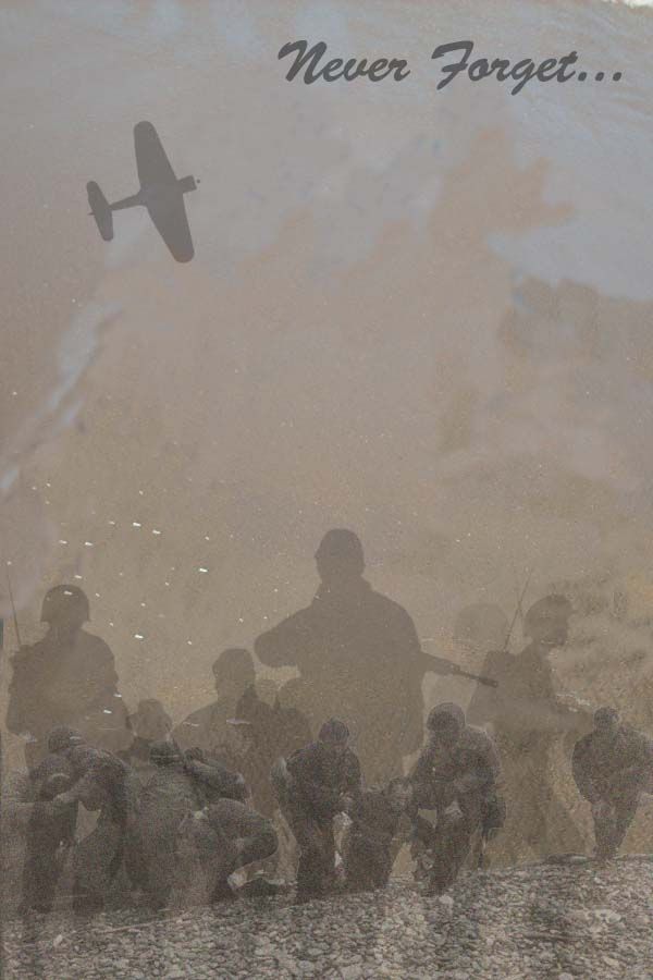
1. Clone tool to erase the two shadows on the beach
2. added my soliders and lowered opacity and changed levels and curves
3. added the source image 1 of the beach and lowered opacity and erased. Also moved around levels and curves
4. Put a very slight grain over the entire image
5. Added text in top corner
6. I did erase a bit of the soliders gun to make it not look like an m16 because they didn't exist during Normandy (5 years and 3626 days ago)
Stop effing around & credit your sources or remove them. Even if you do, the M16 doesn't belong at Normandy
I don't really get where you used source ... upload sbs and ditch the text \
hey CMYK46, buddy boy, I credited them. So wtf are u talking about big boy. And thaks for the advice on the m16, maybe a little nicer tone next time but thanks anyway
Allow me to reiterate: There is a clear shadow of an M16 here, which did not exist at the time of Normandy, and the type placement would be better suited to the empty space at top of image. As for the remainder of your diatribe, it's referring to my comment about your image before you chose to alter it and change your comments from private to public.
I did change it now. So I do appreciate the comments CMYK. i do see that it was an m16, hopefully it looks a little different now. hahah. Thank you though
just ditch the text all together it makes the image blah
nice may be better without the text and plane 
Ya agree with lamantine and jellopudding....remove the text and the plane...
nice sentiment, but it's a new image really... imo poor use of source...sorry
Nice image, but I agree with others that the source is very minimal and difficult to visualize. Good Luck anyway!
Minimal source used and I hate agreeing with her but the pudding girl is right.
Howdie stranger!
If you want to rate this picture or participate in this contest, just:
LOGIN HERE or REGISTER FOR FREE
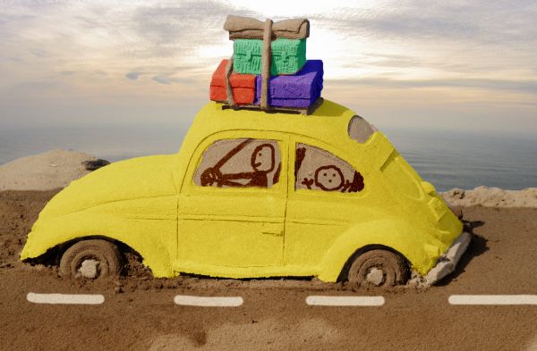
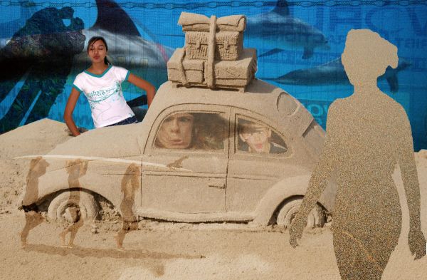
Color layers using soft light blends and a beach background from sxc.hu
Thanks to bunlee for the image (5 years and 3648 days ago)
Very cute, but a more cartoony background might be more effective. And maybe driving through snow would better explain the incomplete wheels.
I like this..
hahah, this is really funny and cute! great idea with the colors and the window drawings!
Howdie stranger!
If you want to rate this picture or participate in this contest, just:
LOGIN HERE or REGISTER FOR FREE
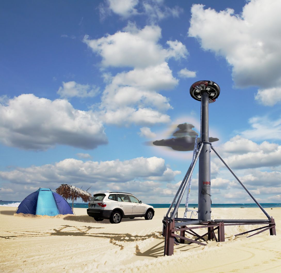
At the Beach (5 years and 3648 days ago)
?
ty ur comment Li3N, makes no sense to me either lol, but I like to look at it just the same
very abstract entry. GL!
Howdie stranger!
If you want to rate this picture or participate in this contest, just:
LOGIN HERE or REGISTER FOR FREE
Photography and photoshop contests
We are a community of people with
a passion for photography, graphics and art in general.
Every day new photoshop
and photography contests are posted to compete in. We also have one weekly drawing contest
and one weekly 3D contest!
Participation is 100% free!
Just
register and get
started!
Good luck!
© 2015 Pxleyes.com. All rights reserved.


good job !

spectacualar sci fi piece... though I think it's TOO well done to be a hoax..(IMHO) (Fantastic image all round.. and very good luck)
LOL
Howdie stranger!
If you want to rate this picture or participate in this contest, just:
LOGIN HERE or REGISTER FOR FREE