Well, at least I had a go. (5 years and 3891 days ago)

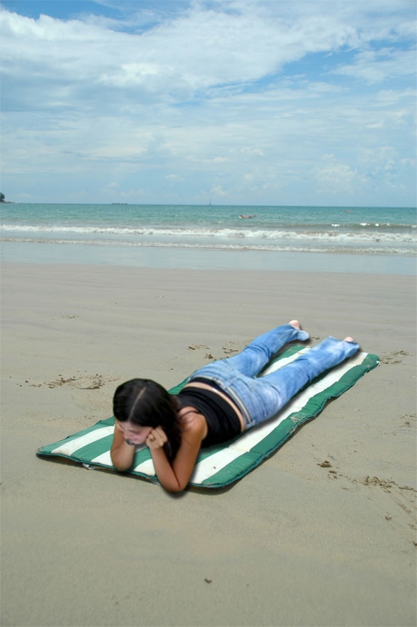
Relaxing on the beach on a spring day. Taking the rays of the sun. Thinking of life. (5 years and 3893 days ago)
Good blend. Source pic is © Lars Christensen
the source pic is from dreamstime in the free images... that i have an account from.
check the shadow of the girls head
She's never gonna get a tan like that! Good Job.
Author, you need to work on the shadows a little. The shadow from the girl would follow the contours of what she is laying on, they would not be uniform.
image blurness reduce
would be better if she was looking at something good luck
Maybe put her further down the beach to match the blur? Keep something in the foreground as the focus. Try and remove the highlights off the face??
whats she lookin at??

the idea is very good but i think u need to worker more, face is a bit blur and ligths also dt match so well
Howdie stranger!
If you want to rate this picture or participate in this contest, just:
LOGIN HERE or REGISTER FOR FREE

Thanks susiet (5 years and 3900 days ago)
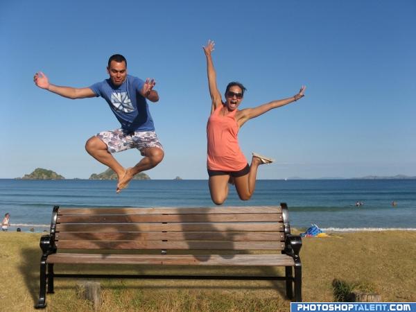
Good job and good luck. Take a look at the shadow on the ground. There should be a shadow of the people through the bench and onto the ground.
in the shadow casted by the bench, it should not be completely black as there are gaps between the wooden planks in the bench.. One more thing is the shadows casted by the characters... the shadows of the feet of the male char and knee of female char are wrong.. these shadows fall on the horizontal seat of the bench and do not get seen as shown in this pic. there should be a small deviation between the shadows on horizontal portion and vertical portion of the bench.. just my opinions.. gl 
an eg of shadows on uneven surface - http://www.itchy-animation.co.uk/tutorials/01-blue-shadows.jpg take a look at the shadows of the branch on teh window...it maybe difficult to incorporate this fact in PS, in that case u could just raise the shadows so that they fall on the vertical portion of the bench alone..
setting the shadow discussion aside. this is a very energetic picture.. very happy and fun mood.. good luck
Nice idea good luck!
very nice
good
nice
Bench looks way too big in relation to the people.
nic, could do better with the shadow tho
Funny  . To make you more nuts about shadows and such, I think the shadow from the bench should be a bit less deep amd more to the left. And up to you, but if you like a more symmetrical image, I'd crop a bit from the right side of the image. Good luck!
Very good, looks like it could really be there, good one 
Looks pretty realistic,great job.Maybe you could make the people a bit larger,but that's up to you.
odd clean bench on the beach. What are the tree stumps?
Very fun. Nice job!
Howdie stranger!
If you want to rate this picture or participate in this contest, just:
LOGIN HERE or REGISTER FOR FREE
nice..........
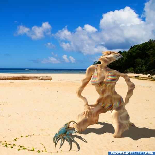
this makes my cheeks wiggle... LOL.. good job author..the shadow work could use wiggles too LOL...I can almost hear the pssssssssssssssssssssssss
Good Job. Recommend deflating the shadow as well.
I like the idea
funny GL
it looks like shes melting
Yes...I think I have to agree with Tuckinator! Unfortunately, she doesn't really look like she's deflating! But, hey, it's not an easy task, so high marks for trying! Best of luck!
Lovely work, best of luck
Howdie stranger!
If you want to rate this picture or participate in this contest, just:
LOGIN HERE or REGISTER FOR FREE