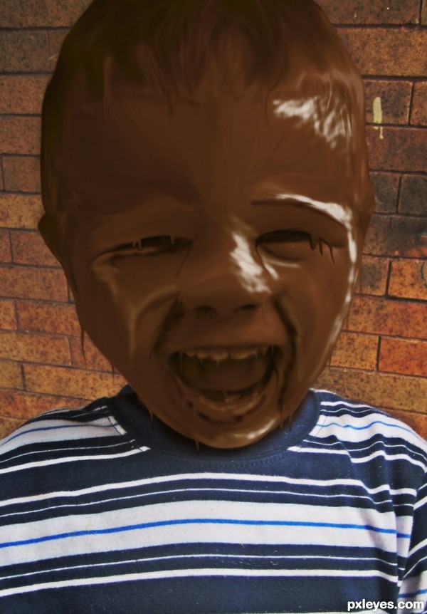
no outside sources used. i included the photo in SBS... this is a photo i took of my son
i included link to a tutorial i used in sources (5 years and 3500 days ago)
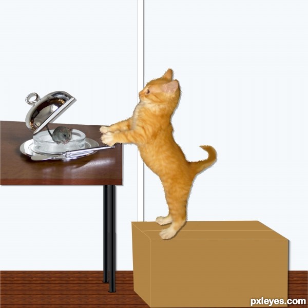
Spec Thanks to Rev Xanatos Satanicos for use of his picture found on Flickr photo sharring.com
Spec Thanks to Lynette S. for use of her picture found on Flickr photo sharring.com (5 years and 3511 days ago)
Table is skewed, and everything should have a shadow, not just the cat. 
very cute image author, I love the idea.. a little tweaking will help, but the overall message is very readable..... good luck 
like the idea -- the shadow does not give the cat enough distance from the wall and the table needs to be adjusted for perspective
Idea is very cute and funny. But you really need to fix the table's perspective, add shadows. The bottle is unnecessary, IMO. For kitty's fur, smudging needs to be in the same direction. 
Hey thanks all for coments and help. I did have shadows but maybe hade them wrong anyway I made changes hope I didn't make it worse.I took care of the things you all mentioned Did I get it right?....Thanks to all
applied shadows conflict with the original photograph - otherwise a nice effort.
Thanks Oriel ..Can I ask why shadows conflick with original its a brighter and bigger back round
awwwwww!
HI AUTHOR - sorry Im slow - if you look below the butter dish there is a patch of shadow as if the light is shinning from the top - the shadow AROUND the cat and the box and to the right of the table looks as if the items were merely a flat cut out with the light shining from the left side. You can see the shadow of the butter dish clearest below and slightly to the left of the dish itself - what you mostly see under the dish is a reflection.
Howdie stranger!
If you want to rate this picture or participate in this contest, just:
LOGIN HERE or REGISTER FOR FREE
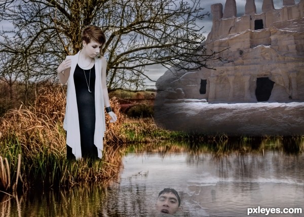
Thanks to the following: Idhren for the image of the girl, marksebastian for the image of the male,and neilalderney for the field and water. (5 years and 3544 days ago)
Girl looks somewhat different from the image. This is just my view. I'm could be wrong . GOOD LUCK
Can you tell me in what way? I MAY BE ABLE TO IMPROVE IT - THANKS
Sorry - didn't mean to shout....
What a cruel girl... But the girl doesn't seem looking at the man, he needs to be slightly behind (or up). And unless this lake has a hole inside, he is too much near the edge to drow, IMO.
I had told you before! This is just my view. I'm could be wrong. GOOD LUCK
No doubt you're IMPROVED
erikuri, the girl is not looking at the man because she is not BOVVERED (bothered in plain english-it's just a quaint Englich experssion!) With regard to him being too near the edge to drown - well the poor bloke is half dead anyway so quite incapable of doing anything about it....
neeraj55 - thanks! I think that's a compliment.....
o my o my o my,poor old sod....nice humor author...best of luck
Howdie stranger!
If you want to rate this picture or participate in this contest, just:
LOGIN HERE or REGISTER FOR FREE
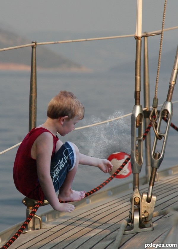
Thanks to eirian for the image of the boy, CorneliaMladenova for the image of the ball, and dewlittle for the splash! (5 years and 3564 days ago)
The kid should look like he's on the deck.
ummmmmmm, different...
the rail and rope has a shadow, the boy should have one too.
Will get back to the drawing board - later. Thanks all.
Agree with CMYK46 plus the light on the boy needs to be increased and shadows will need to be added.
Howdie stranger!
If you want to rate this picture or participate in this contest, just:
LOGIN HERE or REGISTER FOR FREE
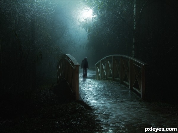
(5 years and 3568 days ago)
Beautiful image, but you might have to red flag it and ask. As one image has been altered by the author already (some smudge).
wonderful image 
good luck author 
fantastic...... I can feel the atmosphere of loneliness here, very strong......I like this one,.....my fav too
Not sure about the random still green leaves here and there.. colours are otherwise very good and the overall composition is very nice in all its simplicity.
wow, a simple but effective picture
Yes, author, your entries are always fantastic!... 
Fabulous image could be a possible issue with one of the Sources tho……you need to add a new shadow to the figure what you have at the moment is incorrect, if you refer back to the original bridge image you will be able to see in what direction it should be. Sorry for the nitpick..
I can feel it here.... 
Lighting is very well done great overall mood
feel of loneliness in your entry. I like it . very much. best of luck
Very nice mood you created 

Quite an awe inspiring image. Beautiful!
Congrats! 
yeah I knew it was you..... congrats again.....
Congrats again great image!
Congrats for 2nd
Great work! Congrats - AGAIN!!
Congratulations!
Congrats
Congrats !!
congrats 
congrats!
Howdie stranger!
If you want to rate this picture or participate in this contest, just:
LOGIN HERE or REGISTER FOR FREE
Nice but you'r not showing how you did sbs.
good work, can have some chocolate on shirt also. SBS is incomplete
Howdie stranger!
If you want to rate this picture or participate in this contest, just:
LOGIN HERE or REGISTER FOR FREE