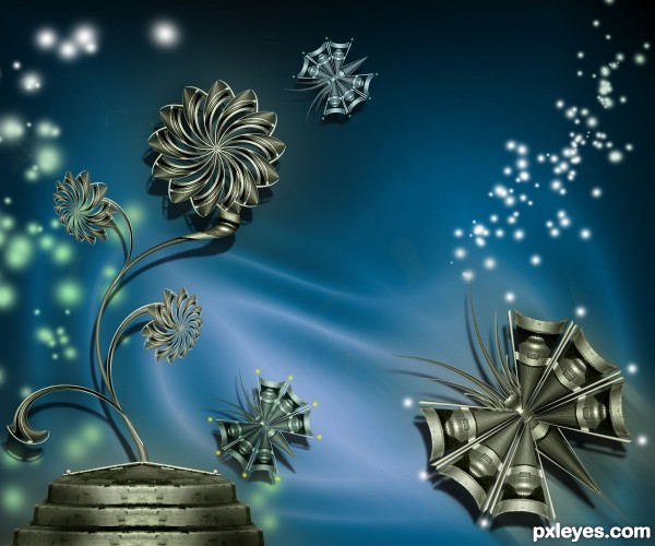
Only source image used.
Default photoshop Brush used.
Please see in High Resolution. (5 years and 3440 days ago)
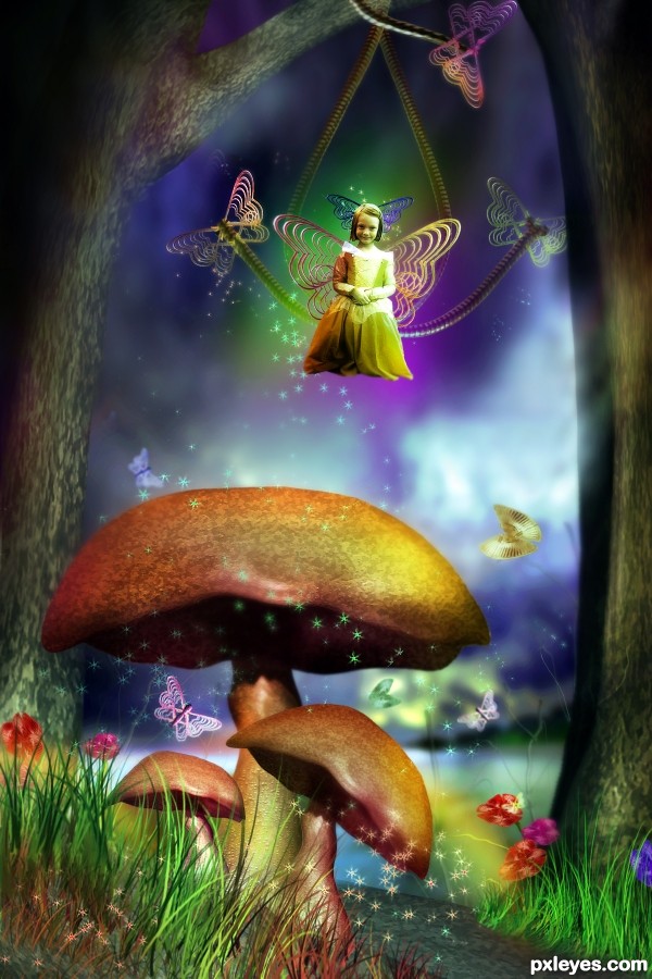
No outside source used except the girl image. (5 years and 3448 days ago)
Ummm...I believe that would be "Princess".
Yeah, looks more like a princess. Nice chop though. GL!
LOVE the mushrooms, and great job on the lighting. I'm humbled....
Maybe she is Princess Knight... 
very very cool work author,especially on the shroom's...
 incredible looking image!
Nice Fantasy image 
good work, like the mood
Howdie stranger!
If you want to rate this picture or participate in this contest, just:
LOGIN HERE or REGISTER FOR FREE
(5 years and 3457 days ago)
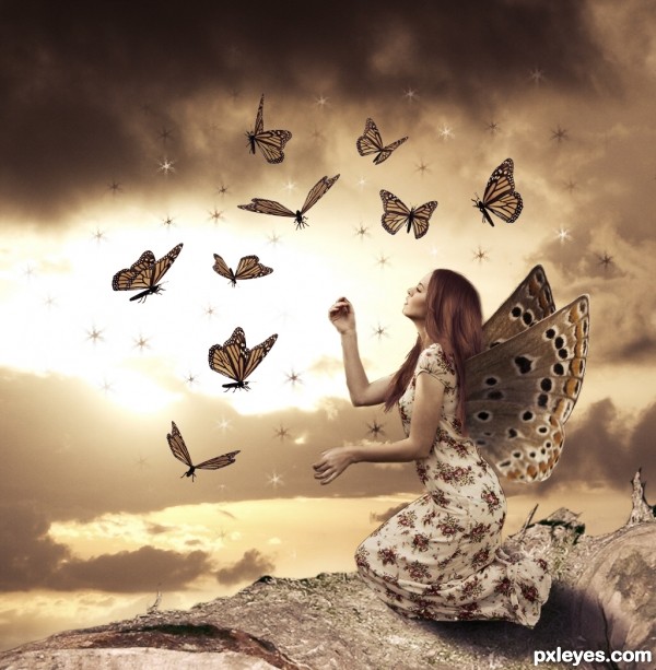
Has potential but some issues. Shadow under the woman is all around her??? Theres a black line around her left arm. The wings look like they are behind her instead of on her back. You Could place the left wing in front of her hair. Good luck
She's floating above the branch. 
EDIT: Shadow is better now.
Beautiful. 
i like it ,good luck
very nice work...good luck
Great work, but I think that the butterflies are large and then colors is very strong
Lovely and peaceful! 
Congrats!
congrats......
Congrats!!
Congrats...
Congratulations!... 
Howdie stranger!
If you want to rate this picture or participate in this contest, just:
LOGIN HERE or REGISTER FOR FREE
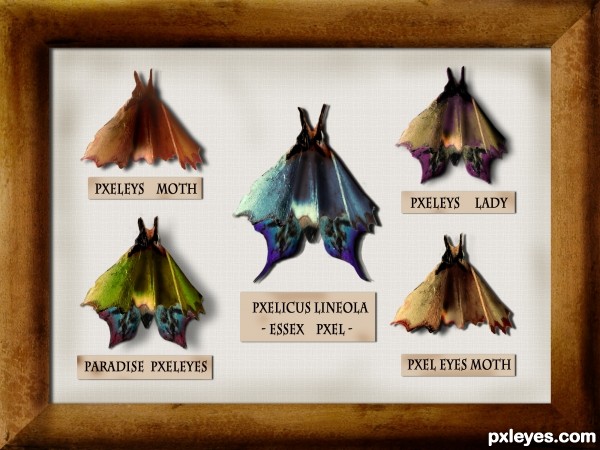
Only one external source used (5 years and 3480 days ago)
Clever idea. Well done!
nice
Very good entry!
Very creative and curious idea. 
Very creative, but the butterflies/moths look flat, not three-dimensional. Some Burn Tool on the bodies and refinement of the shadows falling on the background (different parts of the moth would be different distances from the background and thus would cast a slightly different shadow) would help. A stick pin through each moth might add to the realism.
Hi, everyone!¨Thanks for the comments!
@ DanLundberg
I didn't want to touch the original texture much but, you're right, some things should be improved. I uploaded it and decided to see what the others would have to say . I appreciate your suggestions and, yes, burn tool just might be the best solution for the "fake" inner shadows. i will try to improve that part!
And as for the pins- sorry, i just couldn't!  ))) I made the pins and in the end decided not to use them, I couldn't stab the poor creatures!
Great idea author,i like your different approach to this contest...well done
thanks, erathion!
I made some changes! DanLundberg, thanks again for the suggestions- burn tool really did do the trick (I don't think I use it nearly as often as I should  ). I did my best to achieve a more 3D effect and I think it looks better. I also used both burn and dodge tool to add the same effect to the frame. Then i added some smudges to the background and to the tags- i thought it should be older!
Anyway, I appreciate your inputs! Thanks!
i like it !!!!
I think there's some more depth now. BTW if you create a selection beforehand, that constrains where your burning occurs so you can easily get hard lines between burned and unburned areas..
Congrats...this is really really cool work...
Howdie stranger!
If you want to rate this picture or participate in this contest, just:
LOGIN HERE or REGISTER FOR FREE
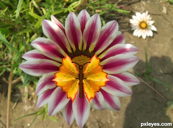
Simply butterfly ;) (5 years and 3482 days ago)
nice work ! g l
Thank you  It's not perfect but it's ok
It's cute in its simplicity. 
very nice author...gl
i like this
I agree it's cute = )
Howdie stranger!
If you want to rate this picture or participate in this contest, just:
LOGIN HERE or REGISTER FOR FREE
lovely work
Ditto Nisha
Beautiful . . . .
good
Beautiful as always!
Nice work author...gl
Howdie stranger!
If you want to rate this picture or participate in this contest, just:
LOGIN HERE or REGISTER FOR FREE