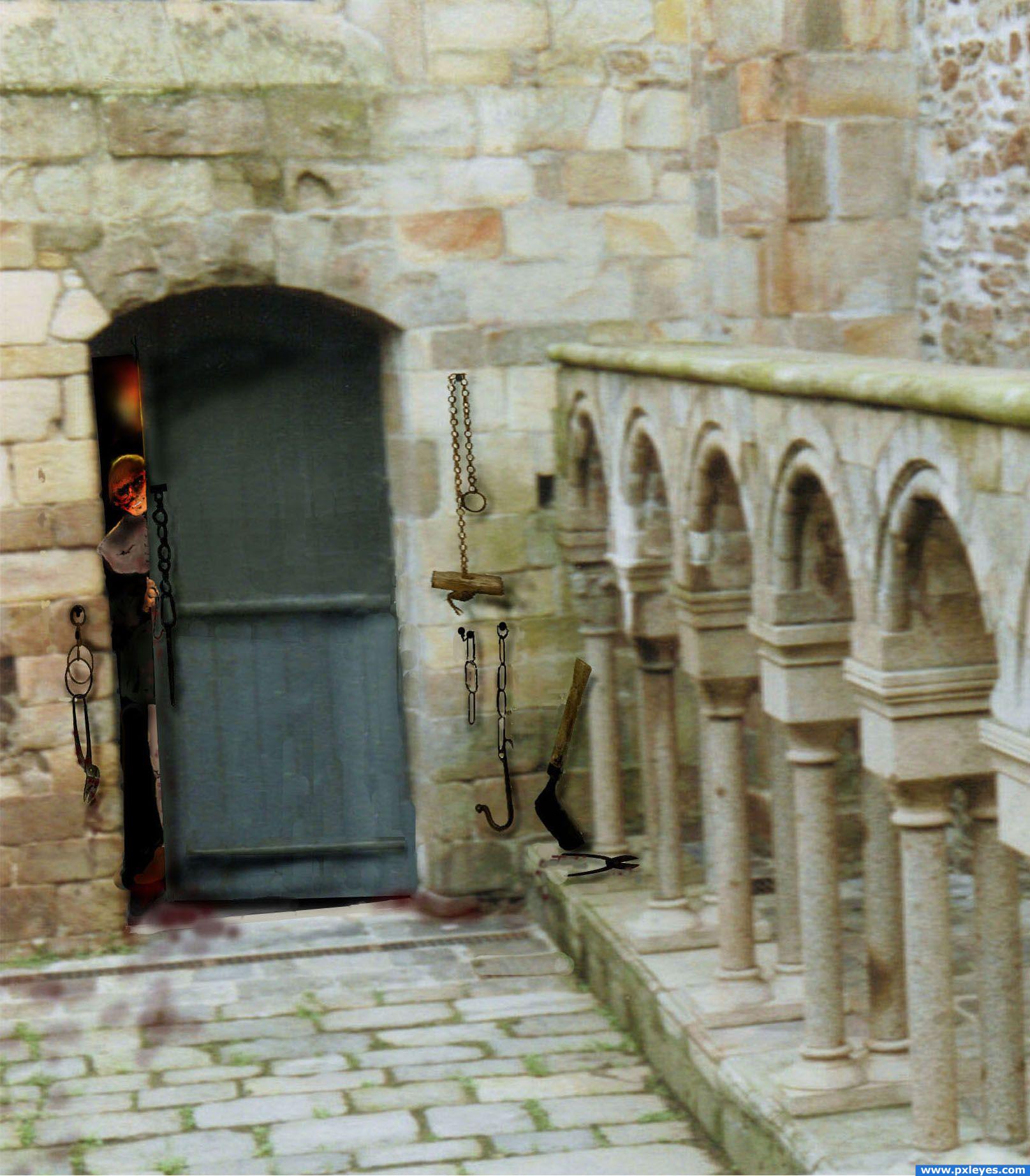
"Welcome...the spa 'therapist' will see you now."
A bit of dark humor.
The castle photo is one that I took during my travels. (5 years and 3941 days ago)
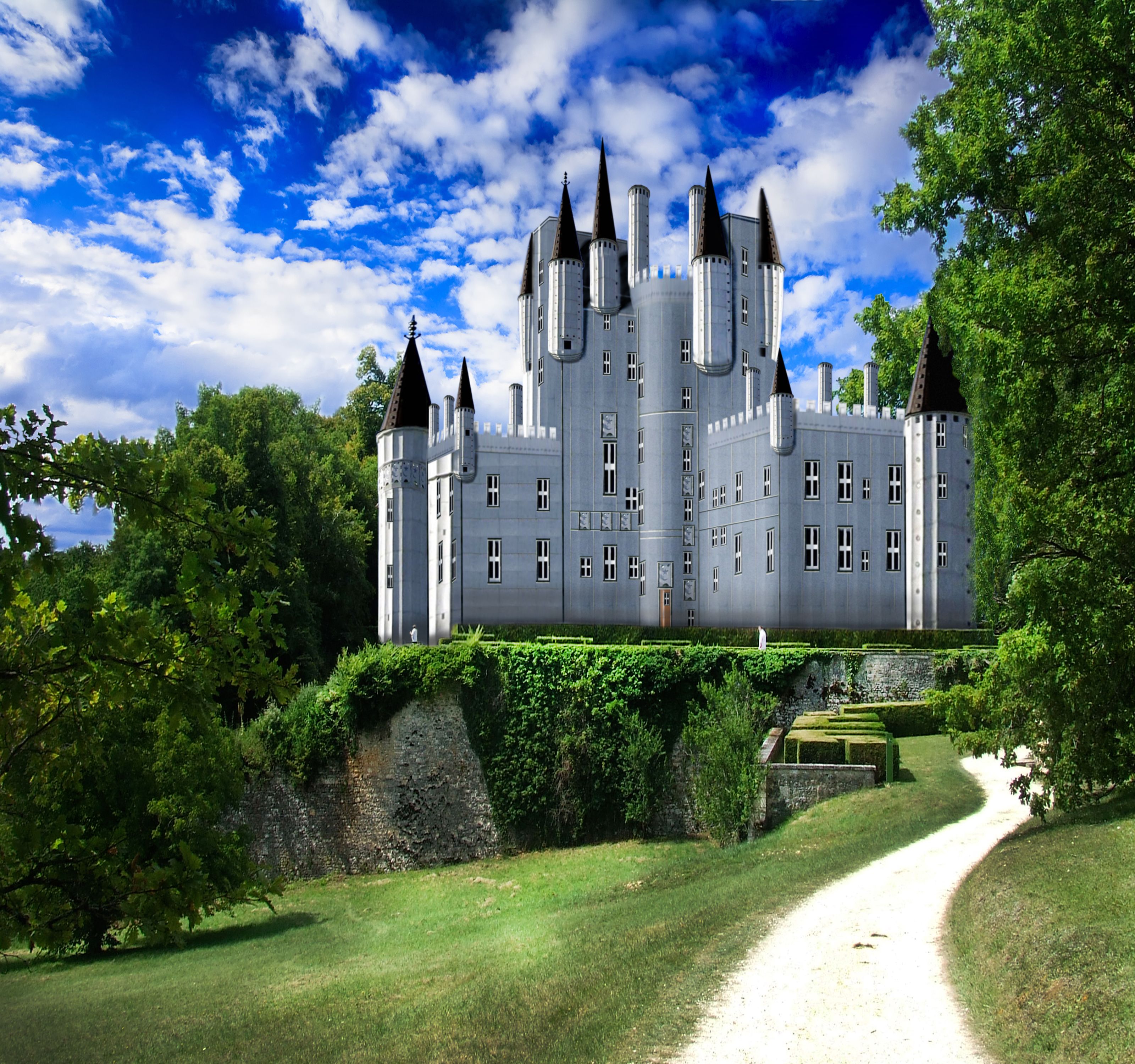
i worked a lot at this (the castle is all source), but... i am waiting your suggestions because i want to improve my creation.thx (5 years and 3950 days ago)
Very nicely done, but for some reason it looks like it's floating. I suggest darkening the bottom gradually to make it look like a shadow. Good luck!
Awesome! *favs it* There are three castle entries in this contest, but I have to say, your entry is the best! But I think you need to add some shadows to it. GL 
Looks pretty ok. The middle part is maybe a bit too massive (all grey-ish), while there's perspective. So add some light there where's needed (since the light comes from left, the side in front with the windows in perspective should receive light). Also, dont just copy-paste one window in perspective for all windows, cause you see it doesnt fit well. You may want to look again at the half masked tower right on top (why it's masked like that?), but for the rest well done. Good luck!
Good work !! .. but im may be even better if you use some filters.. to make it look more realistic !!
The plane (wall) to our right of the door should be lighter. Listen to what the other commenters have said, and good luck...pretty nice job! 
The photo is blurry but the castle is really sharp; you may want to blur the castle, especially the middle a bit. Also it looks like some of the trees on the right should be overlapping the castle as they're out in front. Finally the hedges on the bottom of the castle make it look like it's floating but I'm not sure why.
pm me and ill talk about this with you............great concept, i have a few suggestions
i darkened the bottom , added some highlights and blurred.thx for comm, they really helped
The lighting looks much better and the castle is no longer floating, so good job on both those points. The contrast, however, is very high around the towers but very low in the center part. Also the shadows aren't dark enough, and the castle itself isn't casting any shadows.
wow,this one amazing,so nicely done and good detailing
great entry, but i think some of the building part is flying.. give some shadows pal
the light is coming from the left. where i should put the shodows? (i think the shadows are in the back of the castle)
That looks really good, great job author.
Good improvements, author. The castle has way more depth now. Good luck!
thanks for comments and suggestions.
Very good blend.
Congratulations for 2nd, great
Congrats for your second place!
Congrats!
thank you all.
Congrats!
Howdie stranger!
If you want to rate this picture or participate in this contest, just:
LOGIN HERE or REGISTER FOR FREE
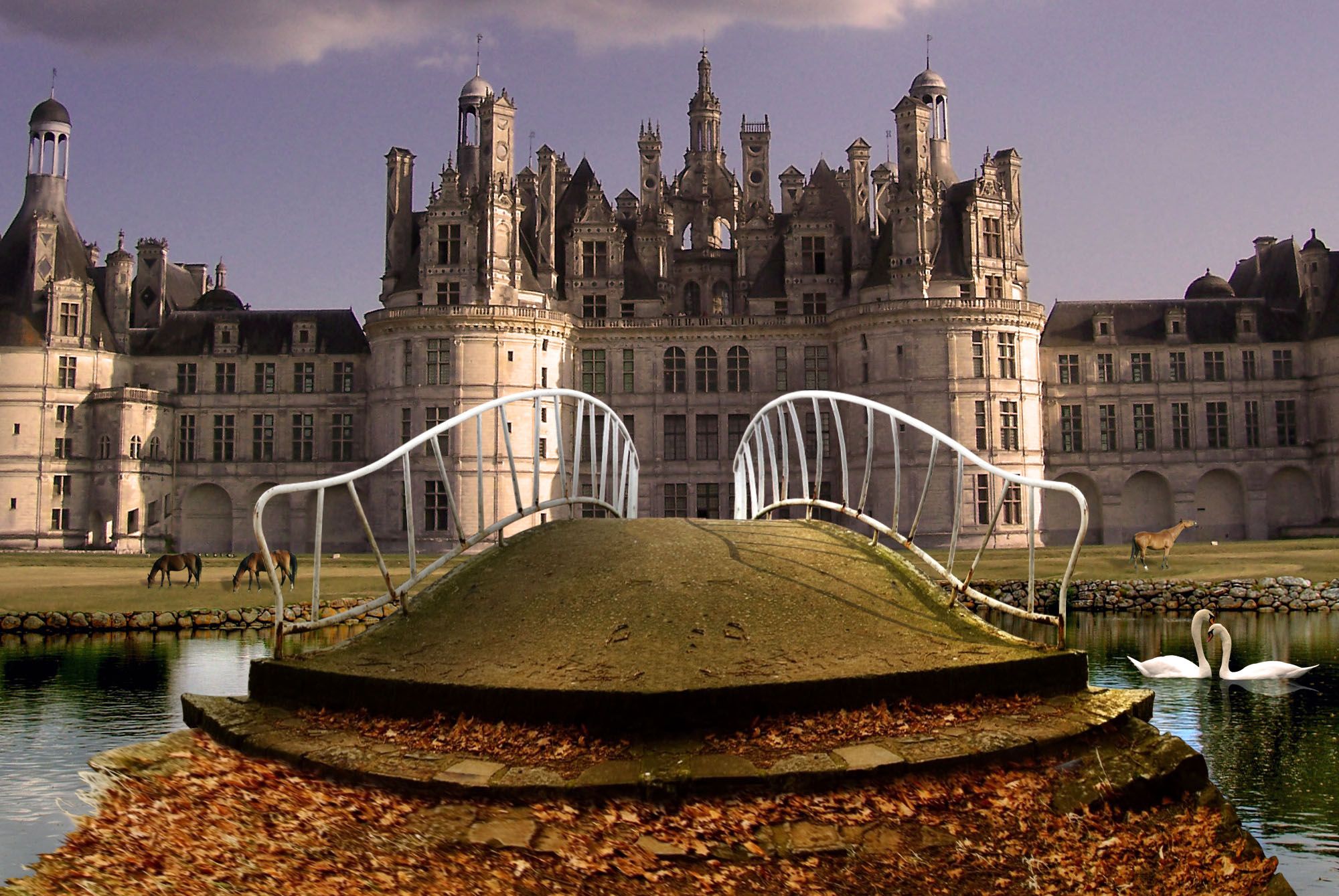
one of my old entries :) (5 years and 3950 days ago)
Nice attention to detail. I like the shadow coming from the right side rail. It would make this even better if you lighten right side of bridge and darkened left side (including leaves) a bit.
Cool job! Try changing the color of the castle to a more brownish-orange color, so that the image gets a more autumn feel. GL
I like it.. maybe use the clone stamp tool to make each side slightly different. Good luck!
like this one a lot, well done
nice image author..
Good work
I can almost see a prince riding on a white horse on his way to his love, who lives in that castle... Yes I'm hopelessly romantic Very good job and really a lovely composition! Good luck 
Howdie stranger!
If you want to rate this picture or participate in this contest, just:
LOGIN HERE or REGISTER FOR FREE

thanks to carlosalk for the source (5 years and 3952 days ago)
i like it, but where's the door n windows??
thanks, no door n windows, that's why i call "lonely castle"
Maybe a bit too pink for my taste, but not bad result. You may want to check the edges from the spires, they can do with a bit of masking. Good luck!
The edges are way too jagged and the entire castle is kind of blurry. Good concept though!
Good, but you should darken the castle if you want some lonely feel. And add some shadows. GL
Howdie stranger!
If you want to rate this picture or participate in this contest, just:
LOGIN HERE or REGISTER FOR FREE
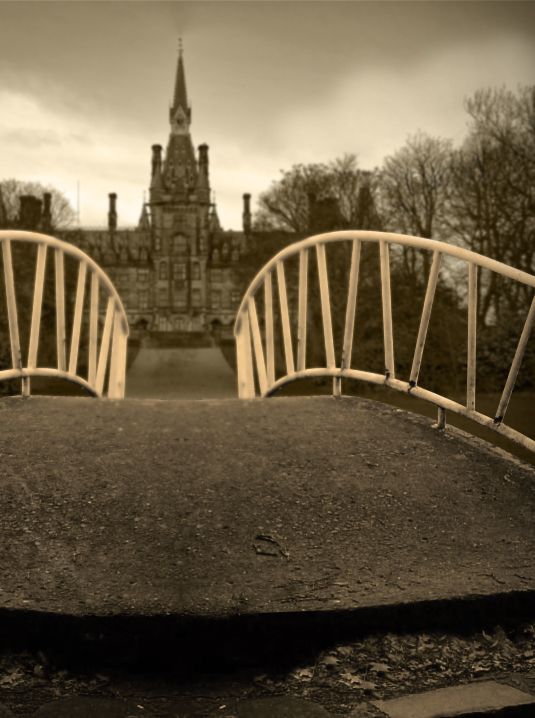
(5 years and 3954 days ago)
Looks good! I'd suggest putting some leaves in the center foreground so you avoid the symmetry of an obvious flip job...othwerwise nicely done!
very nice feel.. the color selection is very 1940's good luck (excellent work)
EDIT: WOW.. the simple crop is SIMPLY EXCELLENT.. makes it even better (thank god I gave you a super high mark to begin with.. hehehe)
This is great! Ditto CMYK...perhaps also darken one of the foreground sides of the cement to further avoid symmetry issues...
EDIT: Really looks great, now. Love the crop and angle now! Looks more interesting to me now!
I cropped the image differently and added some shadows, so that it no longer looked symmetrical. I am happier with the result now, kind of an interesting perspective. Thanks!
I like the DoF you put into it.
Awesome job! *favs it*
Beautiful! Love the mood
The perspective is great! I just like the whole compositon with the castle in the background and especially your colour choice. Good luck!
Howdie stranger!
If you want to rate this picture or participate in this contest, just:
LOGIN HERE or REGISTER FOR FREE
Photography and photoshop contests
We are a community of people with
a passion for photography, graphics and art in general.
Every day new photoshop
and photography contests are posted to compete in. We also have one weekly drawing contest
and one weekly 3D contest!
Participation is 100% free!
Just
register and get
started!
Good luck!
© 2015 Pxleyes.com. All rights reserved.


very dark hehe GL
Oh no thanks... I think, I'll stay outside Funny idea! Good luck
cute idea but some parts are very blurry and some parts are way too detailed.
Lenaina, I am with you on that! I'll stay outside too.
k5683 thanks. That's what happens when you work freehand on the monitor. I don't use a graphic tablet either. I am saving for a Wacom. Hopefully it will save me from pulling any more hair out of my scalp. He, he, he...
Howdie stranger!
If you want to rate this picture or participate in this contest, just:
LOGIN HERE or REGISTER FOR FREE