(5 years and 3558 days ago)
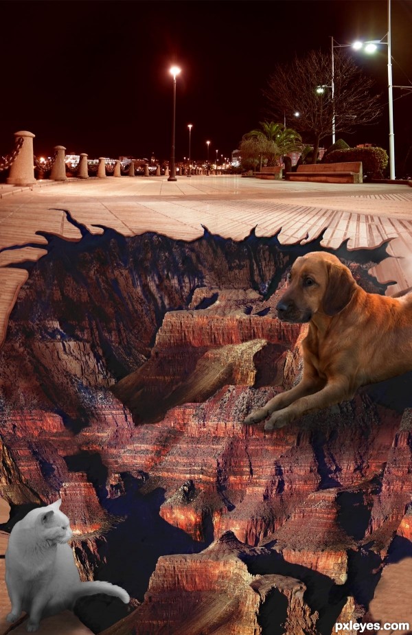
Good idea but animals need to be blended a little better.

Wow! A challenging contest! Thanks to mqtrf at pxleyes.com for the walkway photo; Thanks to the following at morguefile.com; wax150 for the dog; clarita for the cat; and to kconnors for the Grand Canyon source photo. (5 years and 3562 days ago)
Good idea but animals need to be blended a little better.
why the animals...? IMO, they detract the quality of your image since they seem to be placed there randomly :-S
The animals are obviously on top of the artwork with shadows to show that they are actually on a flat surface . They are not randomly placed, rather each is partially on the artwork, and partially on the walkway.
nicely done
The animals are a great idea because they show that it is a 2D image. You would see this a lot in photographs of Mr. Mueller's work.
Very nicely done, I love the results you ended up with. Good Luck!!
Howdie stranger!
If you want to rate this picture or participate in this contest, just:
LOGIN HERE or REGISTER FOR FREE

(5 years and 3594 days ago)
Nicely masked, image is a bit simple, but good, clean work.
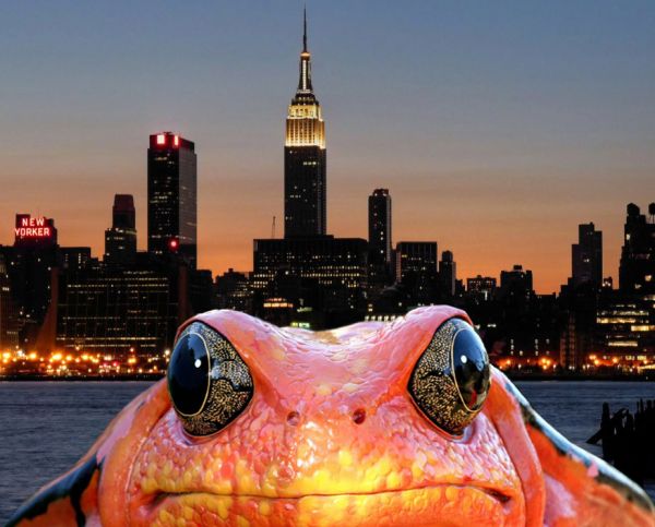
Frog is too brightly lit for a dusk scene...
Which work is the right one???
i dont get the idea in this one..
i giant frog i thought of it from godzilla
It dont look giant, it looks close up. There is nothing to scale it with.
A little too simple.
proportions are a bit wrong and the luminosity on the frog...a little more effort would help.
Howdie stranger!
If you want to rate this picture or participate in this contest, just:
LOGIN HERE or REGISTER FOR FREE

source and my images (5 years and 3601 days ago)
Excellent shadows!
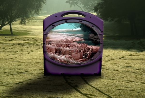
Hmm... If the box is in the middle of the way, and the trails just stop in front of it... people are swallowed by the box!!! 
I don't really understand.
think Men in Black and the size of the Universe
fantastic! GL 
Very nice work...totally different...good luck author
shadow blends very well! i like it a lot :P
15+ entry??? Not sure I understand this one. You need to do a bit of work on the masking on the inner left side of the "globe" - The edges do not line up...
sorry Brandon, but the piece has been up for three days and no one mentioned the lens on the side was so horrible.. I never change an entry after three days (I personally don't think that's fair) I'll try to live up the the 15+ standard.. though I really have no clue what that means.. unless you mean I should source more or something 
Nice work....
This is one intetresting picture! masking issues around the bottom left of the port hole window... try using the pen tool instead to do your masking... GL!
A giant purple box full with a new world! Great! 
clever work and very nice shadows !
Even though I may not understand this one, you have done a good job of combining this, shadows and all. Good Luck.
Howdie stranger!
If you want to rate this picture or participate in this contest, just:
LOGIN HERE or REGISTER FOR FREE

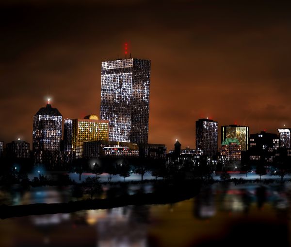
I have always loved city lights.
Only contest source image used.
tree brushes: http://www.brusheezy.com/brush/1337-Tree-Master-Pack (5 years and 3618 days ago)
Very good use of source, well done  GL
GL
I second that emotion, very nice image from scratch!
I've done too... A city at night seems like a jewel box!... It's nice!
extremely well done great use of source
Cool....well done
Post sources for tree brushes & straighten the perspective on the large building...everything else is good.
Great use of source and great imagination....Good work.....
It would have looked better if the center building were plum. IT leans slightly to the right.
Congrats for your second place, Buzzy!
Congrats!! 
Howdie stranger!
If you want to rate this picture or participate in this contest, just:
LOGIN HERE or REGISTER FOR FREE
Not bad, but the side of the sphere is a bit rough. Perhaps you can put a round selection that fits the sphere and then feather it with 1 or 2 pixels. Good luck!
thx for advice
good one...
Howdie stranger!
If you want to rate this picture or participate in this contest, just:
LOGIN HERE or REGISTER FOR FREE