(5 years and 3909 days ago)
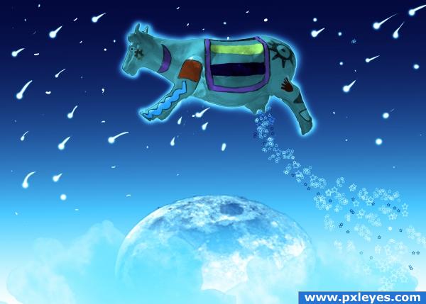
I was surprised that no one else has done this one yet. It was my second idea. I won't tell you my first, because I might still do it.
The photo in the last step of my guide is my own. (5 years and 3909 days ago)
Looks nice! Good job 
very nice... 
one word.... CLASSIC
looks really cool and i think the pic is dominent!
Thanks everyone!
Howdie stranger!
If you want to rate this picture or participate in this contest, just:
LOGIN HERE or REGISTER FOR FREE
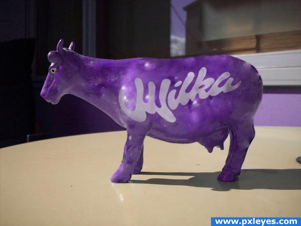
the cow has gone wild... dont think its copyrighted, it is not milka, it is WILKA! :) (5 years and 3913 days ago)
yeah this is a great wilka! 
changing the First letter should be enough author.. Just red flag the entry and inform the mod what you did and it should be alright (good WORK)
awsome i live in canada and every day i creave milka chocolate
Milka is out... Now the Wilka rules the streets... 

perfect shading on the text!
the new source image is by NiklasNikon from flickr... if anyone is interested... 
Cool!
Chocolate rules. all the best with your entry.
Eheh nice idea, great blend 
I guess it's regional. I didn't get it!
great idea! looks quite real too 
Howdie stranger!
If you want to rate this picture or participate in this contest, just:
LOGIN HERE or REGISTER FOR FREE
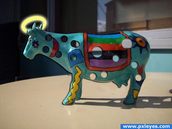
When I was young, I always wondered what a Holy Cow looked like. (5 years and 3914 days ago)
Very funny idea, i think it's a bit simple though.. maybe, really make it obvious he's holy, put it in a magical place, give it wings and a bunch of people bowing down, but just a halo is a little simple. Good luck!!
i'm gonna have to agree with ponti this time
I wanted it to be simple and easy on the eyes, it seems like everyone likes putting animals in magical places.I want people to notice things like the holes in the shadow or anything in this simplistic image that makes it great!
holy cow's got holes LOLOL
I'd like to change background with something other so holes stand out from image. IMO holes should not be visible in shadow as light is coming from left.
Try using a displacement map on the holes, that way they'll look more natural. If you pentool the cow and duplicate that layer several times with some nudge on each layer (when done merge those underlying layers and blur them) you'll get a better idea off depth. Just some pointers 
thnx!
The shadow isn't so godlike...
Glad you remembered to put holes in the shadow. I double checked because I was wondering!
lol, funny one. the shadow is not perfect, but only for a very formed eye  good job!
Howdie stranger!
If you want to rate this picture or participate in this contest, just:
LOGIN HERE or REGISTER FOR FREE
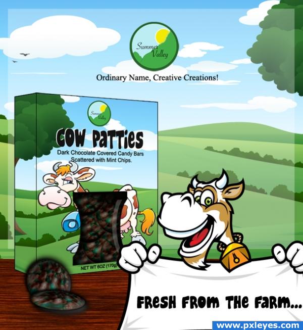
Back again by popular demand. LOL. Holy Cow Patties!
*Surely you remember this one, Wazowski! Your criticism got it where it is now. Any other advice?* (5 years and 3931 days ago)
Urp (I'd be in the toidy if I wasn't giggling with an evil delight.. truly twisted)
very nice
heheheh....Brilliant! Like b4 

I thought u made tat illustrations....LOL......though nice work....GL
good job. but I don't know why you created a full artwork with barcode in a die-cut keyline?You can avoid black outline from the packaging and give light and shade instead of that. GL
@ gopankarichal; Originally I started out with a completely different idea, including the entire package layout and both sides of the box, but the farther I got, the more I began to change my mind. I'd already gone pretty far by this time, so I kept what I had for the SBS. Thanks for the comment, though.
@ loopy, I'm glad it still tickles your fancy! LOL.
And thank you GolemAura! I had fun with it! 
Seems really nice and tasty, i want it! =)
hhhahahahahha lol
oo i'm sure kids want it!  cheers!
very nice 
Excellent idea 
Yup, I remember this one!  Still a funny one
  Good luck!
Good work.
Howdie stranger!
If you want to rate this picture or participate in this contest, just:
LOGIN HERE or REGISTER FOR FREE
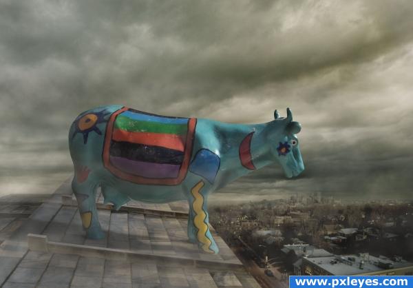
Wow! I'm not too keen on the idea itself, but the image looks fantastic! You created a very nice mood that goes well with what's happining in the image itself. Good work!
i think the sky needs moe work because right now it looks way to cloudy and if you look at the roof the cow is way too big to be on top of one that size the cow is almost biger! you might want to work on that a tad but i can say that you did a good job with the image
AAAHHH!!! NO! DON'T DO IT!!!! Hehehe! Very nice job GL
GL 
We're eating good tonight! You got it all wrong! She's not commiting suicide! Cows can walk up stairs but they can't walk down. She's just stuck! : )
Congrats Hymerion!
Congrats!!
congrats!
thank you for your votes and cooments!
Congrats!!
Congratulations for 3rd
congrats!
Howdie stranger!
If you want to rate this picture or participate in this contest, just:
LOGIN HERE or REGISTER FOR FREE