(5 years and 3942 days ago)

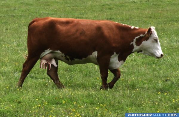
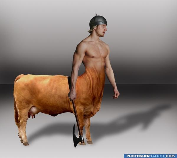
Tried blending two images together.
A lot of masking, dodge / burn, and clone stamp.
Will try fininsh SBS tomorrow.... (5 years and 3957 days ago)
I think would be better with a landscape for background.
definatly a good job.. great tech work.. right on theme
I agree that it should be on a landscape  Good otherwise tho
Great work! The back end of cow suggests a brighter floor surface there too. Perhaps use some variation in lightness of surface. 
there should be some lighting on the guy, great idea though
Creative
nice
Funny idea, but I also agree with DML. Apart from that, I see two different lightsources: the guy receives light from the right, shadow on ground is from light coming from front left. Good luck!
Thanks for all the comments. To clarify all your concerns - The warrior is at a photo shoot where they are using multiple light sources and thats also why there is no landscape background 
good work. if you can match the body color to the cow's color, will be better.
nice job 
Howdie stranger!
If you want to rate this picture or participate in this contest, just:
LOGIN HERE or REGISTER FOR FREE
a little disturbing, but very funny. Nice image author, very original
very nice idea! i'd just play with the contrast and maybe curves a bit cause it would blend in better, i think
Thanks Elficho, but I wasn't going for subtlety here...
lol sick dude!
good one author, that one might milk you
Sweet! The lighting is a bit off. Maybe burn it a bit to blend it better. Good Luck.
LMAO this one is hilarious!! IMO the hand has a highlight on it..where is the light coming from? Soften it a little and it's perfect...Good Luck
Hahaha - yes the highlights kill it a bit - funny though.. Good blend to the udder!
very funny and creative, nice imagination good luck
creative!!
good idea
nice
LOL. clever
lol at your title, good work
eh heh...heh heh heh....ahem, i probably shouldn't say what i'm thinking (: Great job, kudos on creativity.
Howdie stranger!
If you want to rate this picture or participate in this contest, just:
LOGIN HERE or REGISTER FOR FREE