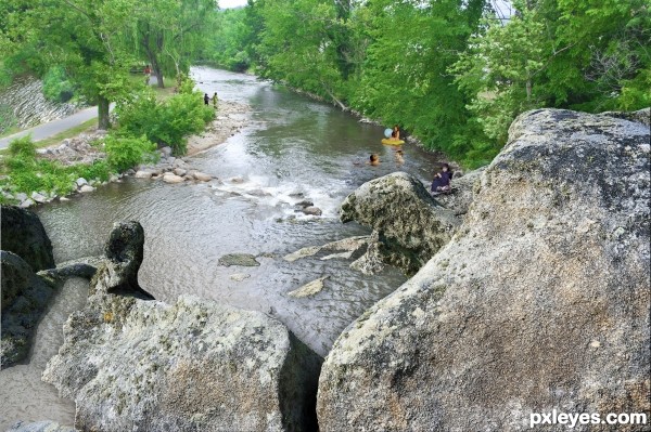
(5 years and 3552 days ago)
- 1: boy and girl
- 2: boy fishing
- 3: tubers
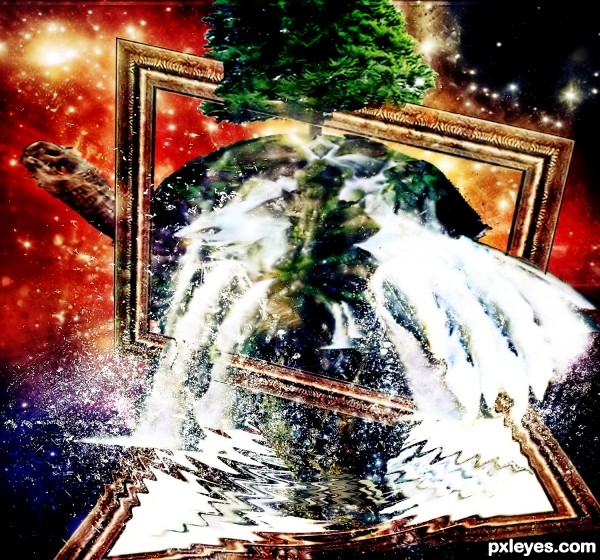
took so much time to completed
the water flow is from the turtle shield (5 years and 3555 days ago)
i like the idea! but its a little busy
I agree with Tucker; idea is good, but it's kinda confusing...
confused about what
besides what is a little busy
I think your on as far as the idea goes but technically there are place for improvement. First off, all of your source images are way too small. You must not of clicked on the sources picture to get the full resolution. I think the resolution is what really hurt the clarity on this. Second some of the masking needs a bit of work. I wish you luck and make sure you get the full resolution sources next time.
http://img412.imageshack.us/content_round.php?page=done&l=img412/5665/123tie.jpg&via=mupload
permission for source 8
Have to agree about the sources. They are blurry and hard to make out. I wouldn't have known it was a turtle if not told it was there... no offence author.
I like the idea of the image, however is there anyway you could go back and redo it with high res images? it would be a waste to lose votes on this image cause its simply blurry 
will hold vote 
thanks but can someone show me how to get higher res ? cuz i dk how to do it
thanks alot
Hi. For sxc.hu, you'd have to click the download button to give you the hi-res which is what you save, not the preview image. And I noticed you need to credit and notify the photographers for some of your sources so you'll have to get their permission first. Hope this helps.
well i clicked on the download button, of course, but the problem happened when i create t he entry. I divived the progress into another small steps that i used in poor resolution(500x500) now i dont know how to get better quality for the entry
for credit yah
i alway give credit to the photographers if i saw his/her name near the download button. In another way, i cant remember all
nice attempt
http://img697.imageshack.us/content_round.php?page=done&l=img697/5799/10807156.png&via=mupload
permission from author of source 8
You won't be able to get a better resolution for this entry unless you redo the whole thing. My comment was in regards to any other entries you hear on out. When I download the source picture I first click on the image and then you should have different size option. Always choose the highest image size even if it's not required in your entry. Good luck!
do i still have a chance?
cuz today is 4th
not sure if i redo it my work will be paid off
Howdie stranger!
If you want to rate this picture or participate in this contest, just:
LOGIN HERE or REGISTER FOR FREE
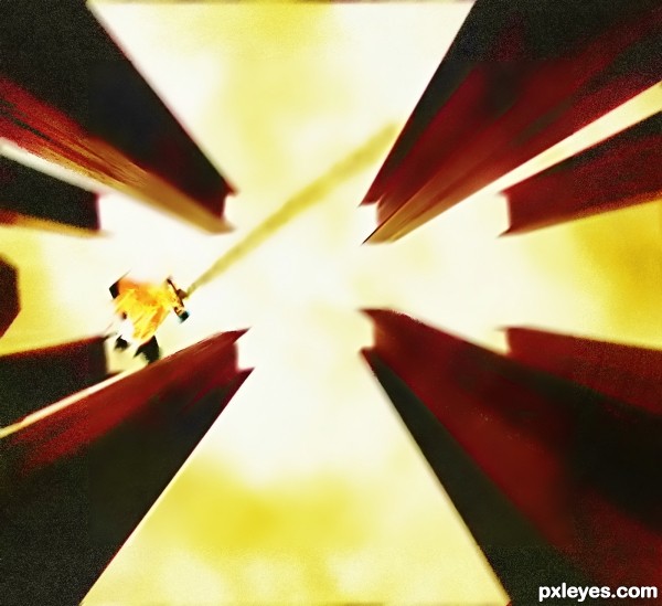
"the falling machine day" (5 years and 3558 days ago)
IMO, the image is a bit noisy, I almost couldn't recognize the airplane.
agree with erikuri
thanks i will fix it now
That's a plane? I thought that was the hostess Twinkie man committing suicide. Yeah, definitely work on your details better and always try to find the biggest source stock with the high res res to get best results.
Howdie stranger!
If you want to rate this picture or participate in this contest, just:
LOGIN HERE or REGISTER FOR FREE
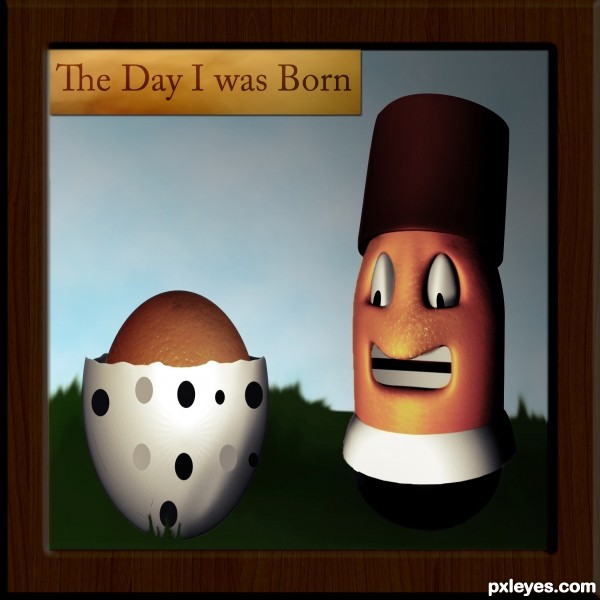
I've made a lot of work to get the final result and I'm very happy with it hope you like it.
Any suggestions are welcome
(The image is made from scratch no references used.) (5 years and 3559 days ago)
source links don't work and again to much 3D in photoshop contest...but i love the final result
1- I've fixed the links
2- About the 3d part I know I've used lot of 3D but I'm trying to learn how to shade. 
The first thing I've done was to shade using the 3d images as a reference but I didn't get the result I wanted so I used the 3d images. 
3-Next time I will try to work without the use of the 3d images or I will use it only as a reference.
4-Finally, Thanks for loving the final result. 
not bad
Congrats for 3rd
Congrats!
Congratulation on 3rd place and great work...keep going...
Congrats for your third place, Tnaggar!
Howdie stranger!
If you want to rate this picture or participate in this contest, just:
LOGIN HERE or REGISTER FOR FREE
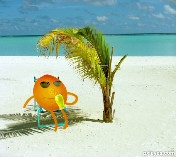
A sunny day from orange`s life :)) (5 years and 3559 days ago)
nice dea tha shadows colored
Orange guy needs the tree shadows on him, and he himself needs to cast a shadow on the sand.
that looks refreshing  I only wish that the orange's hands wouldn't be cut so sudden...
Howdie stranger!
If you want to rate this picture or participate in this contest, just:
LOGIN HERE or REGISTER FOR FREE
wow i love this 1
Thanks Tuckinator!
you must have put a lot of time into this. great job.
Pretty nice work, but the leftt side dark and big boulder doesn't fit into the perspective here very well. There is also a slight problem with the scale of the people when compared to each other. Walking kids and the one fishing could use a slight shadow, you can use the rock shadows as a guide, where the light comes from. To make it even more realistic, you could cast some shadows from the big bushes and trees on the left side of the river bank. (There is also a minor masking error on the left side of the cycling path.
i got rid of the bad boulder. put some shading and shadow on the kids and the fishing kid and fixed the masking boo-boo. but i gotta go to sleep now. i will try to address the rest tomorrow, if work and school permit before the deadline. Widiar, i do appreciate your comments, i really do. but i was so deflated (it is ok, i recover fast and you are right about what you say) in hearing them. I think when i work so long on these things i quit seeing them till you are good enough to point them out. then it is like a sore thumb... sticking right out - blaring at me! but, i do want to thank you for taking your time and giving it a good look over.
Already a lot better with the out of perspective rock removed. You could have blended it in with perspective tool and shadows perhaps, but takes a lot of skill and times, so obviously better choice if you're busy on your life (aren't we all). I'm glad you appreciate my comments and suggestions. And I know how you feel.I think we all sometimes (even best of us) make a picture for hours, then send it with full excitement, how good we did.. waiting some praise and then someone comes and tells how obvious flaws we missed.It is always a good thing to give the image "a rest" and take a new look with fresh eyes and mind.

But it's the whole point of this site I think.. to learn, give and take tips and improve our skills. Would be utterly boring to see 100 perfect chops every night with nothing to say but 'Awesome work dude!111' ..
Widiar, you are so right!!! I have been learning photoshop since january this year, each time i enter, i learn something (some lessons are harder than others!!!) one thing i have learned is that i love it! and another is that no matter how hard the critique is to take - no comments at all is much harder to take!
In high resolution u have big light source issue author...people in the water are in the total sun,and in your image there is no sun anywhere...also u could blend boy on the rocks a bit more,to change his color.Change mode to CMYK and play a bit with curves...i would ton a down magenta for sure.People are to big for the rest of the image,and they need some shadows...Sorry for the nit picks but idea is very nice and this could be good entry...good luck
There is sun where they are, the coloration of the water is the depth (in real life - look at the original in the sbs, note the trees close right no shade in the water, if you look over at the trailer on the far left the sun is directly overhead and the shadow is directly under it.) although even if you were to assume it were the trees the girl is to this side in full sun. i will work on the boy, thanks for the tip. i used some shading as widiar suggested on the kids and the fishing kid. as for the sizes i used the rocks on the beach right by the swimmers to get the size right, and the same for the others. i then used vanishing points to verify them with the distant ones. i also used the items in the original (to the far left) to verify so i have to gently disagree with you on size.
please dont apologize for the nit-picks, it is good that you took your time and looked so thoroughly at this piece. i truly thank you for your comments (and your comments are why i now take the time and such extreme measures to actually measure the people and the perspective now.) my next attempt i will add the steps taken to measure out things to my sbs,
Interesting image. But background image (river, running course) is cloudy, and fishing boy too. Given source and kids in the water are lit by sun.
hey erikuri! thanks for your comments. (btw... loved your "screwdriver"!!!!}
Congrats for your third place!
Congrats! for your 3rd place.
Congrats!!!
Howdie stranger!
If you want to rate this picture or participate in this contest, just:
LOGIN HERE or REGISTER FOR FREE