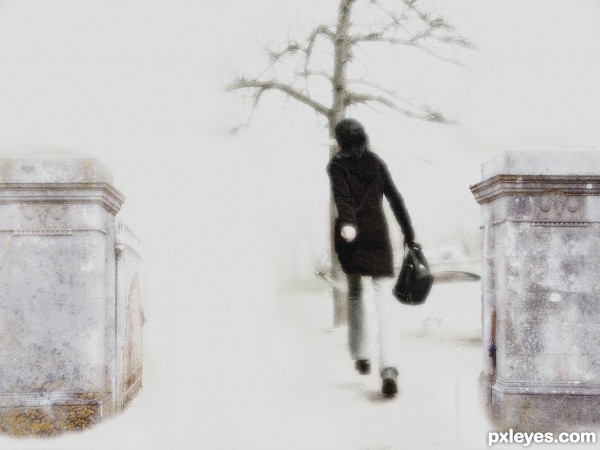
(5 years and 3366 days ago)
- 1: Gate Posts
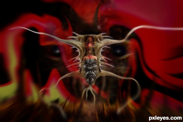
(5 years and 3375 days ago)
Very strange critter ... if I were Alessa I would really want someone to wake me up! Great work.
weird & mesmerizing
this looks like some weird macro shot
Simply creepy!... It's not a dream, it's a nightmare! Imagine this scene getting more and more closer inside your mind... 
so cool creation...it looks like some pissed micro organism...
GAWD...eeewww...it looks like some alien worm inside a human body....but its cool...gud luck 
Howdie stranger!
If you want to rate this picture or participate in this contest, just:
LOGIN HERE or REGISTER FOR FREE
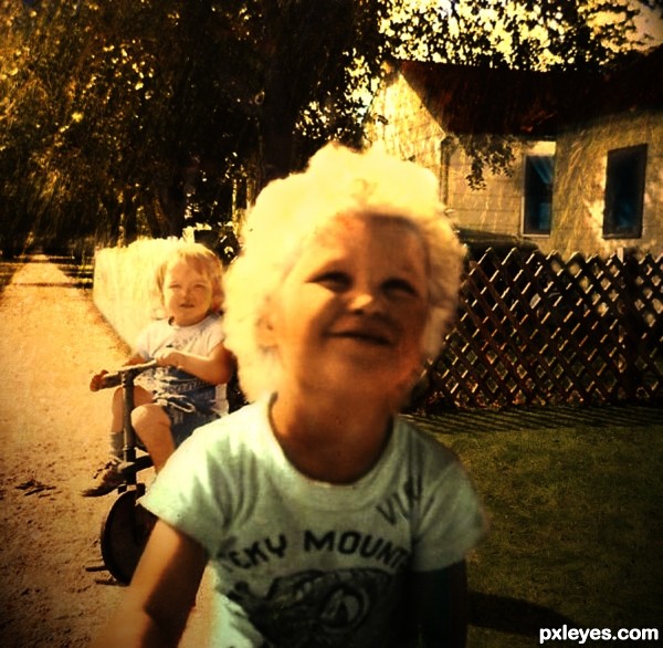
I chose an original retro picture from the 1950's without colour as I wanted some challenge. I tried to keep the feeling of an actual old photograph. Besides standard brushes I used several external sources for the textures.
I somewhat doubled the original image size to make working a bit easier as the resolution wasn't that good to start with.
Skin textures and small boy clothes from the child source
Fence and roof from the wood source.
Pavement from the dirt source.
Grass and trees from the grass and willows sources. (5 years and 3377 days ago)
Howdie stranger!
If you want to rate this picture or participate in this contest, just:
LOGIN HERE or REGISTER FOR FREE
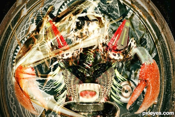
i will update sbs soon
(5 years and 3387 days ago)
The red triangular sections are too translucent, fading away from the rest of the image.
The curved and warped parts of the type ball on the left shows too obviously that you flipped the image - the type is backwards.
The composition is too "mirror perfect" in some areas, and too "non-mirrored" in others, most noiticeably in the lines above the crab claws. The one on the right isn't connected at the end, and is straighter than the one on the right. This inconsistency gives a poor technical visual effect, rather than being a creative part of the design.
plz view in high resolution
cool construction...gl
Howdie stranger!
If you want to rate this picture or participate in this contest, just:
LOGIN HERE or REGISTER FOR FREE
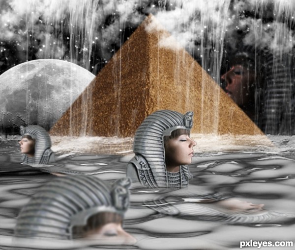
(5 years and 3389 days ago)
The perspective is a bit off, making the helmet look crooked on her head, although that may have been your intention. She looks weird with no shoulders or arms, though.
Howdie stranger!
If you want to rate this picture or participate in this contest, just:
LOGIN HERE or REGISTER FOR FREE
A bit too high contrast. It's almost too bright to look at...Generally you only want to use "bright white" (with no toning or shading) very sparingly as highlight accents. Also, the columns look crooked, throwing the angle of the image off.
Thanks for the input i have tried to correct the angle of the columns and take on broad about the high contrast. I have updated the image so you can now at least look at it without your eyes hurting!
Nice mood.
Unusual image ... I like it; I would like to see it printed as I think it might have more impact than on the screen. Sometimes the "light" can detract from softer, less contrasty images.
IMO
Arca thanks for the comment. Printed on a canvas i think would look good. Would need more work though as only had a laptop and mouse pad to do this whole image.
Howdie stranger!
If you want to rate this picture or participate in this contest, just:
LOGIN HERE or REGISTER FOR FREE