(5 years and 3715 days ago)

So this is the hand of Zeus. Zeus is the go of the sky and king of the gods in Greek mythology. So here is my SBS:
1. Add stone hand to cloud scene.
2. Resize and adjust both photos.
3.Smudge end of hand so it looks like its coming from the clouds.
4. Add lightning.Smudge to make more 3D looking.
5. Darken the clouds with burn tool. Also darkened hand.
6. Created layer over cloud scene and cnahged layer property to "multiply".
7. Colored in the hand a fleshy color. (5 years and 3748 days ago)
Try to fade the hand into the clouds...
Is that General Zod from superman 2's hand ?
nah its zeus bro and ill try when i get back to school i have the psd there :P
agrees with CMYK
Howdie stranger!
If you want to rate this picture or participate in this contest, just:
LOGIN HERE or REGISTER FOR FREE

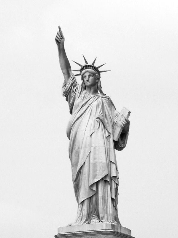
Simple cut and paste, but politically correct don't you think? (5 years and 3748 days ago)
The statue of liberty has nothing to do with "Life, liberty & pursuit of God". This is her inscription: "Not like the brazen giant of Greek fame, With conquering limbs astride from land to land; Here at our sea-washed, sunset gates shall stand A mighty woman with a torch, whose flame Is the imprisoned lightning, and her name Mother of Exiles. From her beacon-hand Glows world-wide welcome; her mild eyes command The air-bridged harbor that twin cities frame. "Keep ancient lands, your storied pomp!" cries she With silent lips. "Give me your tired, your poor, Your huddled masses yearning to breathe free,
The wretched refuse of your teeming shore.
Send these, the homeless, tempest-tost to me,
I lift my lamp beside the golden door!"
Who cares what it stands for, let’s focus on the obvious. For such a simple chop, you could of at least fixed the left edge of the arm and blend it better. Try filter/liquefy for the edge and clone stamp for the blending. It looks a little fuzzy, even in this resolution and the blend is obviously chopped. Upload a high res so we can see the details of your chop better. In fact, since you did chop so little, why not just crop it from the torso? IMO, you should add more sourceimage to it.
actually dont try and clone it, instead use the burn tool at about 5% and burn it until it matches the tone of the rest of the metal you are blending to. the only thing you should clone is other bits of her dress where you get the seams in the metal, add that too the hand and blend it WELL (yes, not sloppy... whoodathunkit) so that it appears as if it actually belongs to the statue... it would atleast then look like its made of metal instead of stone. its a minor touch up that doesnt really need it, but i thought i would get all nitty gritty based on that last comment posted by jawshoewhah...
I don't get what you did here? Replace a torch with a hand? If thats it then i suggest u make another entry because this is bland and unimaginative. and how is a hand instead of a torch anybetter?
Yes, I forgot to fix the blur on the arm, thank you for that constructive photoshop criticism. As for the metaphor, I'm sorry for those of you who don't get it. But the statue of liberty is an icon of our country and this is just a humorous representation of our country is always pushing "God" on its citizens. Maybe I was wrong in thinking that it was a hot topic in our country. And it's nothing against the torch, that just so happen to be her pointing hand. It's really not that deep, nor was it suppose to be THAT fantastic. Just a laugh, kinda like the land of the blind in the new countries.
This is not a contest of "politically correct";ness  . And, were not all American. Or French.
I got it right away.... and understood the message right away.. good luck author,
Ooooooh....Little hot in here....I'd be afraid to put a entry or a comment...lol
I got to give you props on your titles because it's true. This country has more religous nuts and Jesus freaks than any other country in the world. Don't believe me? Just look at the Stupid Laws contest. Most of the dumb laws are religious based.
Howdie stranger!
If you want to rate this picture or participate in this contest, just:
LOGIN HERE or REGISTER FOR FREE

Thanks to Ali Taylor, Jean Scheijen, Coen Deurloo and Konrad Mostert for the nice source photo's.
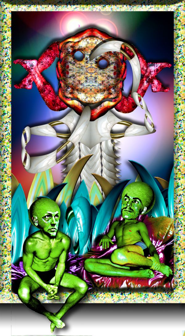
Took me a while to figure out what i would do with these two funny characters. (5 years and 3770 days ago)
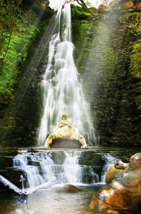
As with a previous entry, IMHO would be better if her feet were on the ground. There would also be splashes coming off her. On second look, she'd be smaller due to perspective. (PS: It's good you got rid of the dog.  )
)
Thx for the advice CMYK46, i will try to fix it 
Howdie stranger!
If you want to rate this picture or participate in this contest, just:
LOGIN HERE or REGISTER FOR FREE

(5 years and 3781 days ago)
Really cool!
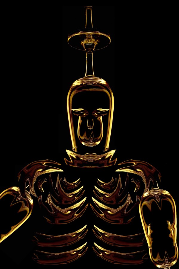
Not a bad concept, but it might be better if you gave him some sort of radiating crown instead of a dopey upside down glass on his head...gotta give him more dignity, ya know...
Nicely done! I agree with CMYK, but perhaps leave the glass on top the way you have it and just remove the very top stem. That might help. Give it a try. 
I think they have a point as far as the crown but at the same time I comend you on keeping the original source image as much as possible. Good imagination!
I like the original inclusion of the glass head. not totally on theme for your image but it works well. GL
Howdie stranger!
If you want to rate this picture or participate in this contest, just:
LOGIN HERE or REGISTER FOR FREE
I like this idea.
Nice work....
Reaaly like it
yep this is surreal alright
He-he. the creature in the beackground looks great!
Howdie stranger!
If you want to rate this picture or participate in this contest, just:
LOGIN HERE or REGISTER FOR FREE