"http://www.morguefile.com/archive/display/745306" Used but didn't make the final pic. (5 years and 3006 days ago)
background picture is my own.
will add a SBS later on. (5 years and 3028 days ago)
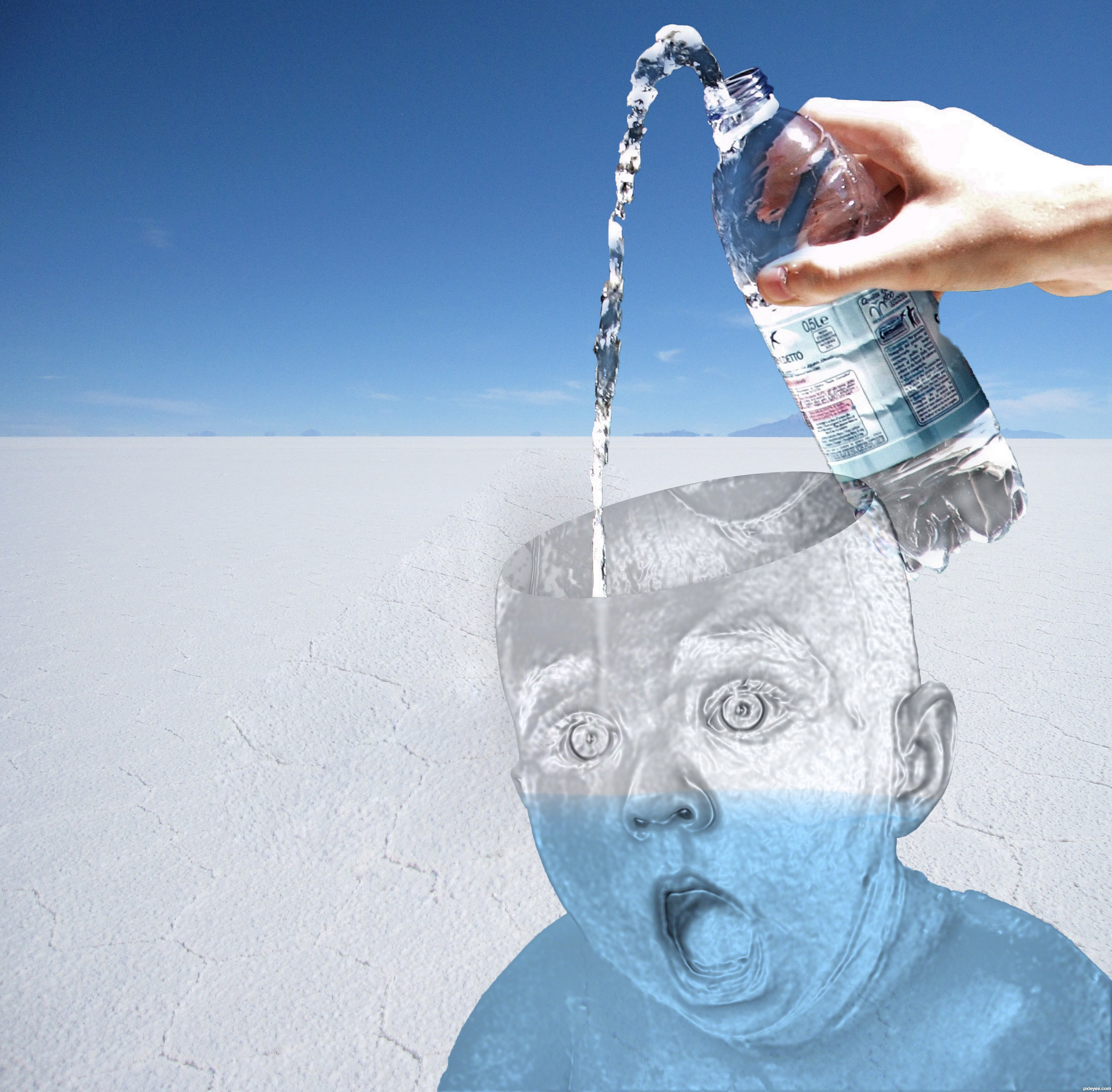
The "glass" of the baby is not showing any of the background. If you reduce the opacity or change the blending mode to show more transparency, it will help this a lot.
Also, the pouring water inside the head is too blurry, and the black background showing through the bottle needs to be corrected, since there is no black in your background.
Thanks for the input,
it was very helpful
tried to fix the problems, hope its better.
like your artistic creation... there are a few gliches as MossyB has already highlighted... gl with working and developing your work.
HINT:
to remove the "blackness" within the image. You can play with the following:
SELECT> COLOUR RANGE
ADD LAYER MASKS

At least straighten the horizon.
Done!
thats just creepy lol
Howdie stranger!
If you want to rate this picture or participate in this contest, just:
LOGIN HERE or REGISTER FOR FREE
Credits:
http://charligal-stock.deviantart.com
http://falln-brushes.deviantart.com
night_fate (5 years and 3056 days ago)
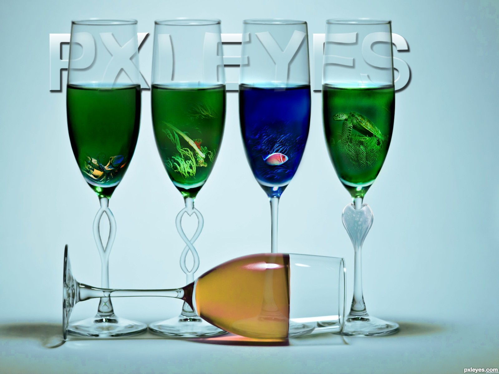
Liquid levels would be parallel to the horizon. Look at liquid level in glass at far right for comparison.
Fixed source 2.
@ CMYK46: It depends on the thickness of the matter in question. I agree the closest glass should probably have the liquid inside more inclined to the left if it was water or wine.
I give you some reasons for the levels to do not look real in this case:
1. Even on the source picture you can see the red glass has a fixed material inside, couldn't this be the case? :P
2. It's even true blue which makes you think it's some sort of non real material or perhaps a blue jelly?
3. The glasses could be moving a little as she steps in and out which would affect the levels at the moment she does.
I'm not trying to excuse my supposedly mistake but in fantasy art what's real and not is relative. If you had picked on the shadows i would totally agree.
Good work !
very nice!
good job, but glasses look flat, maybe try to add some thickness to the edges of the glasses or maybe more shading on the empty part of the glasses, good luck
EDIT: also the glass in the front should drop shadow on the glass in the background.

Congrats on 3rd 
congrats
Howdie stranger!
If you want to rate this picture or participate in this contest, just:
LOGIN HERE or REGISTER FOR FREE
(5 years and 3057 days ago)
Ya know... that could be really cool (or more cool, I guess) if you put something in each glass that connoted the different areas: chopping, photo, 3D, and chopping
I guess so.. Thanks for the idea
I like the way you put fish in the uprights. You could have a goldfish outside the one on it's side, too!
@ MossyB: hmmm.... will try to make something out of your suggestion. Seems a cool idea. Thanks.
like:
the glasses' shapes
not so like:
only green, blue n light brown colors
the light-brown wins should spill out, not like a solid (frozen)
the words : PXLEYES (distracting... no offence to this website
suggest:
more colors,
if there are fish, turtle..etc, should have bubbles
overall cool idea, imaginative
It is great!
I just think that the objects inside the glasses should be a little less clear because
they are inside the liquid so there should be some change in color and clarity.
other than that its a great work! good luck!
Thanks for your comment omercb. I think you are right.
Howdie stranger!
If you want to rate this picture or participate in this contest, just:
LOGIN HERE or REGISTER FOR FREE
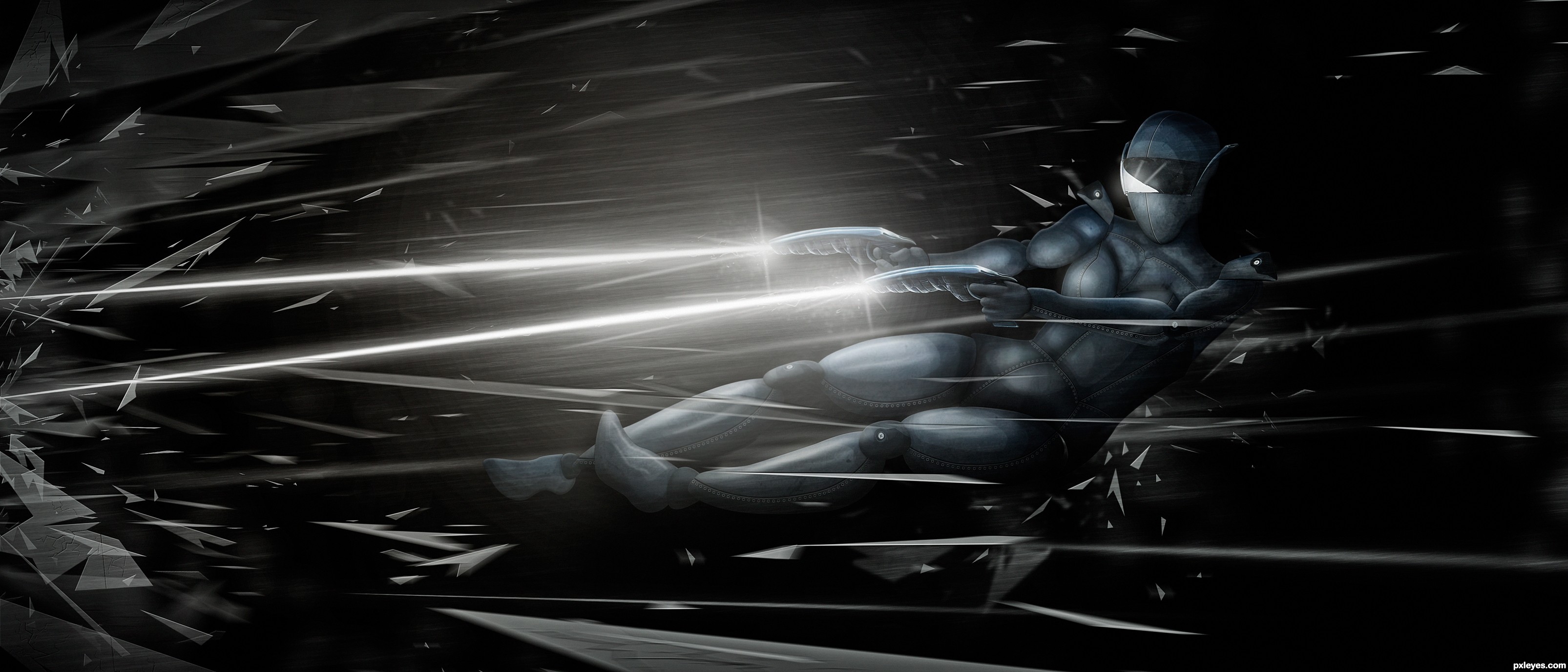
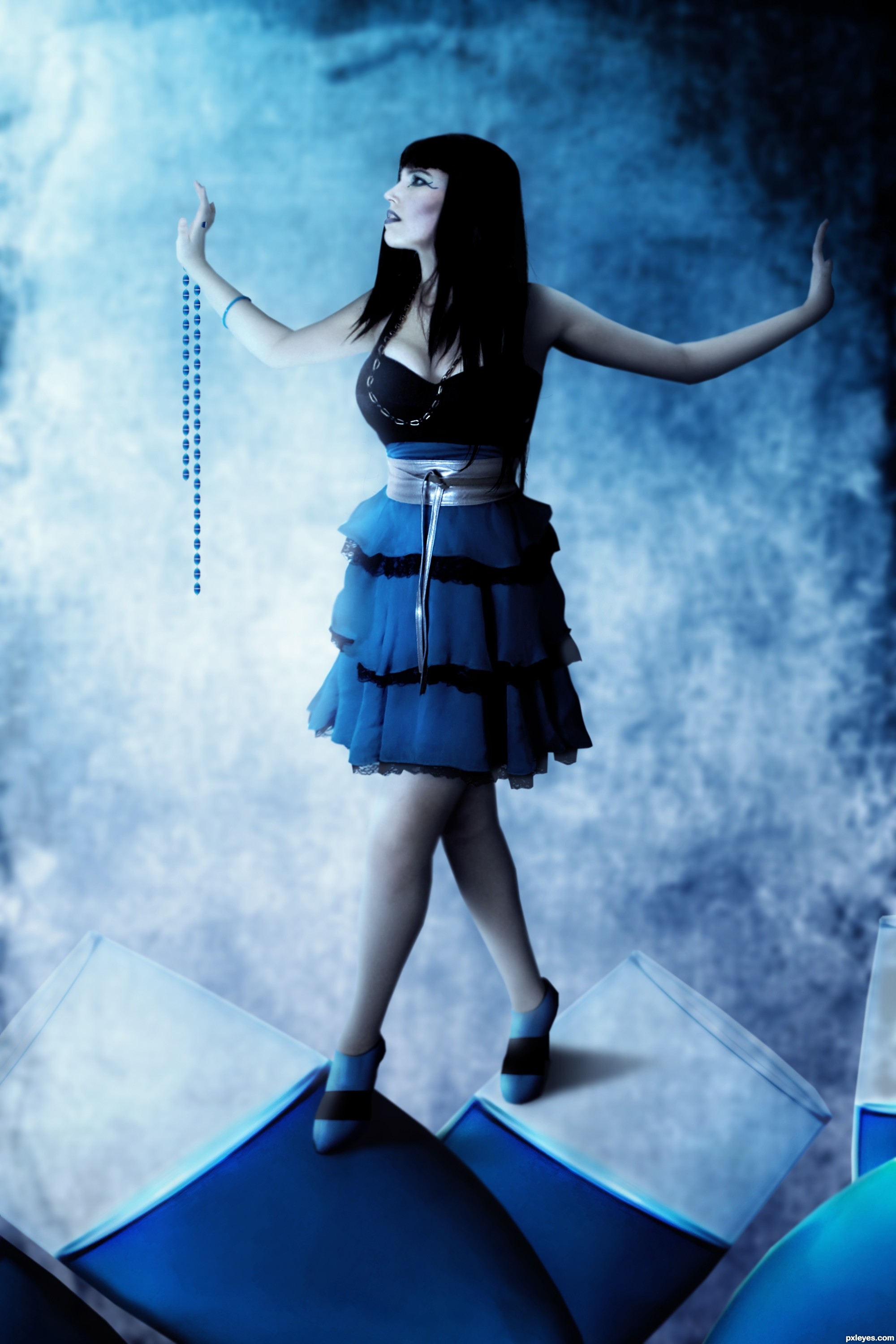
I saw all the subtle but wonderful textures and shinny parts of the helmet and decided to make some sort of robot woman. Everything is made from the helmet, minus the pieces of glass which is just used pen tool. I did use one source for the body position, but you can't actually see any of that actual picture in my finished product. (5 years and 3060 days ago)
Nice work, I like this !
love the body armor!!!
THANKS!!!!!
in hight rez is awsomeeeeeee
Thanks a lot!!!!! I try and be as detailed as possible, because a lot of entries look cool until you open them in high res and realize the blending and detail is actually lacking.
Great image, not sure you needed to source to produce it as its heavily painted ..... still a great image though, well done !
You have ideas that are worth to look at. Your entries are just good and well done. Good luck author.
Very creative and the sbs is so detailed
Wow, hi-res shows the detail of all that work on the seaming, great job, author!
thanks everyone! and Greexman, true it has a good amount of painting, but only adding shadows and highlights. Plus, if you looked at the highres I used the screw from the source a billion times! and the vizor is from the source, and the gun is all made of pieces of the source, basically I'm saying is sorta disagree, the picture would certainly not have turned out as it did without the source. But I'm glad you like it either way and I appreciate all the feed back
Congratulations for your first place.....!
Congrats!..Great job
Congratulations
Thanks everyone for voting so kindly
Howdie stranger!
If you want to rate this picture or participate in this contest, just:
LOGIN HERE or REGISTER FOR FREE
Photography and photoshop contests
We are a community of people with
a passion for photography, graphics and art in general.
Every day new photoshop
and photography contests are posted to compete in. We also have one weekly drawing contest
and one weekly 3D contest!
Participation is 100% free!
Just
register and get
started!
Good luck!
© 2015 Pxleyes.com. All rights reserved.


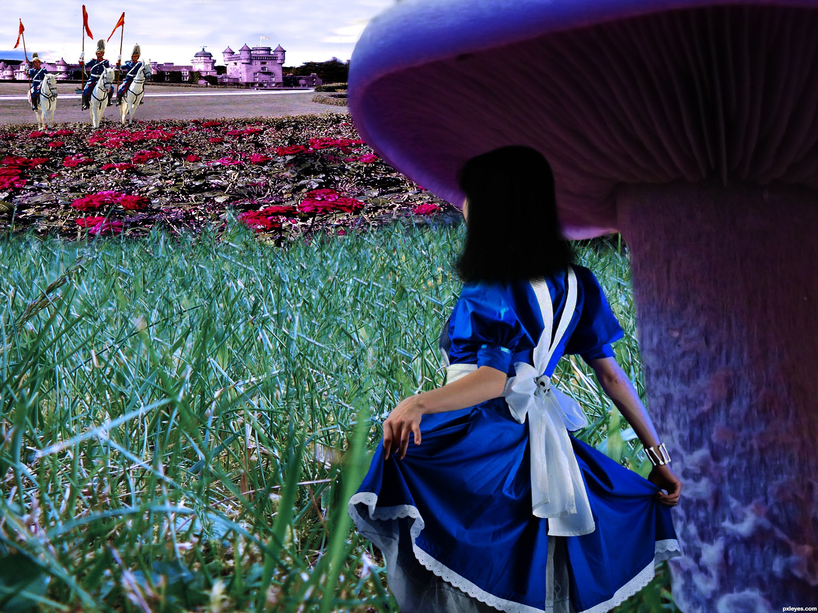
Nice idea. I think the perspective is too distorted. The castle has unreal height. The roses seem flat ( are stretched a little to much). This is only an oppinion. Good luck!
smooth brush it's bad don't use smooth brush while deleting backgrounds.
The hair looks too plain, you should increase the detail. Good luck.
this one had potential, but what was said before I'd only be repeating...
Howdie stranger!
If you want to rate this picture or participate in this contest, just:
LOGIN HERE or REGISTER FOR FREE