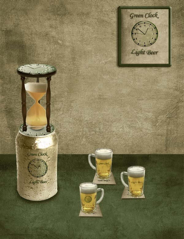
Simple techniques used here,lots of masking,warping and other simple stuff.If it's needed i will upload SBS but i think that is very obvious how is this deviations made.
is not left-handed-http://lindowyn-stock.deviantart.com/
engindeniz-http://www.sxc.hu/photo/1209277
Alessandro Paiva-http://www.sxc.hu/profile/Ale_Paiva
Resources + Images-http://euphoricdesire-stock.deviantart.com/
Thanks guys for the great resources... (5 years and 3682 days ago)
- 1: Hourglass
- 2: Beer in Hourglass
- 3: Beer Can
- 4: Textures
- 5: Beer cups




I think the perspective of the glasses doesn't match the can perspective. And the can label needs a little bit of curves...
Thank u Erikuri i made some changes...
Glasses are tiny compared to the can, and the perspectives are different on glasses, can & beer inside hourglass...
I think it needs more shadow work to really make it stand out. Shadows or contrast or something. It has some really nice flat textures happening in it which make it more illustrative feeling.
@CMYK u are right about the perspective,glasses are made with purpose that small or better to say,idea is that Can is big...@Ysayde u are right about shadowing...i made this at 5 a.m. so i am sure that i have a lots of mistakes...Thanks guys for advices...
Hey, friend, you can wake up early morning to photoshop!... Brave soldier! Ah, now mugs are better than glasses.

But, sorry if I annoy you... I still think that label - on mugs too - needs some roundness...
Howdie stranger!
If you want to rate this picture or participate in this contest, just:
LOGIN HERE or REGISTER FOR FREE