Create using layers of colours with masks to each layout. (5 years and 3454 days ago)
1 Source:
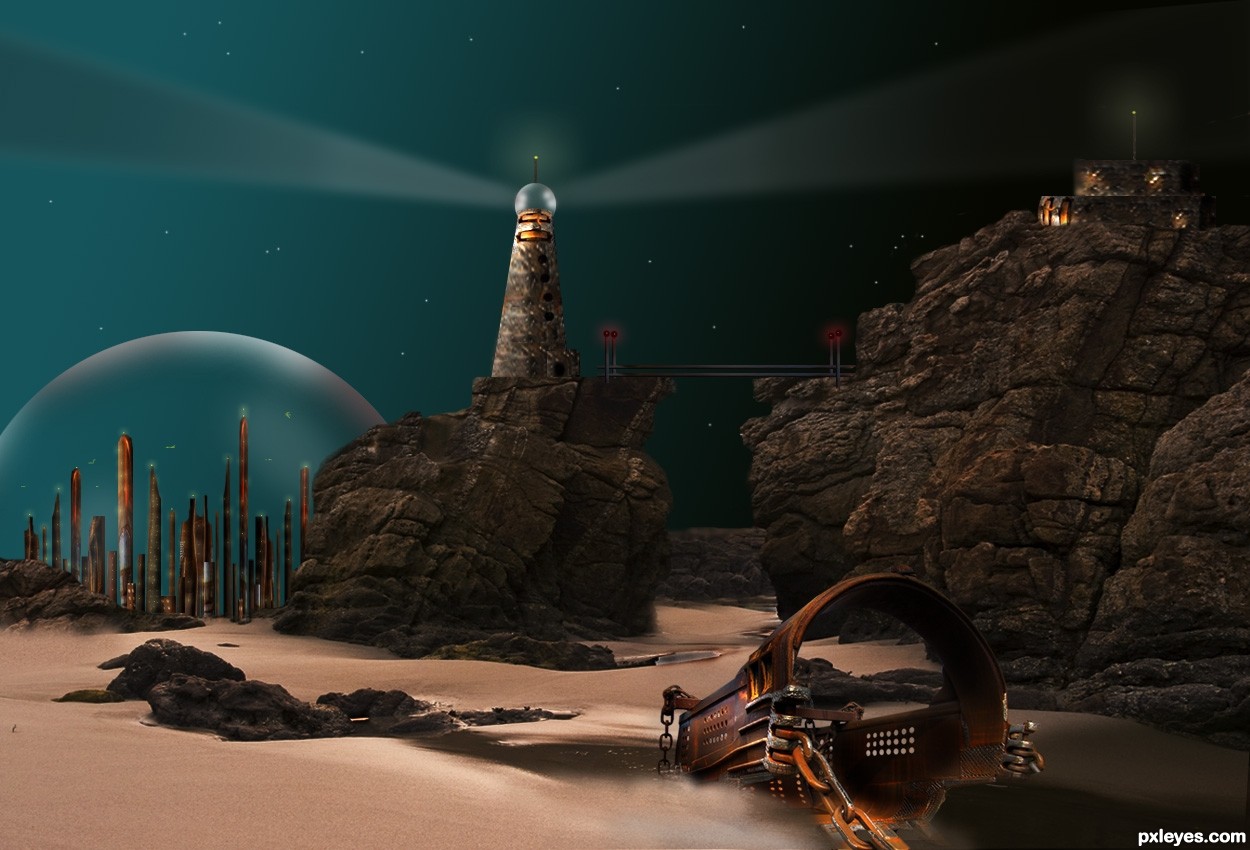
Not so good to create Sci-Fi creatures, but I love the Sci-Fi scenes, so I came out with this idea. Thanks to mqtrf for the pic of the rocks. The rest is imagination and hard work.
I used the source image to create the buildings.
UPDATE: Changes were made, due to suggestions. Made the rocks, background lighter to be seen. Flipped source image. As for the light source...this can be everywhere. There are moons, suns, or simple stars that reflect light from different directions. Just close your eyes and see. (5 years and 3521 days ago)
Too dark. It's very difficult to see all the effort you put into the background.
Also your light source is inconsistent. Something is shining on top of the dome, but on the side of the light house, yet not at all on the hard to discern rocks. Yet the source metal image is lit from the opposite side on the ground, and is throwing off a shadow in the direction of its light source...consistency is as important as making your image light enough to be seen.
Thanks so much MossyB. I did not realize that my image was that dark, it is my monitor, that sends me the wrong brightness... I made the rocks/background lighter, as for the source metal image, I flipped it. Hope the image looks better now.
Cool image, author, I like your buildings, the dome and use of the source on the other elements. However, the huge piece of the source looks like it was just kind of put into the image, and yes, the shadow is off. (They are so tricky and difficult to get, I know!) See the softness of the shadow from the rocks, and how it's very light - try to match that with the source's shadow - very light and blurred. Also, to 'ground' it, try erasing part of the lower side with a soft eraser, and it will look partially submerged in the sand. As far as the darkness now, it has a nice sci-fi feel. 
Better, but still too dark just right of the light house and just right of the source image. But overall it's MUCH easier to "read" and appreciate. The domed city especially looks good.
Pearlie, I gave the shadow a softer look, and sunked the metal source image a little into the sand.
MossyB: I lightened the right side of the lighthouse, just a little. I think it looks nicer. Thanks again.
I did not see this before but it looks great on my monitor now, lighting is dramatic and no longer too dark... a complex scene and difficult image to create. Good work!
brilliant....
Thank you for your comments.
very very nice work author...perspective is well made also mood is perfect...only thing that i would like to see on this image is a bit more stars on the sky...i know its now to late, but some nice nebula would be perfect for this...any how i love your entry author and wish u best of luck...
Thanks Eration...I will do the stars and the nebula...Planning to write a tut for this later.
This is really cool. I love the scenery and the colors and the details. Very creative idea.
Howdie stranger!
If you want to rate this picture or participate in this contest, just:
LOGIN HERE or REGISTER FOR FREE
squirrel stalker-http://queenselphie.deviantart.com/
Vee TEC-http://www.sxc.hu/profile/veetec
Stephanie and Gary B-http://itsallstock.deviantart.com/
Lars Sundstrom-http://www.sxc.hu/profile/sundstrom
peter hellebrand-http://www.sxc.hu/profile/phelle
inspbylife-http://www.flickr.com/photos/inspbylife/
Marcus J. Ranum-http://mjranum-stock.deviantart.com/
Julia Starr-http://www.sxc.hu/profile/night_fate
Thanks guys for the great resources
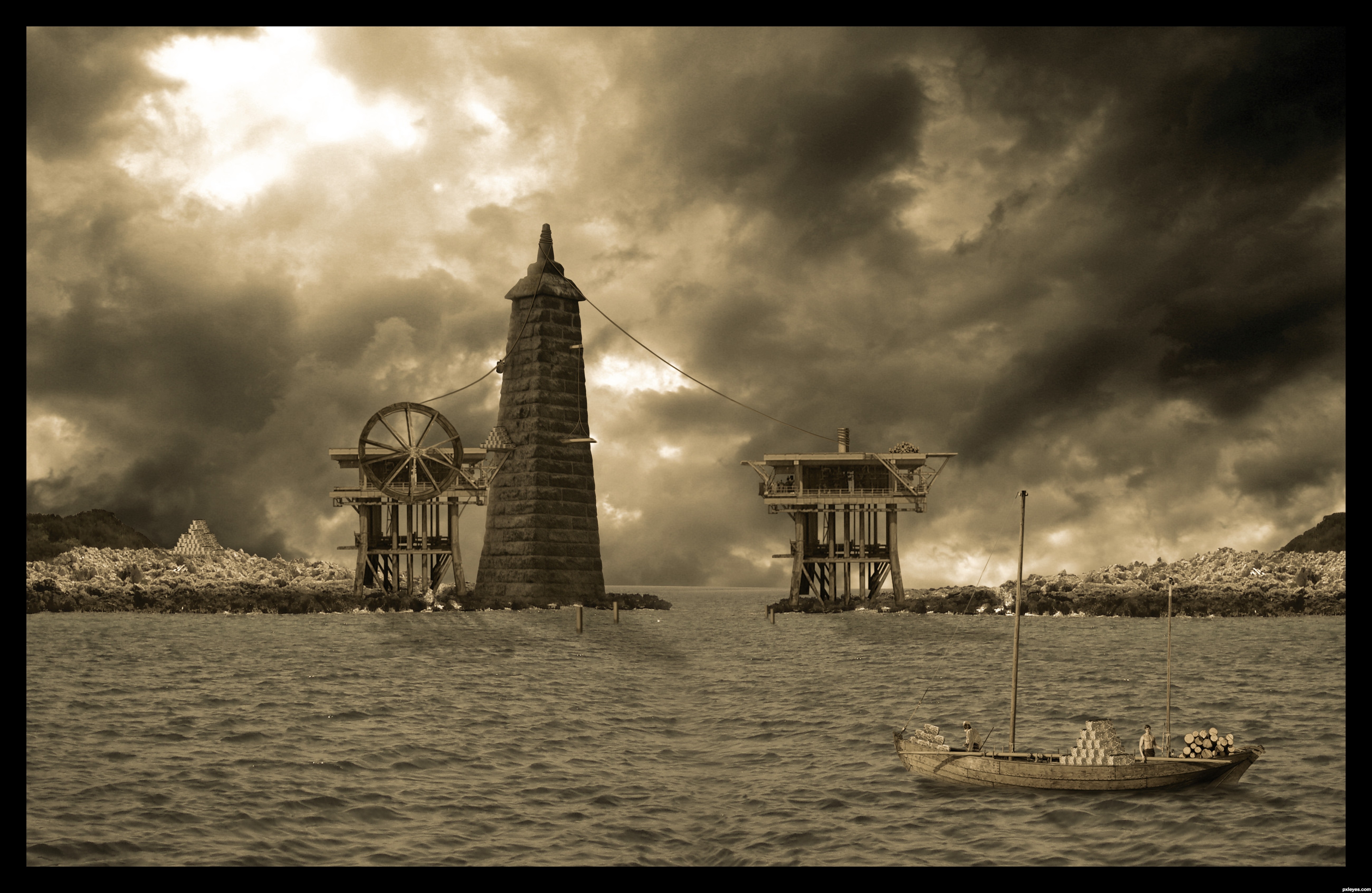
Please watch high resolution before voting,and
don't be afraid to use zoom tool,there is lots
details here...Thanks
(5 years and 3679 days ago)
Stunning!!!!!!
Great Job 
Awesome...
I know that sky . Great work !!
We can see here the construction has been a hard and slow work!
Nicely done, author! GL... 
Yes agrees with all comments and YES that's pretty much what I had in mind when I came up with this idea and you executed it perfectly. Well done and good luck! 
Author, this is quite possibly the best chop I've seen from you!
Thanks a lot,all of u guys...Jaw,this contest blows my mind,and i never had idea how hard is to revive something like this.I have few more ideas for this contest,but i am not sure do i have more courage to start with something like this...Any how,thanks Jaw for this contest,its a big challenge and i was enjoy every second while i was made Pharos...
I look forward to future entries if you do decide to enter more.
Nice mood. There are a few problems in high-res thought, perspective and sharpness are different of different objects. Is this a world famous monument btw?
U are maybe right about the perspective and sharpness issues Ressiv,but don't tell me that u did not hear for Lighthouse on Pharos,one of the 7 wonders of the ancient world?
Well I have to admit, I didn't know this famous Lighthouse! So thanks for pointing that out Those two buildings that hold the tower are the two biggest sharpness problems I think, they are very blurry. Maybe you could fix that in time? Also the casted shadows can be a lot darker, the light is pretty direct from behind the objects. It would spice things up Good Luck
Thanks for the constructive suggestion Ressiv,i made some changes...Thanks again...
You're right viewing in high res is a must. Very well blended.
@Kevinice...this comment of yours is very very incorrect...First of all,"off theme" if u could find some images that represents lighthouse from Pharos,u will see that lighthouse have to parts,on my image is only bottom one,part without light...Second,Pharos was surrounded by two islands near Alexandria,and was placed at the island,so,your comment about ground was is incorrect,again...For wood's maybe u are right but i suppose that in this world we have different sizes of wood.And to tell u the truth,its very rude to use my entry to talk about yours.I don't want to criticize u,only make a point...if u want to do something,try to do that good,do some research...
Very nice job and idea. This contest is a good one for sure.
Good luck Author
Nicely done, great entry!! good luck to you
Very well done. Beautiful entry.
congrats on 1st!!
CONGRATS!!!!!
Congrats for your first place, Erathion!
Congrats, lovely work
Congrats my friend, that's totally deserved
Great job and congratulations on a well deserved win.
Congrats for the 1st. place, Neb!
Congrats on first! Definitely was the best!
Howdie stranger!
If you want to rate this picture or participate in this contest, just:
LOGIN HERE or REGISTER FOR FREE
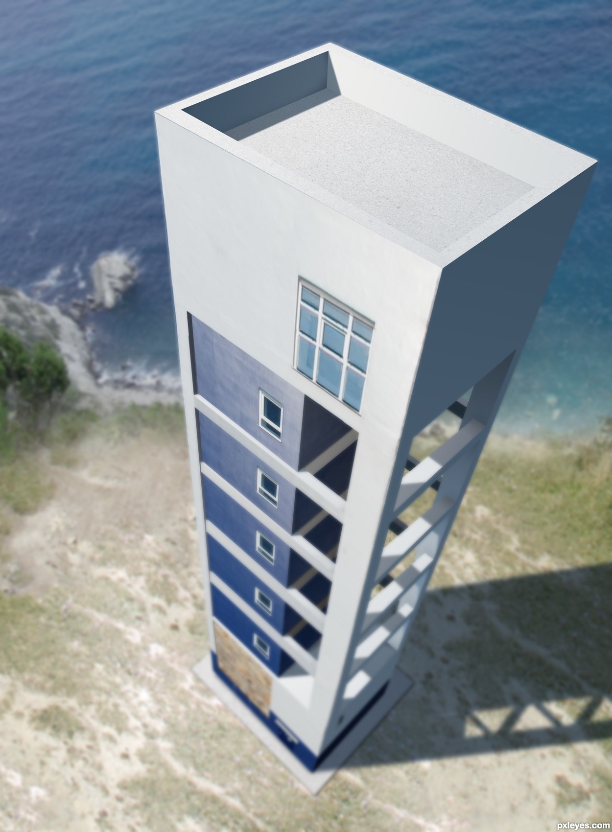
I thought I would look at the contest from another perspective than the rest of the contestants. So I just changed the whole thing.
Everything is done within Photoshop. To 3D program used, to vector or anything like that.
Unfortunately I didn't have the time to add the lighthouse light at the top - another time :)
Hope you like it, it's my first entry since the site change name from PST... (5 years and 3715 days ago)
A bit too much blur, but everything else is great!
PS: Good to see you're back, author!
Nice idea well done
-- PS welcome back wondered where you were hiding (LOL)
Yeah, I had my doubts about the blur. That's why I added the last step in SBS to show the details missing. But the high res wasn't made for full size viewing.
Looks like incredibly tedious work, author.. but an excellent idea and very well executed.
 That's a different point of view!...
And let's consider blur as a soft focus, or DOF... I like both versions!
@Erikuri:
It was supposed to be DOF...
And I meant:
No 3D program, vector or anything like that was used...
Great job author...its not bad that blur thing,gives some idea about how high is building...good luck
good idea
excellent!
Great perspective! I can never create such thing  When I saw your Step 1 just gave up, too mathematical, geometrical, logical etc, etc, for me
great job
Interesting idea and well done...GL
Super concept.
nice............... 
Congratulations for 1st, excellent.
Congrats for your first place, Lundmikkel!
Congrats Mikkel, terrific work
Congratulations on the first place, Lundmikkel!
::: CONGRATS :::
Congratulations! Looking at this, I think I learned one more way to do the things...
.......... congrats for the 1st place ..............
Congratulations!
congartulations!!!... for 1st place...
Congrats!!
Thanks a lot everybody. Nice to be back in the game.
Had this still been PhotoshopTalent it would have been my 6th 1st place in a row. So thanks for the nice votes
Congrats! for your winning. Great perspective work , Well deserve
Howdie stranger!
If you want to rate this picture or participate in this contest, just:
LOGIN HERE or REGISTER FOR FREE

I used this quote as a guide line
"A woman knows the face of the man she loves as a sailor knows the open sea".
Honore de Balzac
Jessica-http://faestock.deviantart.com/
Alana Smith-http://www.sxc.hu/profile/Alana12
Julia Starr-http://www.sxc.hu/profile/night_fate
Andrew Conn-http://www.sxc.hu/profile/andrewconn
Lavica-http://lavica-photoshop.deviantart.com/
Thanks guys for the great images that i used for this project...
(5 years and 3808 days ago)
This girl looked quite small, I think. But it's a good job. GL, author
The girl is very small, and the smallest crow should be a bit smaller. The lighthouse doesn;t seem to fit in too well to the background, perhaps a colour overlay above your image for blending? Good luck!
I think you should make the girl bigger..she looks tiny weeeny
Thanks guys,i made some corrections...girl is bigger not...or better to say taller....
Girl is too small, light is from the right, solighthouse should be flipped to match...
Thank u for the comment CMYK but i don't agree...girl is now regular size and light coming from both side and at right side of the lighthouse is big dark cloud who blocking the light....So i think that the lighting is ok...
this is pretty, in a creepy morbid way .. wives tale says 2 crows mean death....
This is pretty but dimensions are bit difficult to digest...
I think CMYK was right about the lighthouse.
Howdie stranger!
If you want to rate this picture or participate in this contest, just:
LOGIN HERE or REGISTER FOR FREE
Photography and photoshop contests
We are a community of people with
a passion for photography, graphics and art in general.
Every day new photoshop
and photography contests are posted to compete in. We also have one weekly drawing contest
and one weekly 3D contest!
Participation is 100% free!
Just
register and get
started!
Good luck!
© 2015 Pxleyes.com. All rights reserved.


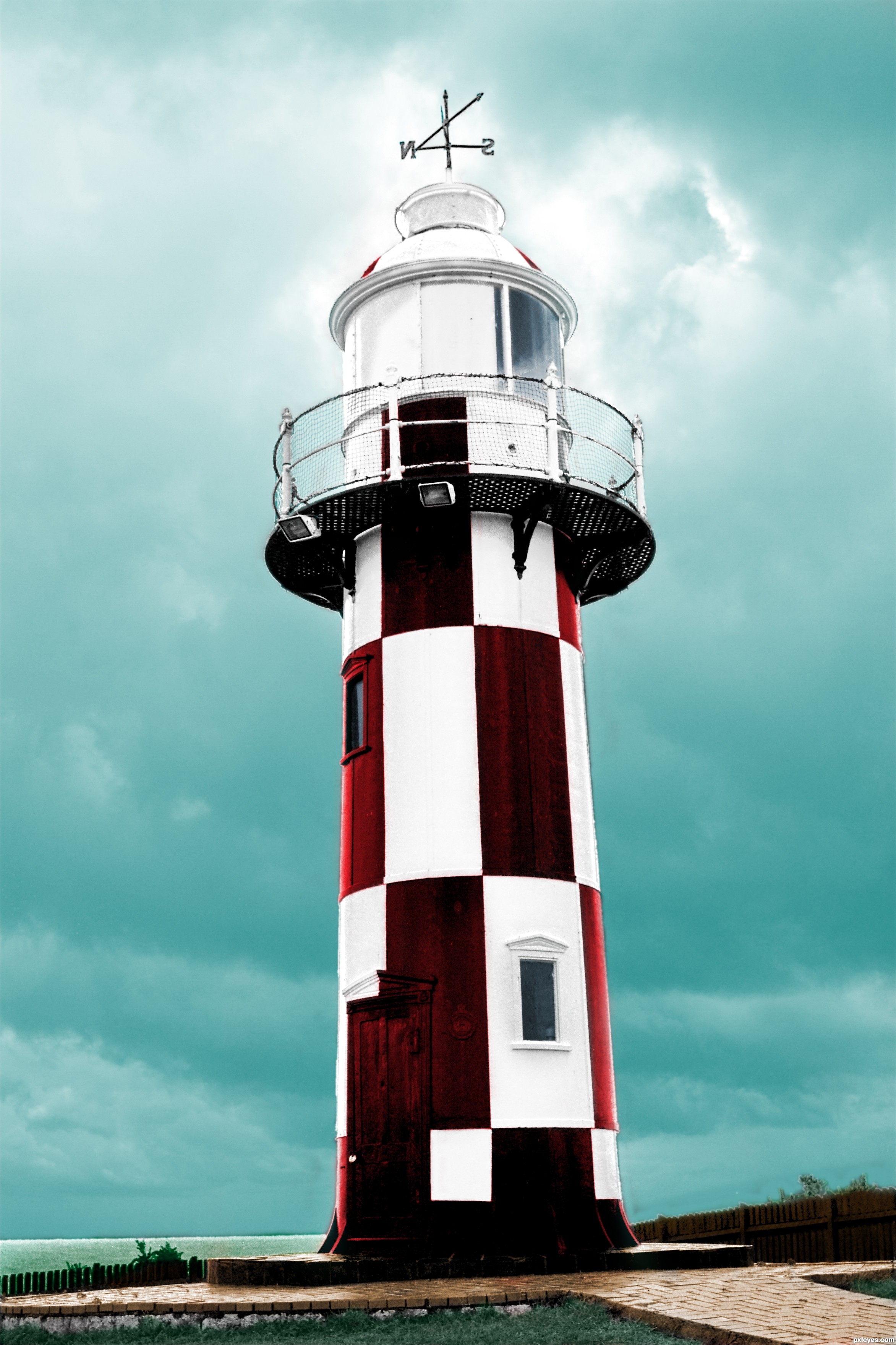
nice work on the light house.... only thing is the sky, those clouds seem a bit dark compared to the lightness of the rest of the image. Maybe do the clouds a softer blue
Agrees with Keiley22!
looking better author
Thanks for the comments. The lighter sky is defiantly a plus.
OH yeah. the color of the sky is a definite improvement.
i love how it compliments the color of red you chose.
nicely done!
Wow! Well done! I'm impressed! GL!
Howdie stranger!
If you want to rate this picture or participate in this contest, just:
LOGIN HERE or REGISTER FOR FREE