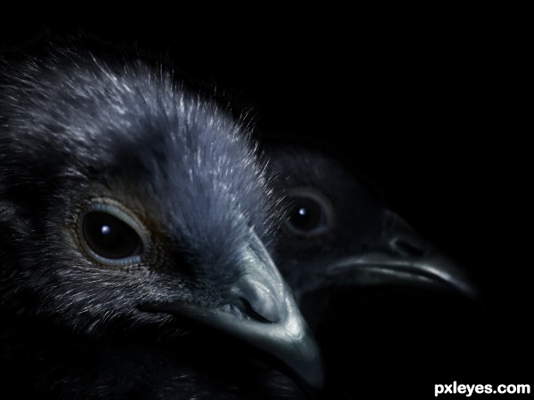
chicks transformation to crows
(5 years and 3182 days ago)
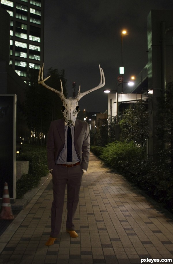
Headed home from a stag party... (5 years and 3192 days ago)
nice work
gl author
For some reason reminds me a bit of Donnie Darko  . Perhaps I'd make the guy's shadow a tiny bit darker and give the suite a little bit of yellow photofilter. If you want you can give the guy a tiny blur (you can experiment easier with it if you make a smart object from the head and body) and also add a layer (with blending overlay) with some tiny grain noise, so it fits better with the quality of the background photo. Good luck!
EDIT: good improvement imo 
Thank you so much for the suggestions, Waz! A bit of Film Grain really helped. I couldn't get the color filter to cooperate, but using Selective Color and adjusting the neutrals to have a bit more yellow and a bit less cyan seemed to do the trick.
This is looking great. I agree that the shadow of the man needs to be darker. Overall a nice creepy image. Love the description.
Not too shabby. Nice work.
great image, good luck!
Howdie stranger!
If you want to rate this picture or participate in this contest, just:
LOGIN HERE or REGISTER FOR FREE
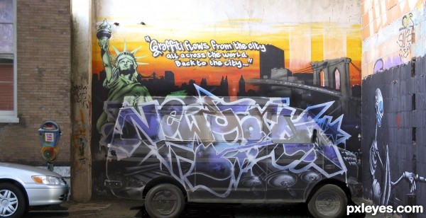
Title says it all
Van was given, used #5 (5 years and 3208 days ago)
nice man cool work
Author if you sharpen the outer edge of the van (and burn the back wall) it will give the van more density , it will make it look like a van is painted like the back wall
As it stands the Van looks like it's PART of the wall painting (not sure if that was your goal)
But it's a very clever and well done image.. (even the greatest Trompe l'Oeil has little give a ways... shadow being the biggest fouler)
Good LUCK though, fun image!!!
Was supposed to look hidden but I will try those suggestions ..I am still learning ...and this type of feed back is welcome
THnaks
Very creative to go beyond the confines of the van with your graffiti. But I think your intention of 'hidden van' (which you've achieved) is misguided. 'Blend in' would be more appropriate and realistic IMO, so instead of a ghost van (what this looks like), a clearly physical van parked in just the right place would be more compelling.
I appreciate your viewpoint but think you may have mis-read or limited your interpretation of the directions ."Use one of the provided van images and place graffiti on it"...when I read stand out, I read "make it different " and I believe I have achieved that ... thank you for your comment .as u are allowed to disagree 
I really like this one! I do kinda wish that the van was in more solid form. Nice job, author!
Howdie stranger!
If you want to rate this picture or participate in this contest, just:
LOGIN HERE or REGISTER FOR FREE
(5 years and 3212 days ago)
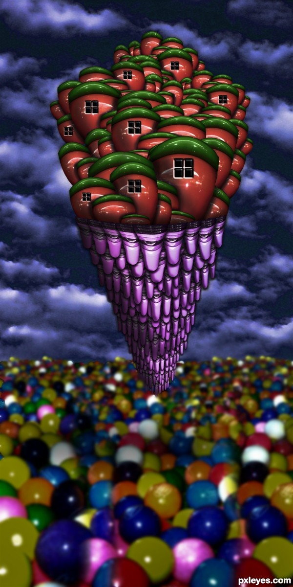
WOW tell me what you eat before doing this! LOL Now serius, that is imagination, nice!
@manelic, Chicken wings, in hot sauce, with handfuls of celery and gobs of Ranch Dressing (ran out of Blue Cheese) and beer (Corona with lime)
That's a menu!
Wow! I love m&m's...
Fantastico!
Creative take on this theme. 
Howdie stranger!
If you want to rate this picture or participate in this contest, just:
LOGIN HERE or REGISTER FOR FREE
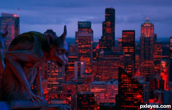
Thanks to claudmey for the gargoyle image.
used
match color
hue saturation
color balance
Brightness contrast
layers (5 years and 3212 days ago)
Great color! 
wonderful!
Cool, but I wish the gargoyle stood out more from the background (e.g., was more silhouettey).
Author, try using the dodge and burn tools to highlight and emphasis the gargoyle. It would make a distinct difference and bring the gargoyle more into the focal point.
thanks for the comments  really appreciated
  I had already dodged and burned the gargoyle statue

very nice mood, good luck!
Howdie stranger!
If you want to rate this picture or participate in this contest, just:
LOGIN HERE or REGISTER FOR FREE
Nice job. Nice feel to the coldness of this image.
Howdie stranger!
If you want to rate this picture or participate in this contest, just:
LOGIN HERE or REGISTER FOR FREE