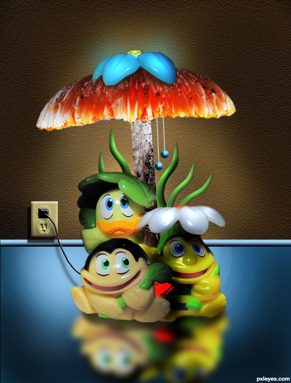
Thanks to mqtrf for the beautiful pic of the mushroom. The rest is just that....PS and lots of thinking. Please check SBS before voting. (5 years and 3354 days ago)
1 Source:
(5 years and 3361 days ago)
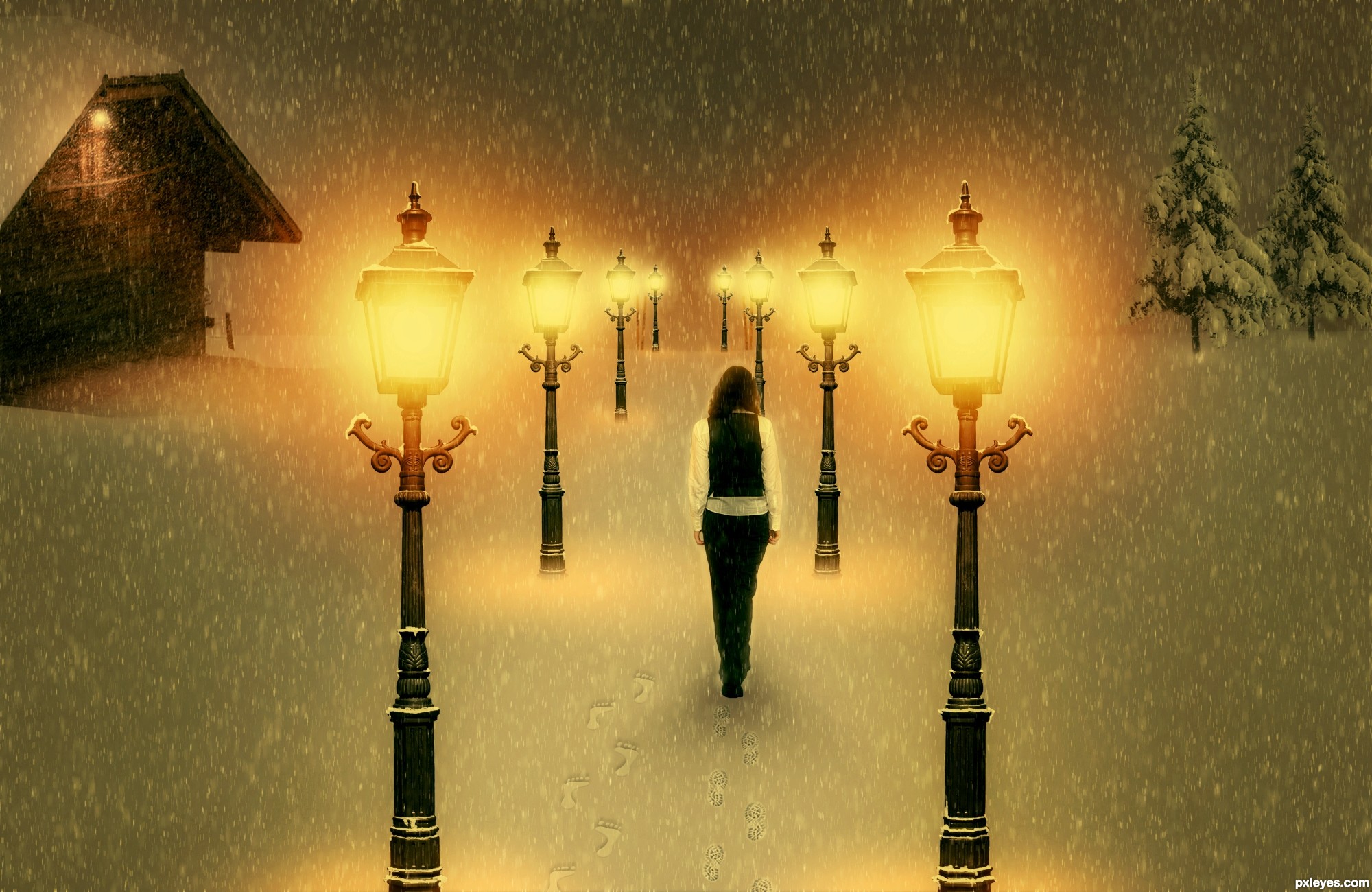
Very cool work author...IMHO she is a bit big compared with the rest of the image...also perspective of the laps is for few degrees wrong...try to fix that and this will be great...by the way great touch with adding foot steps in the snow...best of luck
She's way too big, and the perspective on the tops of the lamps is wrong. Good idea & mood, though.
Also, symmetry doesn't help this image, two identical buildings is a bit weird. Find one or some tries for one of the sides.
edit: I made changes. Thanks erathion, CMYK46 and greymnal for your useful suggestions. But I don't understand how can I make my lamps perspective better...tell me
well done!
From the angle at which the lamps are shot, I don't see what you can do about the perspective issue.
You could transform the lamps just a bit , so that those in the foreground appear bigger, but Make Sure you Don't split the image with them. Splitting image = failed composition.
Also make the far distance foggy, so that you can't perceive horizon, but just image it. Check works of ponti & arca if you don't understand what i mean. I usually do it with some scatter common brush on a layer which I gaussian blur. But internet has many tutorials, try them.
Last tip: since all your elements are vertical, image might be plain - try to tilt the snowfall, a few degrees.
You're doing good, and you're also the only guy with warm mood!
Howdie stranger!
If you want to rate this picture or participate in this contest, just:
LOGIN HERE or REGISTER FOR FREE
Hi
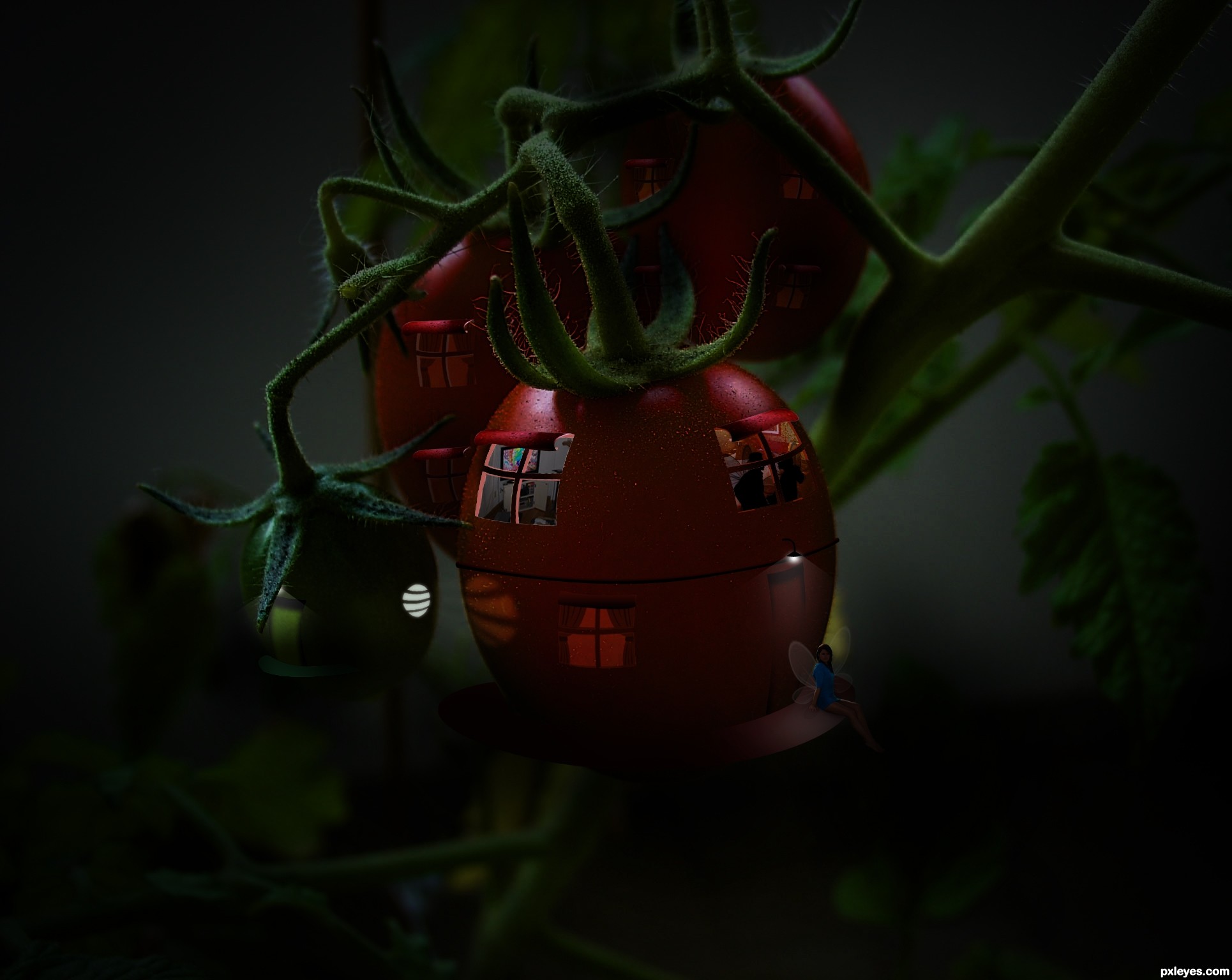
Hope u all like this.... Please have a look on Hires for details...
worked on a thought like, human being lives in tomato and can fly...
(5 years and 3391 days ago)
grt work!!
Thank you...
Great idea, i like it a lot. Just wish it were a tad brighter...but thats just me. Nice job
Beautiful!!! Should finish top 3 IMO 
Too dark! Can't see what's really going on.
i agree with mossy, maybe brighten it u a bit..i'll hold my vote
very very nice scene author...image is a bit to dark and i am sure that would be way effective if u create some cool lights...for example fire flights, lanterns and something like that....GL
i love the detail how the circle light reflects on the tomato
and yes it's a bit too dark
Thanking you all for the comments, and i made it little more brighter... thanks
Very nice and creative, enjoy the full image, change everything, and not change the main image at the same time, it is very difficult to achieve a result as cool as this guy keeping the original image. Congratulations!
thanx peter.....
Well made image, its tough to put light into an image that for realism has to be dark... best of luck 
Very cool in HR, I felt like a peeping Tom, lol.
thank u all
Howdie stranger!
If you want to rate this picture or participate in this contest, just:
LOGIN HERE or REGISTER FOR FREE
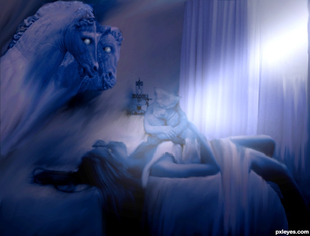
always wanted to do this photo by henry fuseli glad for this contest
thank you
sammydavisdog,gabriellaraujo@flickr and thanks to vclare@sxc.hu for the photos (5 years and 3392 days ago)
The image is a little flat, needs some work on highlights and contrast.
Great painting, yes. Your interpretation is nice too, maybe as ibmaxed said could have some more highlights. What bothers me a little bit is the composition, everything happens on the left side, in the right corner it's as good as empty. Rest space is important, but since too many things happen on the left side, I expect *something* too on the other.
You changed the position from the horses a bit compared to the painting, which shouldnt be a prob for being an inspiration. What I think works great in the painting is that the horse really deems up from the dark and faces the woman, while the woman tries to be as much as possible with her face to the other side. In your entry, it looks like (or how I see it) as if the horses are looking at the gargoyle, observing what it's doing with the poor woman. Perhaps you should reconsider the position of the horses, but I leave that up to you...
Ow, step 6 is can be nice too for being dreamy, though I would make it less liquified then.
Good luck!
I never thought I'd say it about an entry here, but too light...
The Fuseli image has the objects within "the dark of night." These are all placed within a quite bright and smudgy looking background...
I agree wholeheartledly with Woz, the "flow" of the composition is off. You image starts at the upper LH side with the horses, and runs diagonally down to the darkened RH corner, where the eye essentially "falls off."
The original has a more triangular flow, with the figure grounding the eye's movement, and the gargoyle bringing it back up towards the horse's head.
An interesting homage, tho.
added the curtians back to the picture and filtered in some light
played with the eyes a bit to
i am still learning..... lets see what you guys have to say now,
be kind guys im a novice
Why not imitate the original composition? Two horse heads? Woman & gargoyle facing the wrong way?
Great work at recreating a difficult image.
always loved the fact that he made several versions of his own creation.. adding to the mix is quite refreshing.. good luck author.. really enjoy your take on the subject
It was good, but I think you should try to give a bit more sharpness to the image! good luck!
Howdie stranger!
If you want to rate this picture or participate in this contest, just:
LOGIN HERE or REGISTER FOR FREE
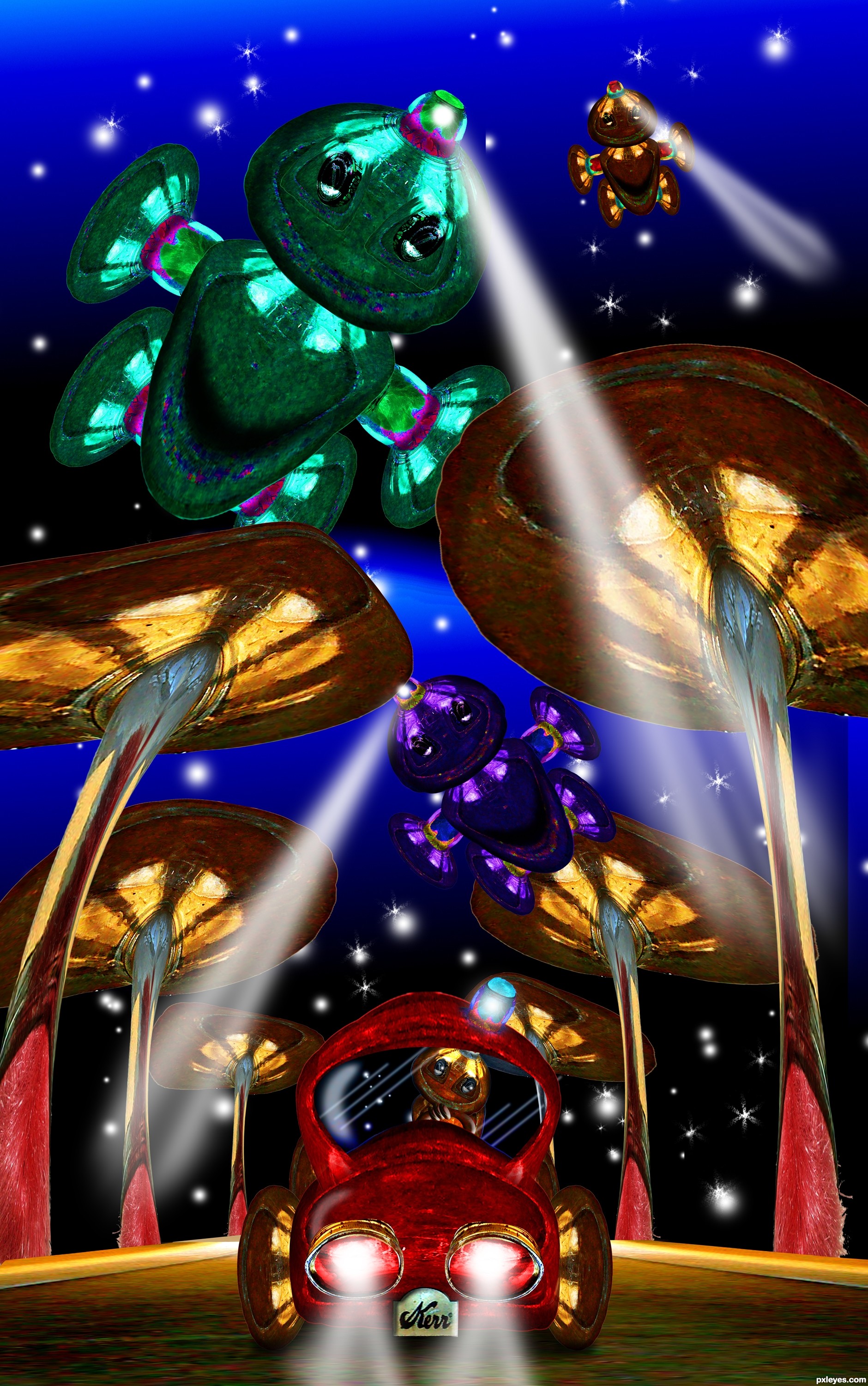
title change as per arca :) (5 years and 3410 days ago)
It's the new Kerr Kar-Kar!!! And it runs on moonbeams! And when the moon is not out the guys in the sky help out! What fun ... I can let my imagination run wild with this image! A whole storybook in one swell foop (or is that fell swoop)!

I'll go with Foop, or foopy or even Fwoopy waddle waddle
cute....as usual.... nice colors BTW... GL author.
Yes George, I am Cute, and the pic isn't bad either

Great work author...nice positive image...best of luck
Beautiful jewel-tone colors! Very imaginative and cute!
This is adorable, love the little Kar guy in the car, but especially those huge 'shrooms with the duster inside! Another kid's book candidate. 
Cute creation, this could totally be kids cartoon = )
Howdie stranger!
If you want to rate this picture or participate in this contest, just:
LOGIN HERE or REGISTER FOR FREE
Photography and photoshop contests
We are a community of people with
a passion for photography, graphics and art in general.
Every day new photoshop
and photography contests are posted to compete in. We also have one weekly drawing contest
and one weekly 3D contest!
Participation is 100% free!
Just
register and get
started!
Good luck!
© 2015 Pxleyes.com. All rights reserved.


Wonderfully done.
Thanks for comment.
YES!!!!
Thanks Drivenslush......!
Cute - great idea! That mushroom fits well.
Thanks pearlie...
Nice job, author. I do think that it would have helped this if the reflection had less visibility the further it got from the figures and more prominent at the base of each. Good job, nonetheless.
Fantastic work and so creative thinking...best of luck author
Cool!!!
Howdie stranger!
If you want to rate this picture or participate in this contest, just:
LOGIN HERE or REGISTER FOR FREE