(5 years and 3293 days ago)
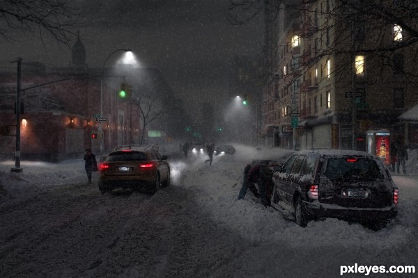
Only background source used (5 years and 3294 days ago)
This is really great, very good work.
nice work, would maybe soften some of the foreground figures...in hi res they look a little clean cut.... but still an excellent chop, well done 
Great! I could nitpick a few things, but I won't. It's a fine image...GL author! 
Nice work! 
Just perfect ! Good luck author !
Nice work
Well done, VERY convincing!
Really love it! And very good sbs!
Well done
I know this is not a comment, but tells pretty much what I mean  . Also good SBS
stunning, great work and great sbs! Good luck! 
Thank you everyone, for the comments and kind words!
Fantastic work author...really really great day to night transformation...well done, this is one of the best in the contest for now...best of luck author
YEEEEKK!! (very nice job) but still YEEEEK!! (thank god I live in Florida)
Really well done, I would have not even known this was a day shot to start with if I saw this pic elsewhere = )
Super
Great work. You have created a realistic and dynamic image. Lovely conversion and super final product! You are my hero (this week  )
)
Very nice result, you made the right mood with the right skills. Good luck!
Congrats Chalty  beautifully done
Congratulations ... great work!
Gorgeous , and very deserving of the win.
Congrats !
Congrats! Really nice image, Chalty.
Well deserved!
congrats
AWESOME! You did a great job! The source image is awesome in itself.
congratulations...
Congrats Chalty, you done good work.
Congrats!!
congratulations...
Congratulations!!
Congrats on the first place..
Howdie stranger!
If you want to rate this picture or participate in this contest, just:
LOGIN HERE or REGISTER FOR FREE
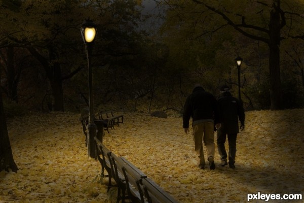
Thanks to Bizior for the use of the image. (5 years and 3295 days ago)
Too much yellow for a night scene...night would be more blue.
Too dark. All I can see is some yellow ground with a couple shadows walking on it. The lamp isn't illuminating very much...
Only a stronger light would cover that much ground and cast that shadow. Yelow is fine for incandescent light, the fringe of the image should be cooler or neutral...simple rule... light = color...less light, less color....if you want a realistic look. Should have a strong set shad at the base of the feet casting off gradually. This image has a ton of potential..nice effort....whoever you are...i'll vote now.
I agree ... this is a lovely effort and definitely moving in the right direction!!!
Could desaturate it some or give it a more "night" colour (blues & purples work well for night). Except where the lamp is (as Stowsk mentioned) the lamp is fine casting a soft yellow glow.
Other than that I will leave the shadow comments to those with more skill in that area ... I think you are getting pretty close (but as I have said before, shadows are not my strong point).
Overall this is looking to be a very lovely image ... I think I will wait to vote as I think this image could get better and better! 
Thanks for all the nice comets. In the source photo there is a lot of yellow and the absents of light will not turn it blue or purple. The lights in my rendition are gas like at my home and do cast yellow on yellow leaves. Yes it is dark but there is no moon and night is dark. Sorry all of you don’t like it but it was fun doing it anyway.
There is a very old song by the Moody Blues, "Nights in White Satin" with the lyrics:
"Cold-hearted orb rules the night,
Removes the colors from our sight.
Red is grey and yellow, white,
And we decide which is right,
And which is an illusion... "
Your lightening of the ambient light has improved this quite a bit, lifting it from the ubiquitous black void so popular in too many entries.
everything is dark! where's the logic?
ShiZa Averroes defined logic as "the tool for distinguishing between the true and the false". So if its night it is most likely dark.
So true about what you have said MossyB. The art is in the eye of who creates it not the possibility of a buyer. Real art has no price because it belongs to the creator. Ask that to the Admins on here . They are so busy looking for copy rights. I do this for fun thats it.
You're the author, whatever you think looks right for your creation is all that matters. The suggestions given are meant to improve your work based on the realism of the piece. You commented "In the source photo there is a lot of yellow and the absents of light will not turn it blue or purple." Actually if you look at the visible spectrum: http://en.wikipedia.org/wiki/Visible_spectrum , you'll notice the chart of spectral colors. At the top are violet, blue and cyan. These are high frequency low wavelength colors, the lower frequency higher wavelength colors are less visible when there is less light so in reality even a bright yellow flower will lose its color when the amount of light is reduced.
I don't understand your comment "Ask that to the Admins on here . They are so busy looking for copy rights. I do this for fun thats it." What does Administration have to do with your entry or any comments made. Moderators look for copyrights and see that rules are followed among other responsibilities as well as assisting members with problems. Apparently we even comment on entries (I just did), so what's the problem?
spaceranger you took what I said out of context. "Real art has no price because it belongs to the creator." What I said was not about the Moderators doing there job they should.
I still don't understand what your comment means within context or without. Ask What of the Admins? Your statement makes no sense, MossyB didn't ask a question only made a nicely poetic statement and complimented your work. So I ask again what do you mean by :"Ask that to the Admins on here . They are so busy looking for copy rights. I do this for fun thats it."
spaceranger take the source pic of mine and do all the different ways of darking it and see if you get blues or purples. As far as the Mods jobs I don't have a problem with it you just don't understand what I said. Mabey I will paint you a picture in Paint.
Howdie stranger!
If you want to rate this picture or participate in this contest, just:
LOGIN HERE or REGISTER FOR FREE
(5 years and 3295 days ago)
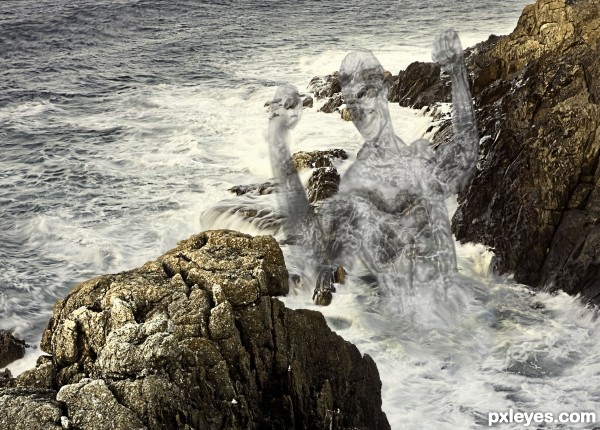
You might want to post a step-by-step, or a link to the transparency tutorial.
No tutorial to refer to,its just a simple plastic wrap with the hue and saturation adjustment.And some blur around the edges,real simple no tutorial needed.I like working things out for myself,more fun than following tutorials.Thx for your comment.
the effect you wanted to create dont works in my eyes!
Very very nice piece author...@what is with u ShiZa do u have somethings nice to say about others work...if u want to gave critique then give creative advice how to author fix his work...now u just trashing others work and that is not good start here...best of luck author
Maybe we have different views on what effect we want?Difficult to say,besause you only give a negativie comment,without anything else.Thx Erathion appreciate the positive comment,it really helps to encourage people to enter again.
I like what you've tried to achieve and I like your idea. Good luck 
Interesting concept and results.
Howdie stranger!
If you want to rate this picture or participate in this contest, just:
LOGIN HERE or REGISTER FOR FREE
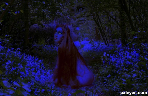
The girl is my photo and the background is Blackdown Hill 1 - Stock
by *GothicBohemianStock
The cat was provided by pxleyes.
I started this earlier in the week and got interupted by a vacation. I finished it late lastnight. The SBS is animated because thats the easiest/quickest way to do it if your in a time crunch.
All the coloring on the girl was done my me. (5 years and 3296 days ago)
Very good work. As dark as this is, you have the contrast high enough that the image is visible, not just a sea of black with some vague shapes. That alone makes this above many other works...Really nice job!
I like this! I almost think it would be even more effective if the outer areas weren't so saturated and gradually got to where it is on the woman. Just a thought. Great job.
Like this to. Though the girl is a little to much in the middle composition wise.
I agree with all the above ... and nice work!
Agreed!
It really hard to see this. I think you made it too dark. I had to go to your SBS, just to find out where you used the source.
Howdie stranger!
If you want to rate this picture or participate in this contest, just:
LOGIN HERE or REGISTER FOR FREE
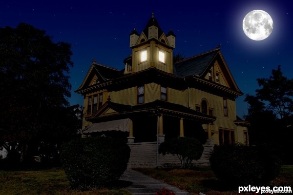
Nice job, the only thing I would suggest would be to desaturate the house a little more. The yellow is still quite vivid, and it wouldnt be this bright in low light.
Interesting work author...gl
What happened to the lights in step 6? I kinda preferred them, but maybe you had a reason for changing them. Good luck!
good work
thanks
I'm sorry that my comment come too late, but the side of the house standing opposite of the moon should be much darker...
Howdie stranger!
If you want to rate this picture or participate in this contest, just:
LOGIN HERE or REGISTER FOR FREE