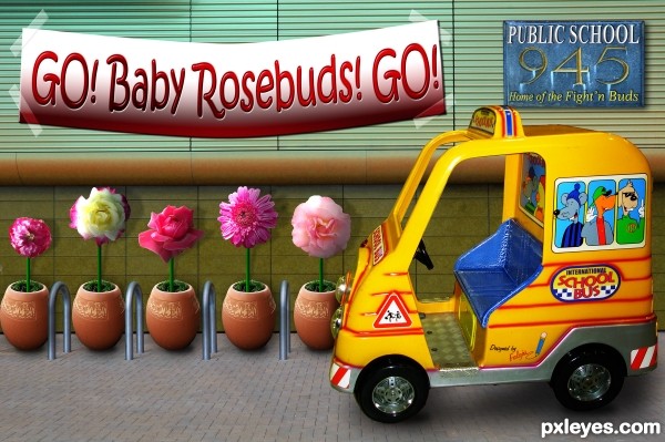
source and my photos (5 years and 3305 days ago)
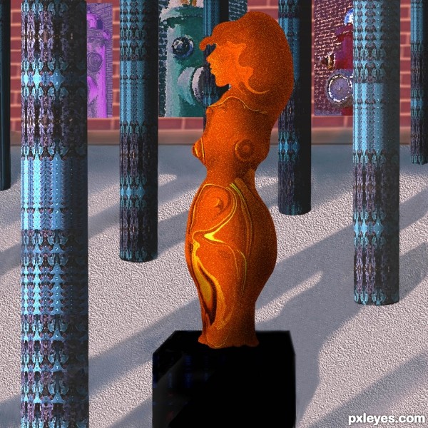
Sculpture, columns, background all made from the source. No outside sources used. Please see detailed SBS. (5 years and 3315 days ago)
Smart idea, it would have looked far better with more time invested by:
-arranging the composition so it would be a simmetrical perspective vs the assimmetrical statue.
-Insisting on highlights of the sculpture like the light was comming from above, vs a general light from the left.
- columns having a base.
- color pallete including complementaries : blue vs orange statue, or red vs green columns.
I'm sure you already know all these, that's why i wish you had more time.
I see you edited the color, nice 
Nice work.. Good luck..
nice work...gl
Howdie stranger!
If you want to rate this picture or participate in this contest, just:
LOGIN HERE or REGISTER FOR FREE
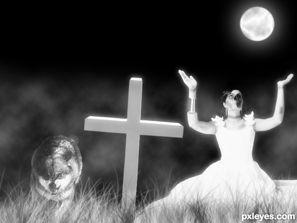
Thanks to:
- aidasonne, juanjo tugores, Saniphoto and Friedrich Hartl @ Photoxpress. (5 years and 3326 days ago)
excellent creation.. very impressed!!!! more More MORE!!!!!
I changed the sources at the request of Mods...
very different then the original.. but still very good  good luck author
Thanks, Ernie. It was the best I could do...
Awesome!!
need more realism, try work the perspective and lights....GL
@petersheep: no more time... 
Very very good work author...Realism is not needed here,this is very good piece...well done author
Howdie stranger!
If you want to rate this picture or participate in this contest, just:
LOGIN HERE or REGISTER FOR FREE
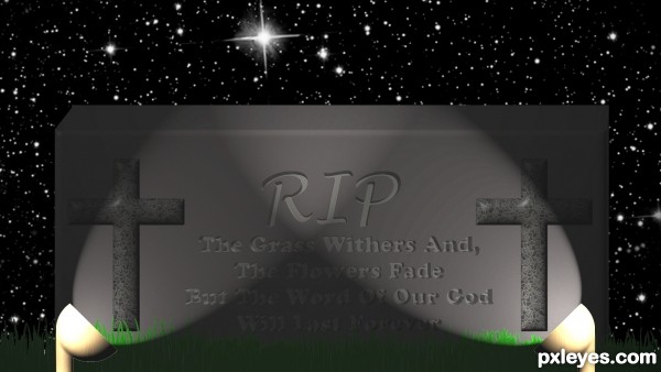
On a little adventure in the cemetary at night time. Used the sources mentioned. The lights are custom. (5 years and 3331 days ago)
cool work author..nice humor...gl
Howdie stranger!
If you want to rate this picture or participate in this contest, just:
LOGIN HERE or REGISTER FOR FREE
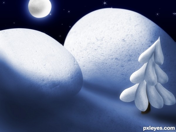
A winter's night that is :) (5 years and 3348 days ago)
The hills are made from the front stones, the moon is made from the back stone and so is the tree. The rest is brush work and burning and dodging. Please leave comments  Happy Holidays!
YOU SHOUL ADD THIS ENTRY TO CHRISTMAS THEME CONTEST! VERY NICE!
YOU SHOUL ADD THIS ENTRY TO CHRISTMAS THEME CONTEST! VERY NICE!
Thank you  I think it's too late now, besides, I don't know if I can have the same entry in 2 different contests. But, thanx, and Merry Christmas!
Beautiful!  Merry Christmas, Author!
Fantastic entry, great time for making this entry...well done
Thank you very much for the comments!
Congrats!
Congrats...
Congratulations!!
Congrats!!
Howdie stranger!
If you want to rate this picture or participate in this contest, just:
LOGIN HERE or REGISTER FOR FREE
lovely work... GL ........
Very Funny and flashy !
That is SO cute! Well done, author. Love the little kid's bus. And my, what a beautiful garden of flowers you have.
Super cute work...gl author
hahaha.. congrats....
Howdie stranger!
If you want to rate this picture or participate in this contest, just:
LOGIN HERE or REGISTER FOR FREE