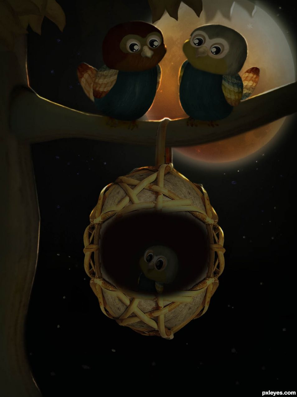
(5 years and 1455 days ago)
- 1: Moon
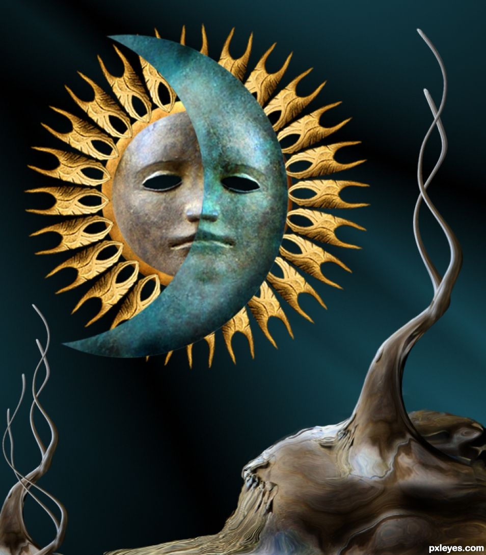
Just source used to make this entry. (5 years and 1671 days ago)
Nicely done.
Thanks.....
Love the trees/twigs
Just one suggestion, maybe a little burn and shaping to the moon back shape to make it more 3D like the sun rays? Just a suggestion, if the moon was more 3D you could soft brush the edges of the moon face to melt into the back moon shape. JUST A SUGGESTION... it's fine just the way it is, I'm just looking at it and my eye immediately runs around the half moon face plopped on top of the moon shape... it's a very strong focal point, that could be what you were trying for so who knows  IMHO of course.
I did some changes, like you said, it needed some burning. I did not soft the edges as they look good to me. but your comment any way, very helpful....
It's a whole new look... SPECTACULAR... Really blends well now.. I look at the whole image now, not just the moon face...EXCELLENT. Wonderful Blend and Balance. Side note...I used to sell giant Sun/Moon wall sculptures my bosses used to hand carry back from South America/Mexico (they were over four feet tall 3D Monsters) and this image would have fit right in with them. Beautiful.
Thanks Driven... my friend from Mexico brought me the wall sculptures of a moon and a sun like you say, and I got the idea by looking at them..
That blending and burning took this from an image I kinda skimmed past, to one of my favorites in the challenge. Awesome author!
Thanks my friend.... comment appreciated.
Good work, congrats!
Well, thanks... we did good...
Congrats 
Same to you... we did good....
Congrats George!!
Thanks my friend....
Congrats George.
Thanks I appreciate your comment.
Howdie stranger!
If you want to rate this picture or participate in this contest, just:
LOGIN HERE or REGISTER FOR FREE
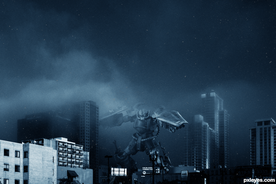
First submission. I had fun putting this together. (5 years and 1685 days ago)
Welcome to Pxleyes! Nice first entry, glad you had fun that's what it's all about! Looks good. I think the dust works but maybe it would be better without the hairs, just my opinion still a nice image. 
I went back and forth a half dozen times on that. And still think maybe the dust/hair layer needs to be toned down a bit.
I thought the dust made sense as it looks like debris but the hair didn't look right for me unless you wanted it to look like an old photo but I'm not sure that works. That's just how I see it.
As a first entry, this is SPECTACULAR. While I can see what you were going for with the texture, it confuses the focus because when viewing the image, I tend to flash to the hairs and debris and not the image. I think that's what Spaceranger is talking about. Good luck and toning back the debris would be a great fix on an already great chop 
WOO HOO.. much improved author! GREAT!
Thanks! The input us greatly appreciated.

Congrats..........
Fantastic job... CONGRATS!!!
Thanks everyone! 2nd on my first submission! Im honored.
Congrats for your first shot! 
congrats 
Congrats!!
Howdie stranger!
If you want to rate this picture or participate in this contest, just:
LOGIN HERE or REGISTER FOR FREE
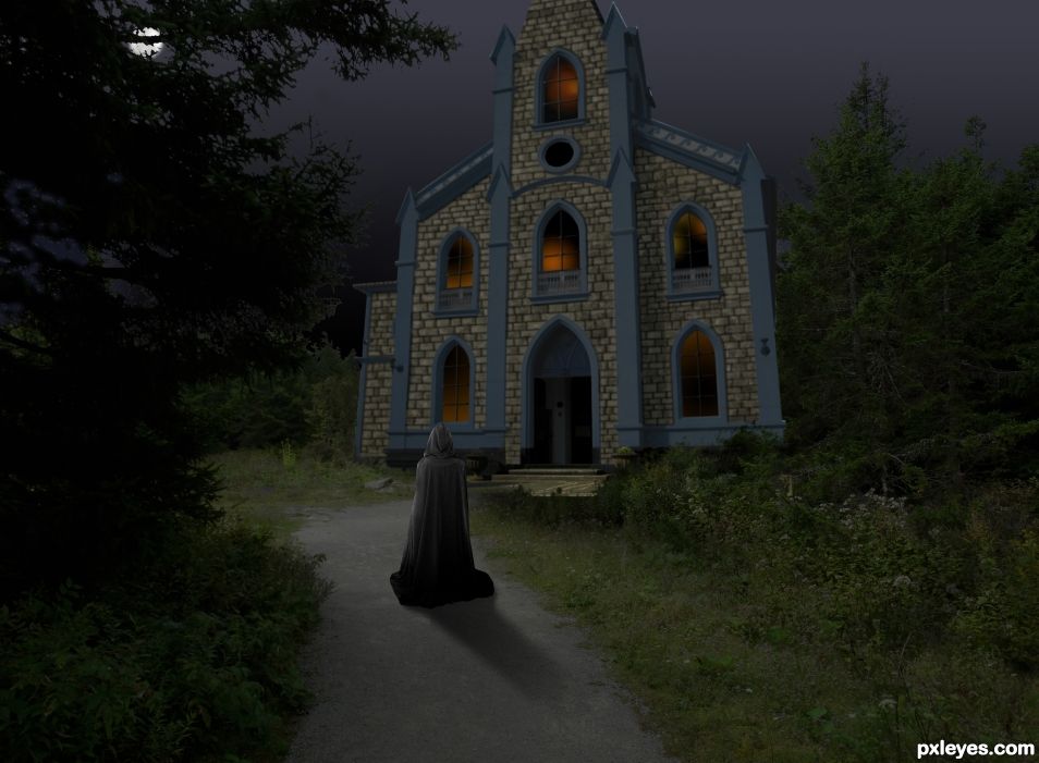
Okay. I'm done. I decided to submit before I made yet more changes. I will never be happy with this, so here it is! I had torches on the building at one point and realized it changed the entire lighting dynamic, so I killed that idea. I had fog too. Didn't like it.
the background photo is mine. I am linking the moon, figure, and tombstones shortly. (5 years and 1712 days ago)
I see from your SBS a lot of work was done but I think the final image is too dark to appreciate the details (and I'm using a 27" high res monitor). You could brighten it up a bit and still maintain the drama.
Well Spaceranger, I did lighten this. LOL, you wouldn't believe how many versions I have. I lost a lot of stone detail dropping it into my photo. I also had tombstones that I spent a long time shading for the environment, and then i lost my link and spent over an hour trying to search it. I finally said %$#@ it. I really like my torches, but they required extensive highlight changes on the building trim, so I nixed that too. I can't say it hasn't been fun!
I know what you mean, I do the same thing, trying all kinds of versions of my image. This looks much better, we can see the details and it's still dramatic. Too bad about the tombstones, I assume you tried searching your history. Even without the tombstones this deserves a good score IMHO.
I accidentally deleted my history at work yesterday. It was a circus of calamities with this thing. When I resubmitted this morning I realized part of a layer was left visible in my revision that looked like amateur hacking.
This looks much better than the original dark version. But the moon is gone, I don't know if that was intentional or not 
Geez! Tripped up by rushing again. I'm putting the moon back! Thanks!
Yeah. I like this image better, the lighting looks good. Good luck!
Sooper Moody! Love it 
You did a good job.... congratulations for 4th....
Howdie stranger!
If you want to rate this picture or participate in this contest, just:
LOGIN HERE or REGISTER FOR FREE
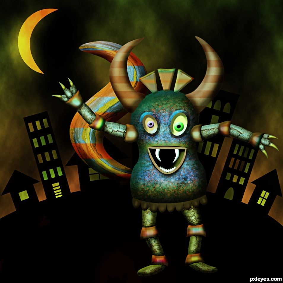
(5 years and 1720 days ago)
I WANT ONE!!!
funny monster 
Good creation... looks funny....
Howdie stranger!
If you want to rate this picture or participate in this contest, just:
LOGIN HERE or REGISTER FOR FREE
So sweet!
congrats!
Thanks
Congratulations...
Thank you
Congrats!
thank you
Congrats!
Thanks Oana. I believe you are new back too. Welcome back
It's good to be back! Thanks!
Howdie stranger!
If you want to rate this picture or participate in this contest, just:
LOGIN HERE or REGISTER FOR FREE