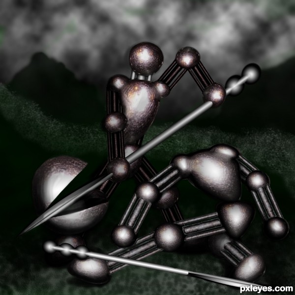
dual till the end (5 years and 3421 days ago)
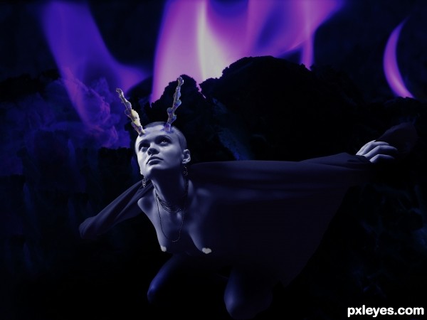
(5 years and 3435 days ago)
Great title! Would have been better represented with a bit more snow/frost/ice elsehwhere in the image, and less inky blackness at the bottom, but it's a very creative concept.
Agreed MossyB; I envisioned a light dusting on her robe and some ice sickle "flames" near her legs. Time on the edit system ran out, so this is what I got 
Glad you enjoyed it, hope it inspires more entries...
Congrats!!
congratulations...
Thank you
Howdie stranger!
If you want to rate this picture or participate in this contest, just:
LOGIN HERE or REGISTER FOR FREE
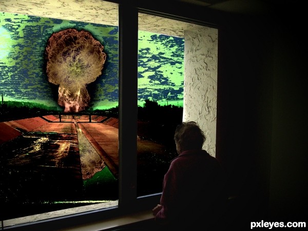
(5 years and 3477 days ago)
Good concept. The black outline around the explosion detracts from the impact of the image IMHO. It should be a glow.
Try to fix your link so it leads to the brush or brushes actually used.
Story:
"The old man was looking through the window and he was seeing..nothing, cause he was already blinded by the flash explosion a few seconds ago." 
Imo, windows would be broken from the exp. at that range - but anyways, i like the concept- imagine staring at an incoming tsunami.
agrees to greyval.. hahaha lol 
very very nice work author...reminds me on inevitable...Val's plot gives depth to your creation author...best of luck
It's a creepy story... and mankind is not far from there if we continue acting against life.
Looks like you color inverted the window part ?
Hmm not sure if it helps the image but anyway good luck  !
!

Howdie stranger!
If you want to rate this picture or participate in this contest, just:
LOGIN HERE or REGISTER FOR FREE
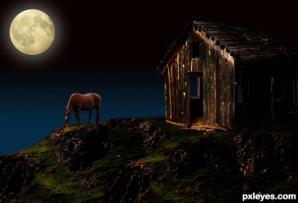
Thanks to mqtrf, for the pic of the horse, to mymy, for the pic of the moon and to Lelaina, for the pic of the hills. The rest is PS. (5 years and 3529 days ago)
Hey, I like this. Very nice job here. Congrats
very nice! I love the tones in this and the lighting. Works really well!!! 
Thanks for your comments.....
props are well chosen and set author...
but i feel, the night makes the objects more
desaturated and moves towards blueshish tones...
that is if you are tending towards reality....
Thanks closedeyes, you are right, I thought of using blue tones at the beginning, but then, I decided to leave it as it is. It is late for changes, but I will do something similar in the future, using your advise.
nice result author...best of luck
Howdie stranger!
If you want to rate this picture or participate in this contest, just:
LOGIN HERE or REGISTER FOR FREE
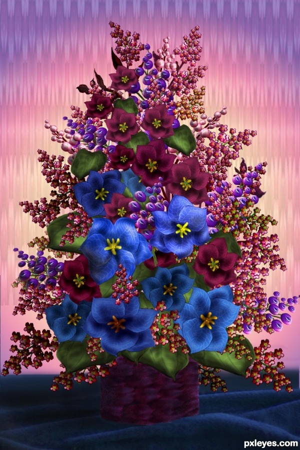
You would, indeed, feel like crying if someone gave you this arrangement - it is full of onions from the background and container, to all the flowers. With a close look, you will also see all the little onions that were used in the pearl-like decorations among the flowers. Hope you enjoy - but don't cry! There are no outside sources except for my own photo of fabric folds under the container. Please see my SBS (It was a lot of work, too) (5 years and 3602 days ago)
very very nice work author...best of luck
Crying only for gladness! This is really wonderful, my eyes are almost full of tears! Don't worry, it's not the onions... it's for a so beautiful image! 
wowwwwwww......... good luck !!
very nice
Wonderfully detailed original work
very awesome work!
Looks like you've got a good formula going here. 
And also congrats for a first place!
Lois, congrats again! 
Congrats Artgirl  I'd love the flowers in my place
hi, again.....congrats again........
Thanks all!
Congrats! for 1st 

Congrats
Congrats...
Congrats! 
Congrats!! Just lovely!
Very well done, congrats on your win!
Howdie stranger!
If you want to rate this picture or participate in this contest, just:
LOGIN HERE or REGISTER FOR FREE
It's too dark. The viewer cannot easily make out what your focal point is, or how it relates to the title. Bring up the lighting so it's a full image, not just some light spots.
k, i tried to lighting it up some and put a litle green in the back to contrast the red...
Better, although still a bit too dark to tell much of a "story." The green does a good job of helping the color contrast, which improves the overall composition. Good luck!
Thanks - one of these days I may figure out photoshop
Howdie stranger!
If you want to rate this picture or participate in this contest, just:
LOGIN HERE or REGISTER FOR FREE