(5 years and 303 days ago)
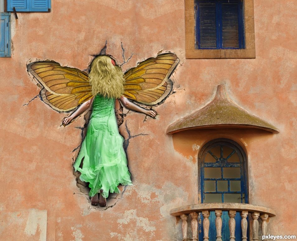
Tinkerbell, Wendy Darling, and Captain Hook. This wasn't easy...
https://www.flickr.com/photos/dreamagicjp/2225392947/in/photostream/
Peter Pan - Keiichi Inoue
(5 years and 569 days ago)
like the smashing into the wall...but having trouble with sunk in on the corner of a building perhaps wing and hand sticking out or move to wall only
Please check the source image. It's only the shade of the wall that makes it look like she's on a corner. (Author, not the best choice of sources because of that optical illusion...).
I see it and yes the shade of the wall is a factor and the illusion but still original seems to have plaster edge ..which I assume the author fixed> I agree not the best choice of source and or placement. still nice work
This was very difficult for me to make. 11 days of work which took over my life. Finding those sources was a chore. I have no clue as to what would be a better source for incorporating Tinkerbelll crashing into a a wall with Capt Hook and others looking on.
But what I did in the meantime was to make the wall all one color and added another window with Peter Pan which hopefully will make the wall look flat. Did a little brushing on her hands to make them go more into the walll, but honestly I can't do any better.
I can say that I poured my heart and soul into this Chop and was one of the most time consuming pieces I have ever made @ 60+ hours.
Much improved...GL author! 
Love the cartonish effect of the fairy hitting the wall, well done!
On other aspects I would have made other choices I think. I'm wondering if the 3 other figures are needed. You might have made the whole image stronger without them and focusing on adding other attributes instead.
Just my 2 cents 
"I'm wondering if the 3 other figures are needed. You might have made the whole image stronger without them and focusing on adding other attributes instead."
Haha. I felt that all the way through, but I was committed to my original idea of having the others looking on. WTH... I went with your suggestion and what was always my gut feeling. Banzai!! 
Well done author
After all the work you put into it I belive looks much better IMHO
PS..I found the other characters a bit too "cartoonish" for this pic also and now your focus is centered on the crash
Appreciate your insight Majkman. A 2nd, 3rd, 4th set of eyes tends to help. As you do these things, you see them from your perspective. Something that looks flat to me (because I know the source images) can look like a corner to someone else for example. It's always a learning experience.
Could have done this so much better if I stayed with just the fairy from the get go. Haha. Such is life.
Well done on 1st!
Thanks. A depressing score. 
Congrats BWR, don't be depressed, you're still first 
Howdie stranger!
If you want to rate this picture or participate in this contest, just:
LOGIN HERE or REGISTER FOR FREE
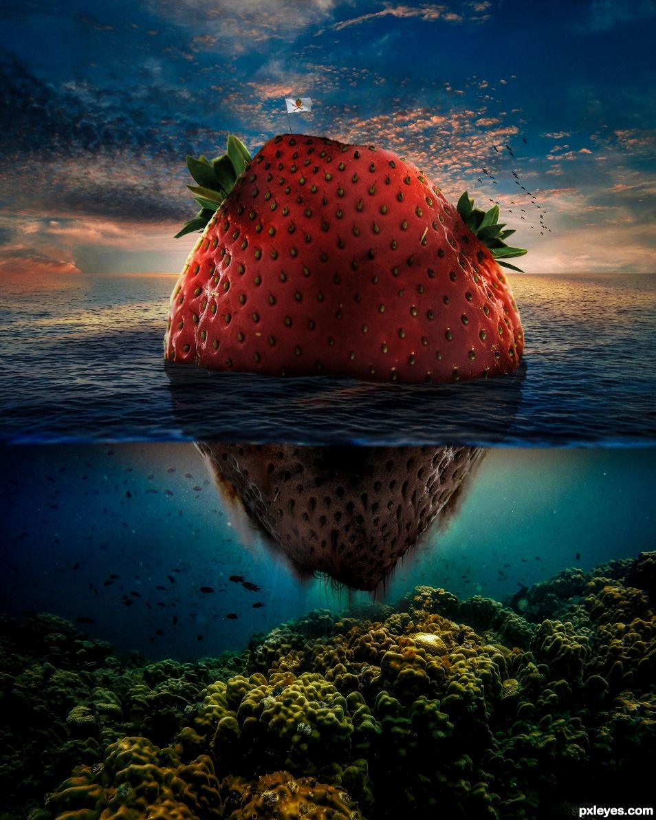
Flag made by myself and birds are brush.
Watch HD version ;) (5 years and 684 days ago)
This is a great image, but you need to fix your links.
Done. 
Please fix your links, they are not working right now.
Have a look here http://www.pxleyes.com/courses/pxleyes-guide/ if you have any problems / questions.
Good work author.Looks so much better at Hi-Res. Can't stand the low resolution previews we have here. I like the small bit of lighting you did around the edges of the strawberry due to the back-lighting of the sunset.
What BWR said, but the flag really makes it. 
Looking at this in high resolution just makes it so perfect. Your creativity is phenomenal and your work stellar. I like everything about this and I envy your skills.
Thanks a lot 
magnifique ! very very very well done author !
Congrats on 1st!
Congratulations, well done.!
Congratulations
Congrats!
Thanks to all 
Congrats !
Howdie stranger!
If you want to rate this picture or participate in this contest, just:
LOGIN HERE or REGISTER FOR FREE
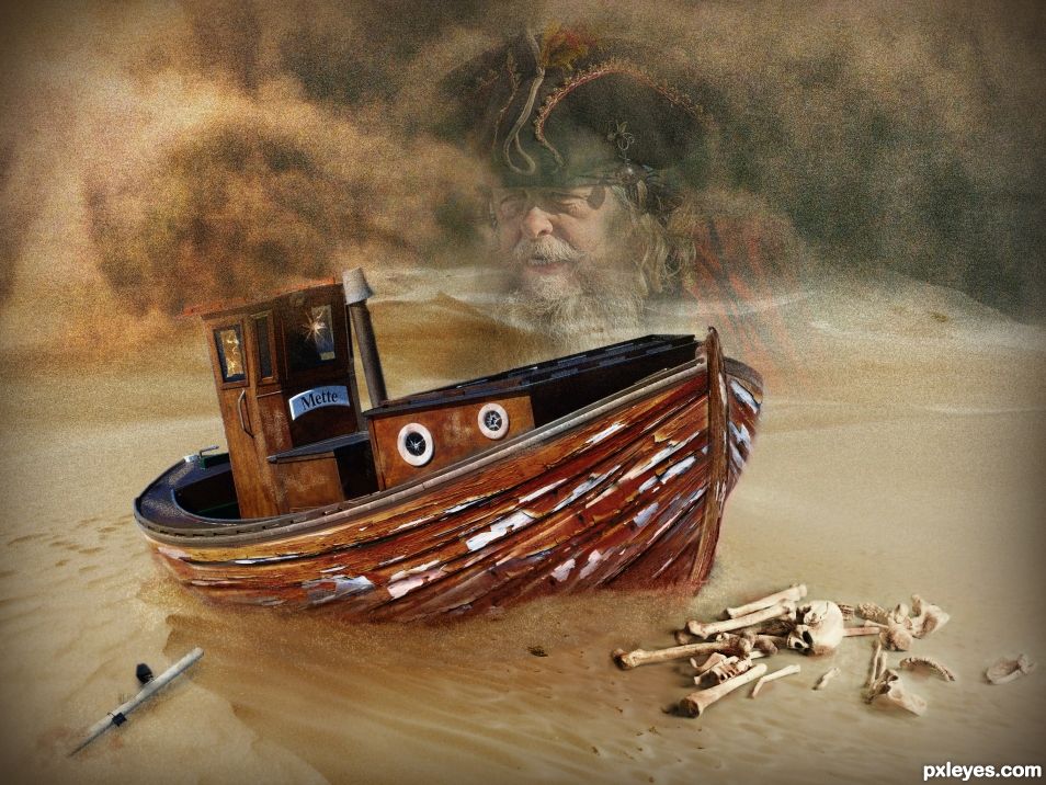
The ghost of a pirate who got stranded on a desert in a dust storm. (5 years and 1300 days ago)
I really like what you have done here, particularly with the flaking paint texture, however I feel the dark lower section of the hull looks a little odd because the paint isn't flaking.
Thank you Madamemonty. It is now. 
It's better but, I think if you followed the curve of the timbers rather than the painted dark section it would be more effective. 
Like that?
Thank you for your kind and helpful suggestions. 
Where's Johnny Depp? hehehe.. great job 
Thank you.
You make me smile. 
That looks much better 
Congrats on third place 
Thank you.
Congrats!
Thank you
Congrats Angel!!
Thank you
Howdie stranger!
If you want to rate this picture or participate in this contest, just:
LOGIN HERE or REGISTER FOR FREE
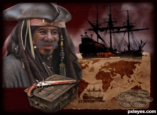
(5 years and 2706 days ago)
Nice job on the hair. The fog and wood texture are well done too.
has that movie poster feel gl
great idea author
nice imagination and nicely done
GL
Howdie stranger!
If you want to rate this picture or participate in this contest, just:
LOGIN HERE or REGISTER FOR FREE
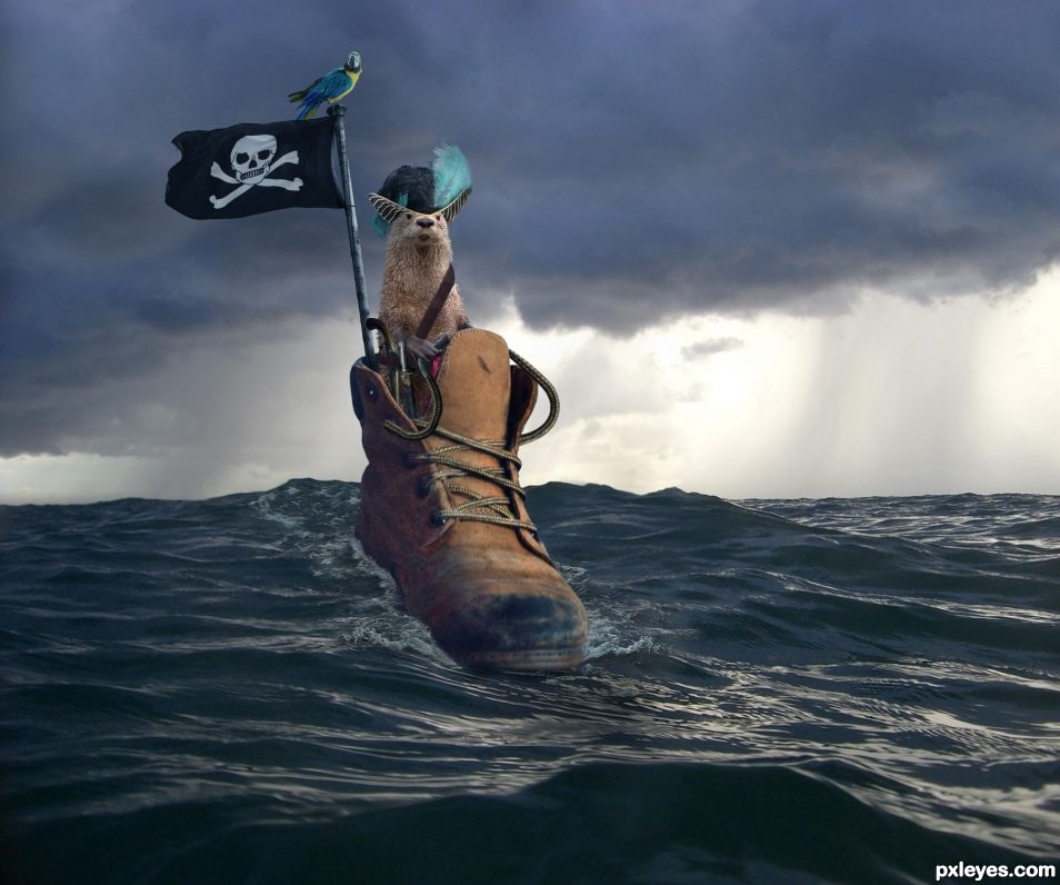
Nice job on the water.
Thanks CM. I am more impressed with the shoes laces rebuild. But yea, if I had to do it again I would have picked a different image to rebuild the water with. I did a bit of painting to make the water blend as well as masking in parts of the external water. I mostly work in Frame Animation in PS and had 5 different versions of the water that were all good.
I was busy this weekend and voted on the Island contest. I was going to take my time Sunday and vote on the Boots contest but I got involved with something else and forgot to vote on it. My bad. I would have voted your entry the highest and I have an over 5 voting power. So it probably it skewed the voting. Am happy to see that the boots contest at least had 4 good entries.
Wow a 48.1%. I am out of here. See you guys.
B, I'm sorry but as you know I'm travelling, so I watch the entries in Pxleyes with a small tablet. I don't vote though as I can't see enough, it is too small. By mistake I touched the wrong place on the left side, I suppose it gave you a bad vote. I ticked the mods and explained my mistake, but now I'm not sure they took it into account. Anyhow it is not only your vote that is too low, have a look! Please, please, please don't go. I'll be back soon.
B, I'm sorry but as you know I'm travelling, so I watch the entries in Pxleyes with a small tablet. I don't vote though as I can't see enough, it is too small. By mistake I touched the wrong place on the left side, I suppose it gave you a bad vote. I ticked the mods and explained my mistake, but now I'm not sure they took it into account. Anyhow it is not only your vote that is too low, have a look! Please, please, please don't go. I'll be back soon.
Howdie stranger!
If you want to rate this picture or participate in this contest, just:
LOGIN HERE or REGISTER FOR FREE