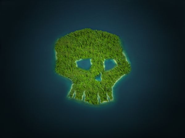
(5 years and 3734 days ago)
- 1: source 1
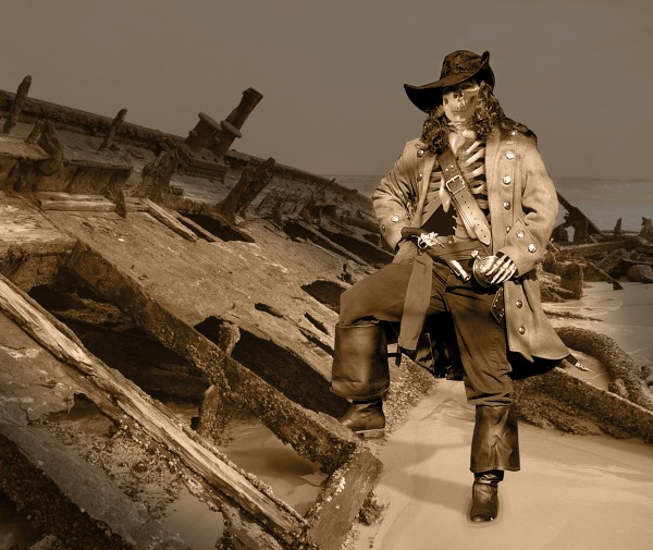
Pirate by Kordite @ Flickr.
Hand by mishkuu @ DA.
Background by SBishop @ Flickr.
Please view High Resolution. (5 years and 3772 days ago)
Good blend & color work! The leg shadow is heinously wrong, though...look at the shadows in the background image...light is from the right.
Fixed the shadow CMYK, I hope it is right now. 
Nope. It should be horizontally from right to left as the shadow at left of the figure.
Adjusted it some more. This is how it will stay (right or wrong) as I won't get time to do any more to it. Thanks for your input CMYK as always. 
very creative work, good blend
Thanks for the fave darkshellie23 
In HR, the left side of the coat by the arm blends in with the background but still a good image.
so cool
Jawshoewhah it was remnents of the color overlay which I have now corrected.  Nisha, thanks for the fave.
Thanks for the fave Cornelia 
this is just awsome author.. love the colouring
Thanks scratzilla1 for the comment and fave. 
Very nice use of source, high marks from me!
Very nice ........Good job Author.
congrats! 
Howdie stranger!
If you want to rate this picture or participate in this contest, just:
LOGIN HERE or REGISTER FOR FREE
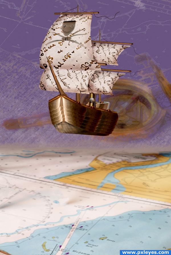
A high-tech pirate ship just escaped papers and maps. (5 years and 3876 days ago)
OUTSTANDING!
Looks really good! Maybe intensify the ship's shadow, great great the way u built the ship!
good work ...!  cheers
sweet.. whoops.. not sweet like SUGAR..sweet like a conquering hero returning to Camelot 
Good job, very, very nice!
maybe you shuld have placed it on the map, in the blue area (sea).
I gotta split hairs. Because that's what I do. It's not a map. It's a chart. Haha! I love this though. That ship is spectacular!
A flying ship, I wonder where did Sparrow go? Good luck author.
Nicely done! Everything but the out of focus compass in the background works for me...it's kinda distracting.
Looks great, very creative and skilled.
artistic work. i like the ship in the air, i think it brings creativity to the image. good structure on the ship
Thank you all, guys and girls!
I like this a lot, but may I suggest a soft shadow being cast from the ship onto the map? Nice job!
amazing! I think it would be even better without the map under it because the colors of the top look awesome together like they are. GREAT!
great use of source! good job!
Very creative
Very creative use of source. 
I think i would have liked it better if you had placed the boat in a real sea. however the boat you build looks real nice, except the stuff you made on the sail.. but i guess opinions differ  nice clean chop
wow
Very nice job, building the ship!  Good luck
Howdie stranger!
If you want to rate this picture or participate in this contest, just:
LOGIN HERE or REGISTER FOR FREE
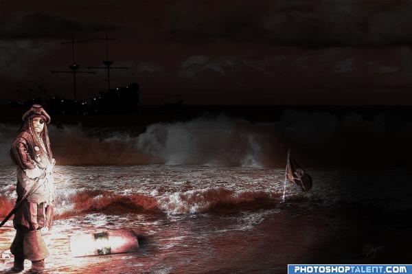
A lost Pirate...
:)
_______________________________
Check this out! (5 years and 3944 days ago)
Not bad, but too much red for a night scene...
okay thx I decrease a little bit 
nice
In fact for a night scene I wonder where the strong light on the pirate comes from. You wouldnt like to reduce it a bit? Well done for the rest. Good luck!
good work
WHY SO RED ??
They are right, at night everything is in bluetones. And the lightsource could be a torch or a firefly or....Moonlight would have been perfect for this setting.
Did you apply some filter on pirate? I don't think it works here. But anyway good work 
I like the red hue. It has a ghostly feel about it, something nightmarish. I like that the light has no evident source. But the ship on the background is too dark and almost missed it.
Its nice.
LKY: because I wanted to show a red night in this style!
Olga: yes it's right. 1.import pirate 2. use Hue/Saturation 3. photo filter: color-orange 4. use brush tool to shadows on pirate and this all under curves. 
nice mood, maybe to much red but i like the background light level for some reason  good luck
Howdie stranger!
If you want to rate this picture or participate in this contest, just:
LOGIN HERE or REGISTER FOR FREE
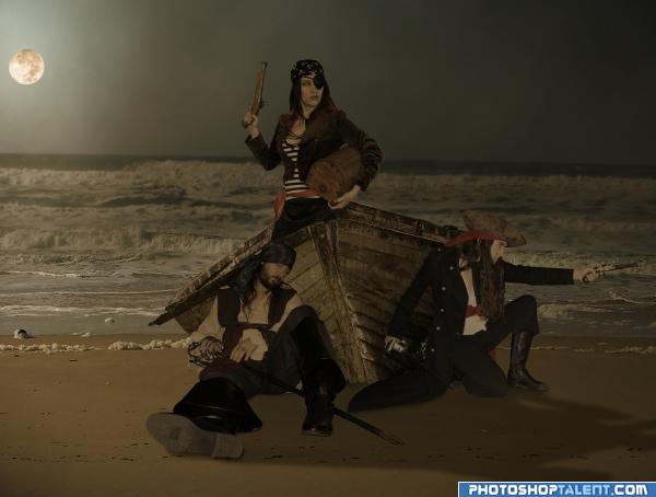
I hope they don't expect to get too far with the old boat.
High Resolution available to see.
Thanks to DelightfulStock, LongStock,Dralliance-Stock and NefletStock from DeviantArt.
Thanks to amitm3 from sxc.hu
All authors have been notified and credited. (5 years and 3948 days ago)
Nice work, good luck 
back to Gardermoen! 
tad on the dark side.. not a bad thing.. wonder if you could soften up the image to get rid of the sharp lines around the people... maybe just edge blur.. they really stand out(they are expertly masked out.. the work is amazing) good luck (Super HIGH MARKS FOR SKILLS) 
I like the feel of this, nice one
GolemAura, I purposely made the pirates and the boat sharp because they are in the foreground and in focus. I blurred the water behind them. Thanks for the comments everyone.
nice
Pretty bright for a night scene, I'd desaturate it some...
nice work 

nice work! but still needs some polishing. Ditto on the desaturating CMYK. I'd also add that the light sources are wrong. you have the moon in the back, but no shadows. the pirate on the right should be almost completely in the shadow of the boat as of where the moon is, for example.
I really like your composition, but I have a few suggestions. The moon being full and that bright would still cast some subtle shadows toward the foreground. This would help to really place the pirates and boat on the beach. Also, some lighting highlights where the moon is hitting them (maybe use dodge tool) would really look nice!! Good luck!! 
Good job! 
Very nice!! Clean, clean, clean. I would suggest a little "disturbance" to the sand under all the feet and boat, rather than smooth shadows only. Wet sand usually gives in to pressure and weight by creating impressions and displacement. Agree with CMYK. menelve and Philister on brightness/highlights and shadows. There's something "pasted in" and a bit isolated about the pirate scene compared to the background, it's not blending naturally. Awesome masking! Perfect!
good work, check the propotions
I agree with elemare disturbances on the sand.. It would help make this piece look real if there are footprints and dents under the characters caused by their weight. The sand still looks really smooth...
I agree with the comments on shadows and also footprints in sand. I also think the moon pulls your eye away from the pirates. Maybe it would be better more behind them to silhouette them. Like your idea.
I made changes as suggested, desaturated the main characters and added a shadow. I'll work on the sand if I get time. Thanks for the suggestions guys.
too dark
Too bright, too dark, I give up!!!!
looks much better now! the pirates could still do with having the dodge tool applied to them to make their right side more shadowed.
good idea but i think the front of the ship and the pirates would be in shadow seeing the moon is at the rear .. but good idea
Haha, poor author  . I think it's not too dark. What you cà n add is a liiiitle bit of highlight on the left side of the standing pirate and the side of the boat. But not very needed either, only if you wanna try. What I wòuld do is put the moon a bit more to the right, cause right now it's almost against the border of the image, which is imo a bit distracting. Put it a bit more to the right and it's more part of the image. Also, the sea in the background is blurry, but the moon is very sharp. Maybe some blur for the moon too? Good luck!
Howdie stranger!
If you want to rate this picture or participate in this contest, just:
LOGIN HERE or REGISTER FOR FREE
Seems a little simple.
I agree it's not very complex but it's a clean chop and an effective idea.
simple but perfect..!
very nice
Howdie stranger!
If you want to rate this picture or participate in this contest, just:
LOGIN HERE or REGISTER FOR FREE