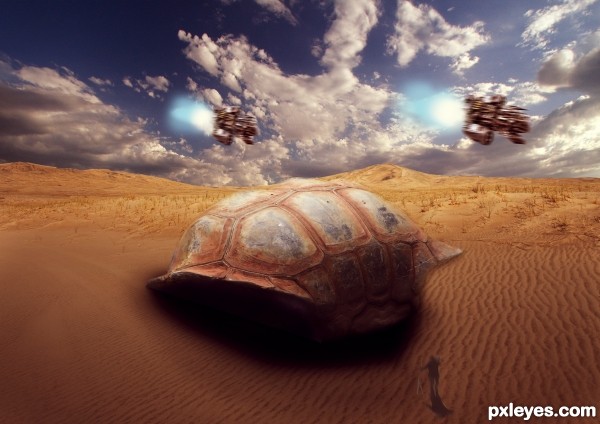
its A giant shell (5 years and 2820 days ago)
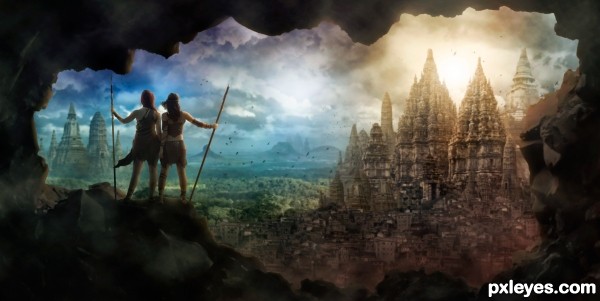
I created this epic view from several pictures of temples and ruins! Lots of digital painting, shading, and coloring to get it all to blend together.
Thanks to Tasastock and RaeyenIrael-Stock for the image of the girls. (permission is in the SBS) (5 years and 2878 days ago)
Nice mood ! This is an eye catching image !!
GL
Yes, very nicely done, like to see a tutorial for this one
Great image 
The perspective on two of the bigger temples on the right are off though, might be able to fix that by rotating and or skewing it. Otherwise: good mood, great color combinations, I like the framing in the rocks... a classic epic game scene 
Wonderful!
Howdie stranger!
If you want to rate this picture or participate in this contest, just:
LOGIN HERE or REGISTER FOR FREE
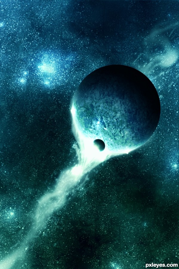
The beauty of a for us incomprehensible power.
The beauty of the unknown.
Be sure check my SBS guide.
No sources used, all done in photoshop CS5. (5 years and 2882 days ago)
Simply beautiful, awesome, and with no sources! Unbelievable... 
Thank you erikuri for your motivational comment! Always nice to hear such a thing!!
Awesome work, I like this one a bunch.
Thanks a lot Emik!
Howdie stranger!
If you want to rate this picture or participate in this contest, just:
LOGIN HERE or REGISTER FOR FREE
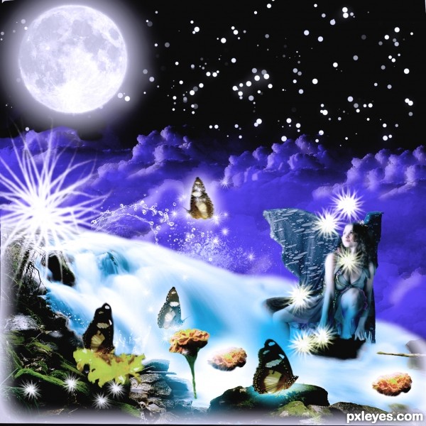
I would like to thank Mjranum of deviantart for providing this lovely girl. Then thanks to Falln-stock for those lovely Moon brushes. Thanks to redheadstock for those beautiful and impressive water and cloud brushes both provided by him. (5 years and 3265 days ago)
I am Back with a bang and brought this entry to life.......................I hope it stays till the end.
cool work...gl
Like the composition.... good luck
Thank you friends..........
Howdie stranger!
If you want to rate this picture or participate in this contest, just:
LOGIN HERE or REGISTER FOR FREE
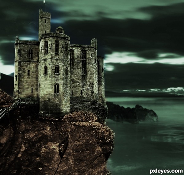
Hope you like! (5 years and 3280 days ago)
Very nice work, good luck!
Howdie stranger!
If you want to rate this picture or participate in this contest, just:
LOGIN HERE or REGISTER FOR FREE
Might be better with less motion blur on the ships.
i did less but liked more
OK then...I don't want to seem like I'm picking on you, but why is the foreground figure blurry, and why is the shadow not proportional.
It's just a personal opinion, but I think the foreground would had to be more focused, while the background mountains had to be blurred. Nice selection of the sources which made the picture very star wars looks like. GL author
congrats!
Nice Job Congrats
thanks everyone
Congrats!!
Howdie stranger!
If you want to rate this picture or participate in this contest, just:
LOGIN HERE or REGISTER FOR FREE