(5 years and 3146 days ago)
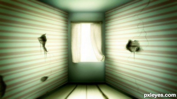
Created everything from scratch. No references/sources were used. (5 years and 3293 days ago)
wow beautiful work 
awesome!!!!!!!!!!!!!!!!!!!!!!!!!!!!!!!!!!!!!!!!!!!!!!
hehe.. right out of the Matrix.. good luck author 
Very nice! Simple yet very effective!
Super cool work author...GL
I like the glow effect in the room =)
Howdie stranger!
If you want to rate this picture or participate in this contest, just:
LOGIN HERE or REGISTER FOR FREE
(5 years and 3353 days ago)
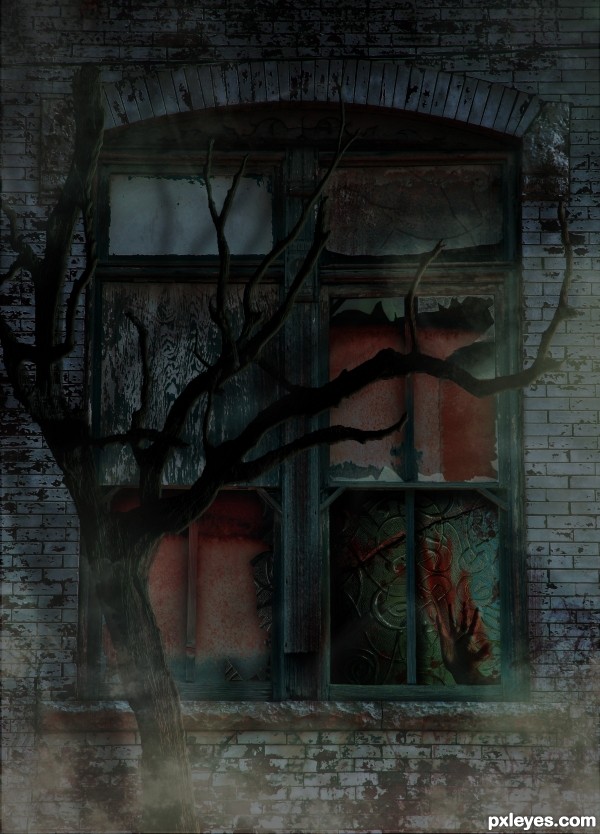
Nice idea all round... reaching out for the hand that is smacked.. Kinda Kate Bush... Suspended in Gaffa.. nice image
Nice job 
REally good spooky creation = )
Appreciate you comments 
Gruesomely eerie and interesting take on the source. Tree appears a little flat in places (could have used some shading to add come "curve" to the branches) but well put together otherwise.GL Author!
Congrats for your third place, Mad!
congratulations...
Thank you Lelaina and ramesan.
Congrats!!
Howdie stranger!
If you want to rate this picture or participate in this contest, just:
LOGIN HERE or REGISTER FOR FREE
(5 years and 3366 days ago)
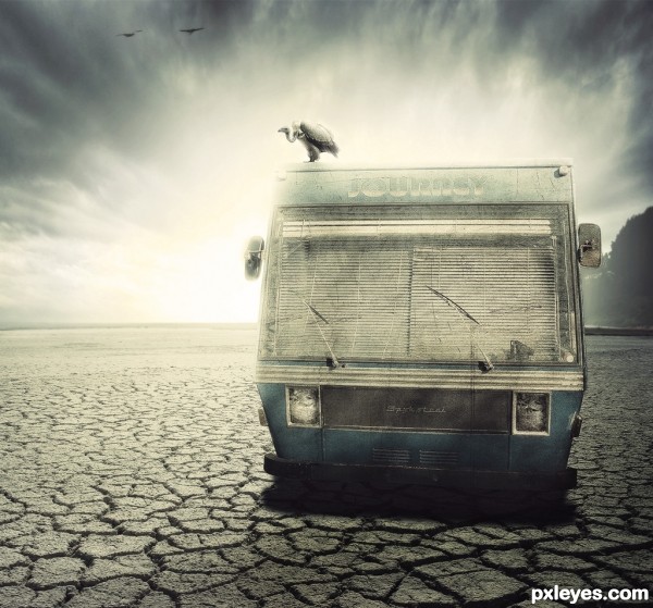
This entry reminds me of the TV series "Breaking Bad" and the desert was a really nice touch. GL! 
I'm with you Josh, I thought the same thing - one of my absolute fav shows btw!
Nicely executed chop too, has a familiar style to it...
Mine too! As well as Dexter and Weeds.
Very Good!
Thank you guys!
really like it
effect is superb
really like it
effect is superb
Excellent job with lighting and making those headlights weathered. Nice work!
All credit to you, I had wrongly attributed this piece to one of our more famous PS artists here, and I was genuinely surprised to see it wasn't theirs - the style is very similar. Trust me this is a compliment to your work! 
Oh and Josh, I understand Dexter, my other favourite show, but Weeds, really that's a bit predictable for you isn't it? 
Thank you guys for all the comments!
And Ray, thank you! I'm new here, I really found your previous comment a little strange, but did not think it was the similarity in style with another person. I do not know who he is, still do not know many people here!
Thank you for your attention!
And forgive my bad English!
Very very nice work author...Great blend and perfect mood...well done
Great work on a difficult source.
I genuinely love this image. Very intense lighting.. fantastic work. And welcome to the site! I look forward to seeing more and more of your work 
Weeds? Predictable? Probably  The last season kind of sucked...
Gostei! Muito bom...
Nice atmosphere and mood
Thank you guys!!!
Mind Blowing composition. Really very inspirational work.
Beauty result!!!! Lovaely see the SBS
Fantastic work Author....G/L.
good work !
Thank you guys!
Howdie stranger!
If you want to rate this picture or participate in this contest, just:
LOGIN HERE or REGISTER FOR FREE
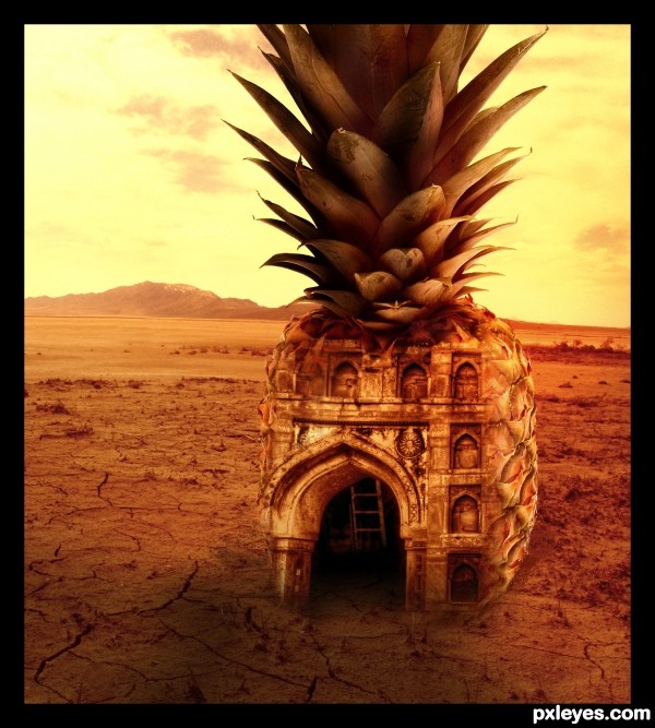
Sunset shot of an abandoned building in a desert. (5 years and 3538 days ago)
very nice work,great coloring...only thing that is wrong is shadow...light is come directly from the back of the pineapple,so shadow have to be in front...fix that author,this work is great...best of luck
Thanks Erathion 

Corrected the shadow.
Nice entry!
Tropical pineapple as a building form in the desert is an interesting concept. I'm afraid I'm going have to disagree with erathion, however. The light in Source 1 seems to be coming from the front more or less and the pineapple is lit similarly (as is still evidenced in the highlights in the leafy crown of your current entry). SBS Step 5 has good lighting to my mind, but nevertheless has some other problems: Pineapple shadow needs to be sharp, not vague, consistent with harsh desert light. Doorway arch needs both right and left sides. Similarly, faux right-side window arches require faux left-side window arches. (My solution would be no faux window arches.) Make the lighting more dramatic like your current entry (but without letting the pineapple blend into the background and without the black border). I think the interior ladder should be moved to the right so it's only partially visible -- or maybe just delete it as it seems kind of unnecessary without more interior light.
Thanks everyone.
Have made few corrections/changes. Hope it is fine now 
Very nice image author. Like it 
very cool!
Good image
Good one
thats really good art
love it..... interesting job....gl
Congrats for the 4th place
Howdie stranger!
If you want to rate this picture or participate in this contest, just:
LOGIN HERE or REGISTER FOR FREE
Lovely rendition! Nice job author. GL!
Very artistic. Well done
very neat feel author, GOOD LUCK!
Thanks for all comments!!!I I appreciate it.
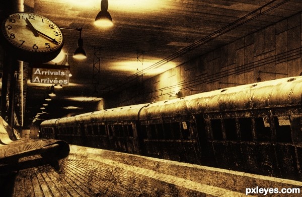
cool effect! the clock looks too big to me
This one is great, maybe the arrival sign to look a bit rustier
I really like the old grungy feel and coloring to this! Nice work, author.
great work author
Congrats for 1st place, nice pic
Congrats, nice work
Howdie stranger!
If you want to rate this picture or participate in this contest, just:
LOGIN HERE or REGISTER FOR FREE