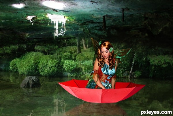
The fairy is my image, the Umbrella is from pxleyes the other 2 sources came from morgue file. Cave photo came from Ardelfin and the pond photo from KConnors. I will upload a SBS shortly. (5 years and 3492 days ago)
- 1: Pond
- 2: Cave like image

The fairy is my image, the Umbrella is from pxleyes the other 2 sources came from morgue file. Cave photo came from Ardelfin and the pond photo from KConnors. I will upload a SBS shortly. (5 years and 3492 days ago)

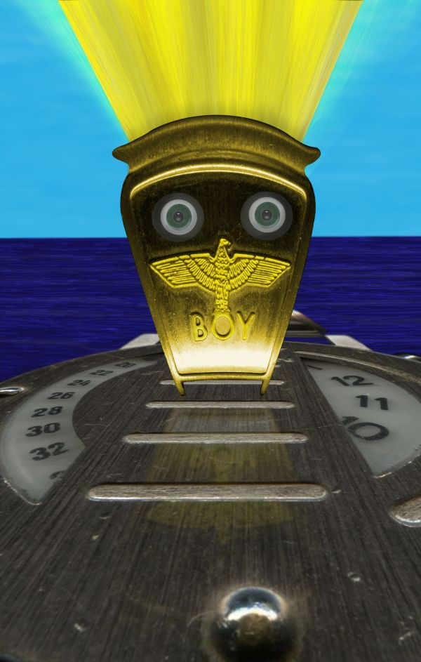
NO EXTERNAL USED!!
Step 1 cleaned watch and then distorted to make platform
Step 2 used some existing background and colored it to be water
Step 3 Did same for sky only blurred and distorted more
Step 4 Took side piece and distorted it using spherize. Then colorized it to be gold
Step 5 made up eyes and discharge light
Step 6 did a reflection of the upright and partially faded it and lowered opacity and fill. (5 years and 3784 days ago)
very nice...good luck

Thanks We'll see how it does. ; )
Good perspective. GL!
Howdie stranger!
If you want to rate this picture or participate in this contest, just:
LOGIN HERE or REGISTER FOR FREE
You might want to use curves for better blend, sometimes a lower oppacity helps too, 90-97%. You should also check the cutout of the umbrela, some edges need work. GL.
Reflection is wrong. You wouldn't see her hands, or the inside of the umbrella. Also, sitting off center like that, she'd be capsizing.
love the idea and the feel of ur image, agree with what greymval said about the blending and edges and also the umbrela reflection in the water is wrong u cant do mirror reflections by simply flipping the image there quite hard to do right but with water u have the advantage of doing a more distorted and vague reflection good luck
Wow, you guys are good. I'm not quite that observant yet. I fixed the edges on the umbrella and moved the girl towards the middle. I however remain truly challenged by the reflection of the umbrella and girl. I tried recreating a mock reflection fom the one rock and using those same steps on the umbrella but it just doesn't look right. Any other suggestions are appreciated.
OK, if curves/ transparancy didn't help, you should make some layers with the environnment colour and clip to your girl& umbrella( which should be desaturated a bit), overlay those and lower oppacity below 20%. , but to have the aspect that she is really in that cave, not in a studio with a background.
Be aware not to make her look dead
Light reflects on surfaces and gives them colour, but surfaces also reflect their color on other objects, influencing their hue - that's the motto of blending, lol.
PS: you could try to place some fog, not too much, if you think it helps the composition- you can find many tutorials about fog online.
Author idea is very nice execution too...To achieve better blending u could use some color adjustment layers...First on top u could create dark blue layer,blend mode set to overlay,opacity somewhere around the 30%,second layer should be dark brown,blend mode set to color,opacity between 20-40%. Watching the mood of the image main color is green,so u could use on top od the dark brown layer ,some kind of goldish layer,blend mode set to color,opacity up to 25% max,and finally dark green layer,blend mode set to soft light,with opacity in between 20-50% depends of what u want to achieve. That is just idea author...best of luck
Erathion's comment is not just an idea, those are clear instructions that should be engraved in stone or something. Too bad I can't add that comment to favorites.. I'll add the pic instead
Thanks for the fave... and the instructions. I'll try and do all that before voting ends. It was very specific which I love!
Nothing I can say that hasn't already been said. GL!
Howdie stranger!
If you want to rate this picture or participate in this contest, just:
LOGIN HERE or REGISTER FOR FREE