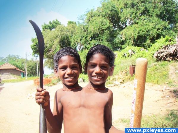
i prefer them twins and i hope shadows are good now (5 years and 3890 days ago)
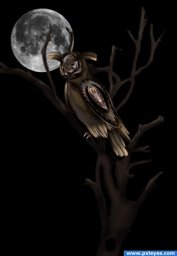
Used a picture of an owl from cg-textures to make the owl and a few brushes of the moon an an African brush tree.
Chopped out alot of key pcs. Will add in a sbs to show. (5 years and 3890 days ago)
great entry!
Nice!! It looks great!!
Nice image....The moon would be giving of some ambient light maybe you could add this to the tree & owl...
I like how you left some of the detail from source image in the wing...have to agree with warlock, some ambient lighting and possibly some very soft glow would really set this piece off. Good image though
Congrats for your second place!
Congratulations for 2nd
Congrats!
Congrats!!
Howdie stranger!
If you want to rate this picture or participate in this contest, just:
LOGIN HERE or REGISTER FOR FREE
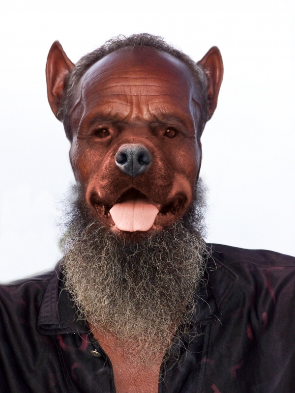
Thanks to CODYBEAR for his picture. Im back again. thanks. (5 years and 3901 days ago)
wow great image author
Arf, arf...good blend! 
 Muzzle's kinda light, though...might look better if you graduated the color from the nose to the face.
Great blending & colour matching!
Great blend, good job!!
Very will done
PXL EyesHomeMy stuff
to everyone. the adress of my source image is : http://www.pxleyes.com/pictures/3825/HAPPY.html. I wrote again and again but the adress doesnt work. but if you look in pxleyes/stock/page 24 youll find the picture. thanks to CODYBEAR.
ok. guys. thanks to mod. the problem was resolve. the link is http://www.pxleyes.com/picture/3825/HAPPY.html
Cute.
nice work tho in my observation i noticed that you madre a misrake on the left side of the face.. not sure if thios was a overlapping layer not removed out of haste ot just something u missed but o.o; it would looked a lot better if that had been ok, also now i am being picky, i find the hairs at the side a bit fuzzy had they been morre sharp it would been better in my opinion.. I love the idea, the ears are so funny lol
Howdie stranger!
If you want to rate this picture or participate in this contest, just:
LOGIN HERE or REGISTER FOR FREE
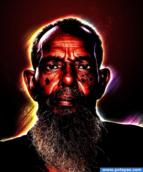
i gave him a sort of aura, used adjustments to make him mistic, used ctrl/cmnd + u to make his eyes dark and make the white of his eyes become lighter. only used source pic. hope you like it.. comments are welcome! (5 years and 3901 days ago)
too dark imo
ok
cool image
i like the tat or engraving in his cheek i think that is really really cool
I LOVE the rainbow halo around his head and neck. I agree with Tuckinator. The tatt (looks like burn scarification. I don't really know what it's called.) looks really cool and genuine. Outstanding work.
many thanks for your comments, i realy apreciate them!!
Howdie stranger!
If you want to rate this picture or participate in this contest, just:
LOGIN HERE or REGISTER FOR FREE
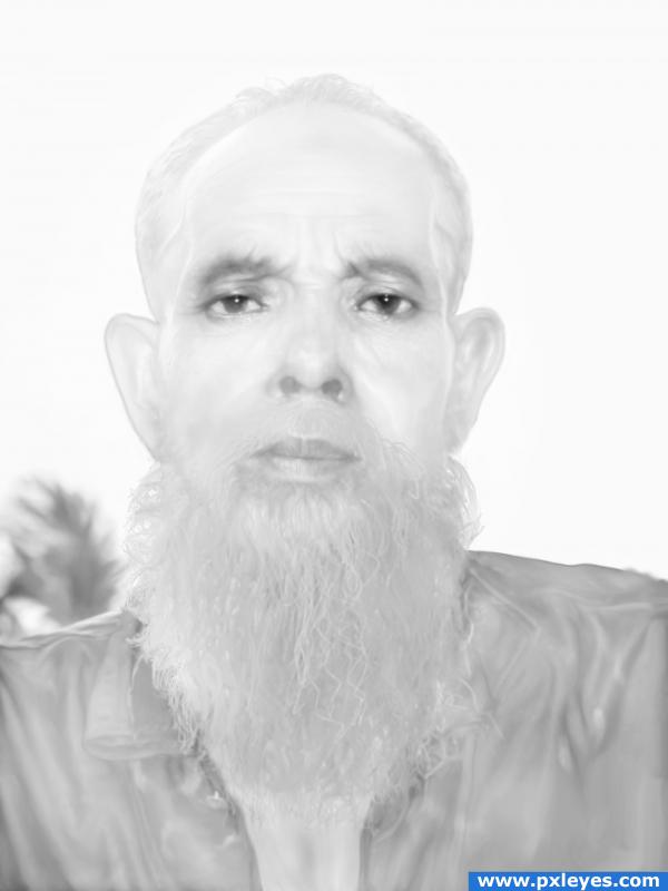
Here is my version.;-)
Only source picture was used.
SBS: Desaturate, Burn, Dodge, Smudge tools.
Different blending options. (5 years and 3902 days ago)
nice!! i tried to make a snow man.. but i cant!! i really like this!! Good Job!!
Nice idea but is a little to much of the same i.e white... need some contrast
its michael jackson in the afterlife... lol
what a creep, nice done!
Thank you guys for comments.  Warlock, it is mean to be white on white.
Howdie stranger!
If you want to rate this picture or participate in this contest, just:
LOGIN HERE or REGISTER FOR FREE
this looks quite good, but what i suggest is getting two different pictures of the same person then joining them together, because your face are the same, and repetition doesn't sell too well. Good luck though, the blending is great!
my eyes were playing tricks on me when I first looked at it. It looked like the necks have scars on them and it looked as if there was a crack (sort of like a ceramic crack) down between them---then I looked at the high resolution and realized those were necklaces. lol
Flip the head on our right...the light sources are opposite.
this image has great potential, the one on the right looks almost see-thru. and the light sources don't match if you would just make them the same person, this entry would be awesome! the other head also looks too big imo but more work, same person and matching light sources, and you got yourself a fine looking entry!
Fun idea but the shadows and colouring on the second head need to be the same as the first...
ah and the right head bigger is mention,(i wanted like that) thanks for comments and tips
@ vampyriccadence: Yes, the light is from upper left, which means the head on our right would have a shadow on the right side, not on the left.
Oh my!
hmm the necklace with the tooth on kinda looks oddly cutout... it would also requier a shadown and not a halo :p just remove the necklace nice picture
dang i just figured out why the tooth ecklace looks odd.. you flipped it and therefor the shadows on he necklace are flipped too XD it looked better on the other boy
thanks Eladine this i haven´t notest i did this image in work without time, this suppose to be an image only for joke and become serious, i will fix it soon as possible
I think the whole body should be widened a bit more, there's no room for the shoulders.
two heads are better then one... is it so?
image is quite fun
Howdie stranger!
If you want to rate this picture or participate in this contest, just:
LOGIN HERE or REGISTER FOR FREE