(5 years and 3030 days ago)
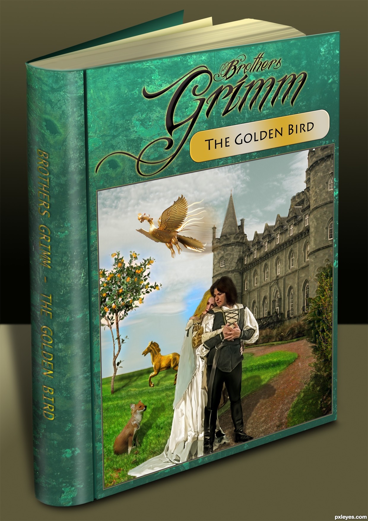
I should have stopped at the compleated image but I just had to see how it looked as a real book. (5 years and 3086 days ago)
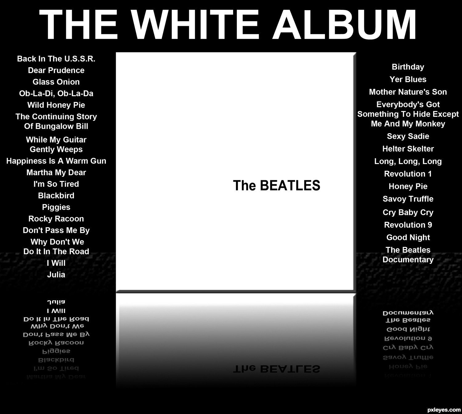
wow.. very good job with the idea.. watch the shadow under the spine as to the shadow under the cover, they should melt together a bit.. overall distortion for the picture is quite well done (the spine containment should encapsulate all the pages not just so far and then bends around it).. fantastic chop all round though.. good luck.. and always IMHO
Great image & SBS! The type on the spine is a bit off center, otherwise nice work. 
The shadow of the man seems wrong, anything else looks good and on place, great illustration of the story.
the text on the back of the book isnt in the middle of the back of the book, that makes it less realistic. move it a lil more to the left
edit: much better author
congrats on first... wonderful entry... think the choice of putting it on a book was great.
Congrats Geex, wonderful work
Congratulations for the first place!!
Howdie stranger!
If you want to rate this picture or participate in this contest, just:
LOGIN HERE or REGISTER FOR FREE
(5 years and 3093 days ago)
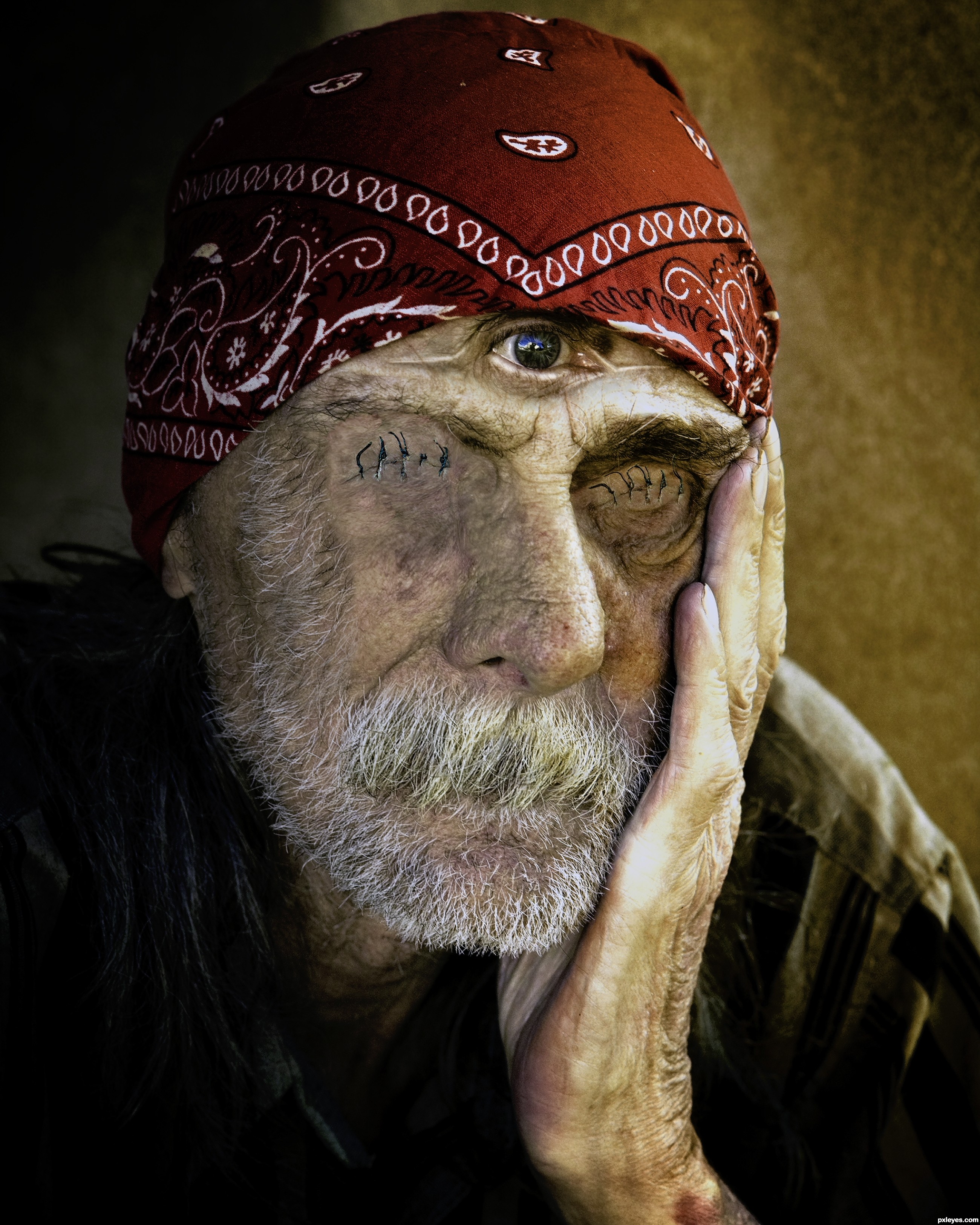
Interesting idea, but the eye is off center.
BAd surgeon Bob....nice idea!
Thanks Bob! It's corrected now.
eeeekkk Shivers! good luck
Changing the color balance didn't improve your pic.
well done.
Thanks again Bob! Adjustment done.
now this is art, excellent theme following, good luck
The 3rd eye.........Good thinking
Howdie stranger!
If you want to rate this picture or participate in this contest, just:
LOGIN HERE or REGISTER FOR FREE
(5 years and 3099 days ago)
Howdie stranger!
If you want to rate this picture or participate in this contest, just:
LOGIN HERE or REGISTER FOR FREE
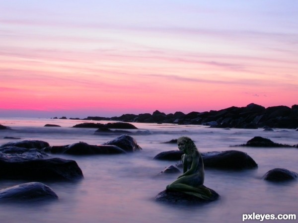
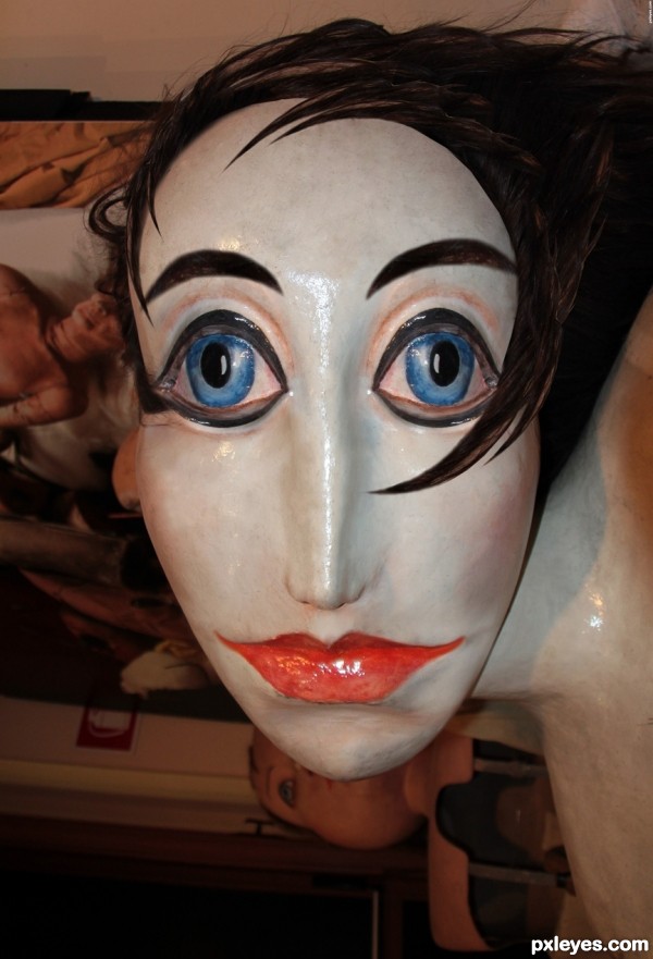
created using clone, brush, path, and two source images. (5 years and 3180 days ago)
It's so dark, it's very hard to tell what parts, or how much of the contest source you've used.
You may want to consider some judicious cropping, to make your use of the contest source more of the focal point in this image. Right now there is too much background, and too little contest source...
Also think about straightening out your horizon line. It's presently tilting down to the RH side...
The head looks too far forward on the neck. Decent idea but lack of a high res version hurts you.
Howdie stranger!
If you want to rate this picture or participate in this contest, just:
LOGIN HERE or REGISTER FOR FREE
Photography and photoshop contests
We are a community of people with
a passion for photography, graphics and art in general.
Every day new photoshop
and photography contests are posted to compete in. We also have one weekly drawing contest
and one weekly 3D contest!
Participation is 100% free!
Just
register and get
started!
Good luck!
© 2015 Pxleyes.com. All rights reserved.


Howdie stranger!
If you want to rate this picture or participate in this contest, just:
LOGIN HERE or REGISTER FOR FREE